Key takeaways
- Format: Portrait listicle with five labeled products
- Best for: Affiliate and review sites driving traffic to ranking pages
- Hook: Which mattress did the editors pick as #1?
- Reuse it: Swap in any product category and tease the winner of your own ranking.
Available sizes
What is a listicle ad?
A listicle ad presents the product's benefits or reasons to buy as a short numbered list, like an article headline ("5 reasons…"). The list format is easy to scan in a feed and lets one creative answer several objections at once.
See all listicle ads →Why this listicle ad works
- 01
Built-in curiosity gap
The ad names five contenders but withholds the winner, so the only way to get the answer is to click.
- 02
Borrowed brand recognition
Showing familiar names like Saatva, Purple and Tempur gives instant relevance to shoppers already researching those brands.
- 03
Timely year stamp
Adding 2026 to the headline signals fresh, up-to-date research and beats older evergreen reviews.
- 04
Editorial authority cue
The Consumer Ranking logo and the Editor's Pick phrasing frame the click as expert advice rather than a sales pitch.
Full creative breakdown
Who this ad targets
This ad targets in-market mattress shoppers who are actively comparing premium online brands and feel overwhelmed by choice. They are likely adults aged 25 to 60 who have already seen ads from Nectar, Purple or Saatva and want a neutral opinion before spending over a thousand dollars. They value expert reviews, side-by-side comparisons and reassurance that they are buying the best option this year. Retargeting audiences and lookalikes of review readers are a natural fit.
Copywriting analysis
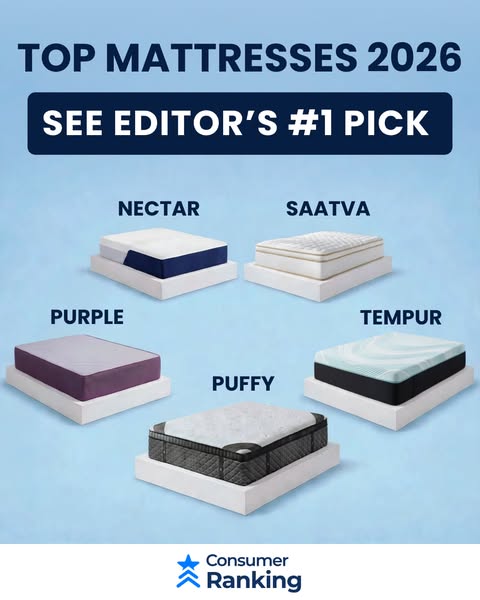
The copy is minimal and does exactly two jobs. Top Mattresses 2026 sets the topic and signals freshness with the year, which matters in a category where review content goes stale fast. See Editor's #1 Pick is the hook: it promises a single clear answer and implies expert judgment without making a specific claim about any brand. The brand labels act as secondary copy, matching the search terms shoppers already use. There is no price, discount or adjective clutter, which keeps the message clean and the curiosity gap wide. For an affiliate creative, this restraint is smart because the landing page does the persuading.
Visual design
A light sky-blue background keeps the ad calm and trustworthy, while the navy headline and dark banner create strong contrast at the top. Five mattresses are photographed at similar angles on white bases, which makes them look comparable and fair. The staggered layout adds movement and avoids a rigid grid. Uppercase brand labels sit directly above each product for fast scanning. A white footer isolates the publisher logo so it reads as a signature rather than a sales banner.
How to adapt this template for your brand
- Pick a crowded category where shoppers compare several well-known brands before buying.
- Shoot or source the products at matching angles and on identical bases so they look fairly compared.
- Write a short headline that names the category and the current year.
- Add a curiosity hook that promises one clear winner without revealing it in the ad.
- Place your publisher logo in a separate footer so the creative feels editorial rather than salesy.
Tips for mattresses ads on Meta
The 4:5 portrait shape is ideal for Facebook and Instagram feeds, where it takes up more screen space than a square ad. Keep the headline and Editor's Pick banner in the top third so they read before the user scrolls past. Test a Learn More button rather than Shop Now, since the landing page is editorial. For Stories, extend the background vertically and add breathing room above and below the lineup to stay clear of interface overlays.
About this creative
This portrait feed ad from Consumer Ranking is built as a visual listicle. A bold navy headline reads Top Mattresses 2026, followed by a dark pill-shaped banner with the line See Editor's #1 Pick. Below, five mattresses from Nectar, Saatva, Purple, Tempur and Puffy sit on white platform bases, each labeled in clean uppercase type and scattered across a soft sky-blue background. The layout is staggered rather than gridded, which makes the lineup feel like a showroom floor and invites the eye to scan from brand to brand. A white footer strip carries the Consumer Ranking logo with a star icon, adding a sense of editorial authority. The ad never reveals which mattress wins, and that is the whole point: the open loop pushes curious shoppers to click through to the review page. It is a classic affiliate comparison creative that borrows trust from recognizable brands while keeping the publisher's own branding modest and clear.
Meta ad · 338 × 600 · Mattresses
Mattress Review Ad Example: Consumer Ranking Top 2026
This portrait listicle ad from Consumer Ranking lines up five well-known mattress brands under a Top Mattresses 2026 headline and teases an Editor's #1 Pick. It is a strong reference for affiliate marketers, review sites and comparison publishers who need a curiosity-driven feed creative that sends shoppers to a ranking page.
Added
All brand names and logos are property of their owners. Adplaylist is not affiliated with or endorsed by these brands.
Details
Ad copy
Primary text
Shopping for a new mattress this year? We compared the biggest names in sleep so you don't have to. See which brand our editors ranked #1 for 2026.
Description
Top brands compared
On-image text
TOP MATTRESSES 2026 | SEE EDITOR’S #1 PICK | NECTAR | SAATVA | PURPLE | TEMPUR | PUFFY | Consumer Ranking
Headline ideas for this template
- 1Which Mattress Won 2026? See the #1 Pick
- 2We Tested the Top 5 Mattresses
- 3The Best Mattress of 2026 Revealed
- 4Nectar vs Purple vs Saatva: Who Wins?
- 5Our Editors Picked One Mattress
Meta image ad specs
| Placement | Ratio | Size (px) |
|---|---|---|
| Feed | 1:1 or 4:5 | 1080×1080 / 1080×1350 |
| Marketplace | 1:1 | 1200×1200 |
| Messenger inbox | 1:1 | 1200×1200 |
| Stories & Reels | 9:16 | 1080×1920 |
This template is 1:1. Request 4:5 or 9:16 to cover all placements.