Key takeaways
- Format: 'X, but for Y' comparison headline with stacked social proof.
- Best for: Consumer apps explaining a new category quickly.
- Hook: A famous brand comparison that explains the product instantly.
- Reuse it: Pick a beloved reference app and add 'but for' plus your category.
Available sizes
What is a comparison ad?
A comparison ad sets the product against an alternative, such as a competitor, the old way of doing things or a cheaper option, usually in a two-column layout or table. It helps buyers who are already weighing options see quickly why this one is the better choice.
See all comparison ads →Why this comparison ad works
- 01
Instant understanding
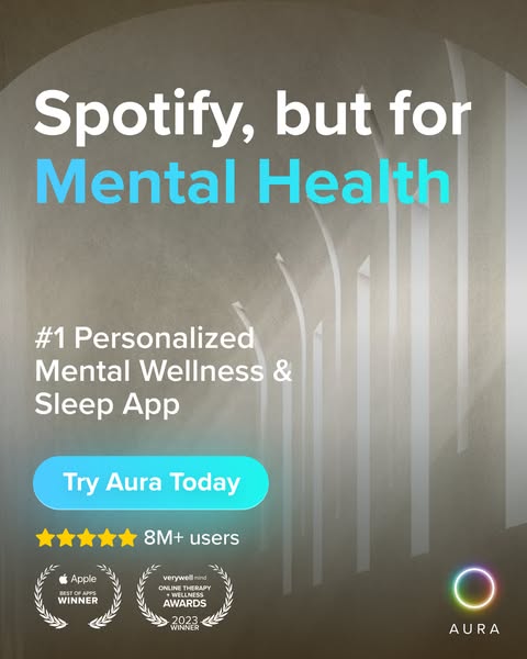
Comparing to Spotify conveys personalised, on-demand audio content without explaining features.
- 02
Proof stacked under the promise
Stars, 8M+ users and two awards back up the bold #1 claim right away.
- 03
Calm visual tone
The serene archway photo makes viewers feel the relaxation the app promises.
- 04
Gradient highlight on the category
The blue gradient on 'Mental Health' pulls focus to what the product actually is.
Full creative breakdown
Who this ad targets
The ad targets adults aged 20 to 45 who already use streaming apps like Spotify and want an easy way to manage stress, anxiety or sleep problems. They are curious about meditation but may find traditional apps too rigid or serious. The analogy suggests variety, personalisation and casual daily use. Busy professionals, students and people with trouble sleeping are core segments, along with anyone comparing wellness subscriptions.
Copywriting analysis
The 'X, but for Y' formula is a proven positioning shortcut, borrowing the meaning of a well-known brand in a few words. 'Spotify' implies personalised playlists, huge content libraries and habitual daily listening, all without listing a single feature. The subhead then grounds the claim with '#1 Personalized Mental Wellness & Sleep App', adding category keywords. 'Try Aura Today' is friendly and low-pressure. The proof points – star rating, 8M+ users and two awards – are listed visually rather than in sentences, which keeps the ad scannable. Using a competitor-adjacent brand name in ads can raise trademark issues, so check platform rules.
Visual design
A warm-grey, softly lit architectural photograph creates a peaceful, contemplative mood and avoids clichéd meditation imagery. Bold white sans-serif type stands out clearly against it. A blue-teal gradient on 'Mental Health' and the CTA adds a fresh, digital accent. Gold stars and white laurel badges add credibility. The vertical stack flows from headline to subhead, CTA, rating and awards, with the colourful ring logo in the corner for brand recall.
How to adapt this template for your brand
- Pick a well-known brand that represents the experience you deliver.
- Write 'Brand, but for [your category]' as a two-line headline.
- Highlight your category word with a gradient or brand colour.
- Stack ratings, user numbers and awards below the CTA.
- Use a calm, on-brand background photo instead of stock product shots.
Tips for mental health apps ads on Meta
The 4:5 format maximises feed space on Instagram and Facebook. For app installs, use Meta's app promotion objective with a 'Download' or 'Install Now' button. Using another company's brand name in ad copy may trigger review or trademark complaints, so test a version with a generic reference too. Add a 9:16 version for Stories and Reels with the headline in the top third. On Google App Campaigns, reuse the headline as a text asset.
About this creative
This 4:5 portrait ad uses a soft, warm-grey photo of a minimalist architectural space with tall arches and light falling through narrow windows, creating a calm, almost spiritual atmosphere. At the top, a big bold white sans-serif headline reads 'Spotify, but for', with 'Mental Health' below in a light-blue to teal gradient. In the middle, white text describes Aura as the number one personalised mental wellness and sleep app. A rounded gradient blue button reads 'Try Aura Today'. Below that, five gold stars sit next to '8M+ users'. At the bottom left are two laurel award badges: an Apple Best of Apps winner and a Verywell Mind 2023 online therapy and wellness award winner. In the bottom right corner sits Aura's colourful gradient ring logo with the brand name beneath. The layout is clean and stacked, leading the eye from analogy to proof to action.
Meta ad · 338 × 600 · Mental Health Apps
Mental Health App Ad Template: 'Spotify, but for…'
This Aura ad describes its mental wellness and sleep app as 'Spotify, but for Mental Health'. The comparison format borrows a familiar product to explain a new one in four words, backed by star ratings, 8M+ users and two award badges. Use it to position any app against a well-known reference brand.
Added
All brand names and logos are property of their owners. Adplaylist is not affiliated with or endorsed by these brands.
Details
Ad copy
Primary text
Imagine a personalised playlist for your mind. Aura gives you meditations, sleep stories, coaching and music tailored to how you feel – all in one app. Join 8M+ users and see why it's the #1 personalised mental wellness and sleep app. Try Aura free today.
Description
#1 personalised mental wellness & sleep app
On-image text
Spotify, but for Mental Health | #1 Personalized Mental Wellness & Sleep App | Try Aura Today | ★★★★★ 8M+ users | Apple Best of Apps Winner | Verywell Mind Online Therapy + Wellness Awards 2023 Winner | Aura
Headline ideas for this template
- 1Your personalised playlist for a calmer mind
- 2Netflix, but for better sleep
- 3Mental wellness that adapts to you
- 4Join 8M+ people feeling calmer daily
- 5The award-winning app for stress and sleep
Meta image ad specs
| Placement | Ratio | Size (px) |
|---|---|---|
| Feed | 1:1 or 4:5 | 1080×1080 / 1080×1350 |
| Marketplace | 1:1 | 1200×1200 |
| Messenger inbox | 1:1 | 1200×1200 |
| Stories & Reels | 9:16 | 1080×1920 |
This template is 1:1. Request 4:5 or 9:16 to cover all placements.