Key takeaways
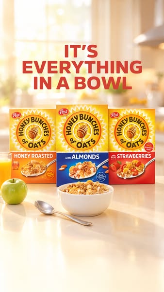
- Format: Lifestyle range lineup on a kitchen counter with the campaign tagline above.
- Best for: Food brands showcasing multiple flavours or variants in one creative.
- Hook: Bright morning light and three colourful boxes that signal choice.
- Reuse it: Line up your variants in a real-life setting and add simple props that tell the usage story.
Available sizes
What is a lifestyle ad?
A lifestyle ad shows the product being used in a real setting by the kind of person who buys it. Instead of listing features, it sells the feeling or outcome of owning the product, which makes it a strong fit for fashion, home, travel and wellness brands.
See all lifestyle ads →Why this lifestyle ad works
- 01
Choice in one glance
Three colour-coded boxes let viewers instantly see the flavour options. It's like a mini shelf in the feed.
- 02
Morning mood sells the moment
Sunlight, plants and juice create an ideal breakfast scene. Viewers associate the brand with positive mornings.
- 03
Props hint at balance
The apple and orange juice suggest a wholesome, complete breakfast. It supports the 'everything' message without health claims.
- 04
Campaign consistency
The same tagline as other Honey Bunches ads builds recognition. Every creative reinforces one idea.
Full creative breakdown
Who this ad targets
This ad targets family grocery shoppers and adults who want a tasty but wholesome-looking breakfast. The range lineup speaks to households with different preferences, such as kids who prefer honey, parents who like almonds and others who enjoy fruit. It suits women and men 25–55 who plan weekly shops, plus people interested in healthy eating and home cooking. The bright, aspirational setting is designed for awareness and consideration on Meta.
Copywriting analysis
The copy uses the campaign line "It's everything in a bowl." In this creative, the word "everything" takes on a new meaning: not just the mix of flakes and clusters, but the variety of flavours on display. The line is warm and simple, with no feature claims or offers. Because it repeats across the campaign, it builds memory over time. The flavour names are carried on the packaging, so the headline doesn't need to list them. The primary text can turn the range into a question, inviting viewers to pick a favourite.
Visual design
The image uses a soft, bright colour palette: whites and creams in the kitchen, with orange, blue and red packaging creating a clear colour rhythm. Shallow depth of field blurs the background and keeps attention on the boxes and bowl. The symmetrical three-box arrangement with the bowl centred in front gives stability. Sunlight from the windows adds a glow and a fresh, morning feel. The red headline at the top contrasts with the bright, airy background and is easy to read.
How to adapt this template for your brand
- Arrange 2–4 product variants side by side, with the bestseller in the centre.
- Set them in a real-life context, such as a sunny kitchen, desk or picnic table.
- Add a few props that support the usage story, such as fruit, juice or a spoon.
- Use soft natural light and a blurred background for an aspirational feel.
- Place your campaign tagline at the top in a bold brand colour.
Tips for food ads on Meta
On Meta, this 9:16 creative works in Stories and Reels; the headline is high, so check it stays below the top UI area. For Feed, crop to 4:5 around the boxes and bowl. Range lineups pair well with carousel ads, where each card shows one flavour in detail. Use a Shop Now CTA to a retailer page that lists all flavours, and test it against single-flavour creatives to see which drives more add-to-carts.
About this creative
This vertical ad from Post's Honey Bunches of Oats shows the product range in a warm, sunlit kitchen. Three boxes stand side by side on a glossy white counter: Honey Roasted in orange on the left, with Almonds in blue in the centre and with Real Strawberries in red on the right. The centre box is slightly forward, making it the visual anchor. In front sits a white bowl of flakes and clusters, with a silver spoon resting beside it. A green apple and a glass of orange juice add colour on the left and suggest a balanced breakfast. The background is a soft-focus kitchen with large windows, plants and bright morning light that creates a gentle glow. Across the top, the campaign line "It's everything in a bowl" appears in large red-orange capitals. The ad combines a lifestyle setting with a clear range lineup, helping shoppers pick their flavour while associating the brand with bright, happy mornings.
Meta ad · 338 × 600 · Food
Cereal Ad Example: Honey Bunches of Oats Flavour Lineup
This Honey Bunches of Oats ad lines up three flavours, Honey Roasted, Almonds and Strawberries, on a bright kitchen counter with a filled bowl, spoon, apple and orange juice. It is a lifestyle range shot for vertical placements that shows choice while keeping a warm breakfast mood.
Added
All brand names and logos are property of their owners. Adplaylist is not affiliated with or endorsed by these brands.
Details
Ad copy
Primary text
Honey Roasted, Almonds or Strawberries? 🍯🥣 Whichever you choose, Honey Bunches of Oats brings flakes, clusters and flavour to every bowl.
Description
Three delicious flavours: Honey Roasted, Almonds, Strawberries
On-image text
IT'S EVERYTHING IN A BOWL | Post Honey Bunches of Oats – Honey Roasted | with Almonds | with Real Strawberries (boxes)
Headline ideas for this template
- 1It's Everything in a Bowl
- 2Three Flavours, One Perfect Bowl
- 3Honey, Almonds or Strawberries?
- 4Find Your Favourite Bunch
- 5Brighten Your Morning Bowl
Meta image ad specs
| Placement | Ratio | Size (px) |
|---|---|---|
| Feed | 1:1 or 4:5 | 1080×1080 / 1080×1350 |
| Marketplace | 1:1 | 1200×1200 |
| Messenger inbox | 1:1 | 1200×1200 |
| Stories & Reels | 9:16 | 1080×1920 |
This template is 1:1. Request 4:5 or 9:16 to cover all placements.