Key takeaways
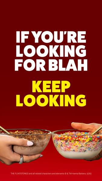
- Format: Attitude-led comparison ad with two-line setup/punchline and two product bowls.
- Best for: Brands that want to stand out as the fun, bold option in a dull category.
- Hook: A cheeky headline that dismisses 'blah' alternatives.
- Reuse it: Position your product against a bland idea, not a competitor, with a two-colour headline.
Available sizes
What is a comparison ad?
A comparison ad sets the product against an alternative, such as a competitor, the old way of doing things or a cheaper option, usually in a two-column layout or table. It helps buyers who are already weighing options see quickly why this one is the better choice.
See all comparison ads →Why this comparison ad works
- 01
Comparison without a competitor
Calling out 'blah' frames every other option as boring without naming anyone. It's bold but low-risk.
- 02
Setup and punchline in two colours
White sets up the line and yellow delivers the twist. The colour shift makes the message easy to follow.
- 03
Two flavours, two personalities
Cocoa and Fruity bowls show the range side by side. Viewers pick their favourite at a glance.
- 04
Human hands add warmth
Hands holding bowls make the scene feel real and shareable. It suggests breakfast is something to enjoy together.
Full creative breakdown
Who this ad targets
This ad targets younger adults and Gen Z who like bold, colourful food and are tired of plain, 'healthy-looking' breakfasts. It also appeals to parents looking for a fun cereal kids will eat, and to nostalgic millennials. The confident tone suits social-first audiences who respond to personality-driven brands. It works best for broad US Meta campaigns aimed at 18–40-year-olds, with an emphasis on awareness and consideration.
Copywriting analysis
The headline "If you're looking for blah, keep looking" is a confident challenger statement. The setup speaks directly to the viewer with "you're," and the punchline tells them they won't find boring here. "Blah" is an informal, almost childish word that matches the brand's playful tone and quickly sums up what Pebbles is not. The structure is conversational, sounding like a friend's sassy reply. It never names the product; the colourful bowls do that. The copy builds a brand attitude that makes choosing Pebbles feel like a statement.
Visual design
The layout splits the frame into a bold text block on top and the product bowls at the bottom. The deep red background unifies the design and makes the white and yellow type pop. The two hands enter from opposite sides, creating a symmetrical 'face-off' feel that supports the comparison idea. Brown Cocoa Pebbles and rainbow Fruity Pebbles provide strong colour contrast between the bowls. The heavy, condensed capitals feel loud and confident.
How to adapt this template for your brand
- Identify the boring alternative your product stands against, such as plain, bland or basic.
- Write a two-part headline: a setup about that boring option and a punchline that dismisses it.
- Use two colours for the two parts to highlight the punchline.
- Show your products held by people, entering from opposite sides of the frame.
- Keep the background a single bold brand colour.
Tips for food ads on Meta
On Meta, use the 9:16 version in Stories and Reels and keep the headline inside the safe zone, as it fills a large area. For Feed, crop to 4:5 with both bowls visible. The confident copy works well as a static but could also be animated with the punchline appearing after a beat. Test it against a softer, taste-led headline to see which drives better CTR, and use a Shop Now CTA linked to retailers.
About this creative
This vertical ad from Post's Pebbles brand uses attitude instead of features. The background is a deep, rich red, and the upper half is filled with heavy white capitals reading "If you're looking for blah," followed by a bright yellow "Keep looking" across two lines. The contrast in colour makes the second half feel like a punchline. In the bottom third, two hands reach in from the left and right edges, each holding a glass bowl with a gold spoon. The left bowl is filled with chocolatey Cocoa Pebbles in milk, while the right one overflows with rainbow Fruity Pebbles. One hand wears rings and a light pink manicure, adding a human, lifestyle feel. Small legal text at the bottom credits the Flintstones licence. Instead of comparing Pebbles to a rival brand, the ad compares it to the idea of a boring breakfast, giving the brand a confident, playful personality.
Meta ad · 338 × 600 · Food
Comparison Ad Example: Pebbles 'If You're Looking for Blah'
This Pebbles ad puts two hands holding cereal bowls, Cocoa and Fruity Pebbles, under a bold headline that dismisses boring breakfasts. It is a comparison format that positions the brand against blandness rather than a named competitor, built for vertical social placements.
Added
All brand names and logos are property of their owners. Adplaylist is not affiliated with or endorsed by these brands.
Details
Ad copy
Primary text
Plain cereal? Hard pass. 🌈 Fruity and Cocoa Pebbles bring the colour, the crunch and the flavour. Why settle for blah?
Description
Fruity & Cocoa Pebbles – never boring
On-image text
IF YOU'RE LOOKING FOR BLAH | KEEP LOOKING | THE FLINTSTONES and all related characters and elements © & ™ Hanna-Barbera. (s26)
Headline ideas for this template
- 1If You're Looking for Blah, Keep Looking
- 2Boring Breakfast? Not Here
- 3Colour, Crunch and Zero Blah
- 4Fruity or Cocoa – Never Boring
- 5Skip the Blah, Grab the Pebbles
Meta image ad specs
| Placement | Ratio | Size (px) |
|---|---|---|
| Feed | 1:1 or 4:5 | 1080×1080 / 1080×1350 |
| Marketplace | 1:1 | 1200×1200 |
| Messenger inbox | 1:1 | 1200×1200 |
| Stories & Reels | 9:16 | 1080×1920 |
This template is 1:1. Request 4:5 or 9:16 to cover all placements.