Key takeaways
- Format: Single big stat with co-branded logos and download CTA
- Best for: B2B case studies, gated reports and SaaS lead generation
- Hook: Giant '85%' framed as a question
- Reuse it: Put your customer's best result in huge type and gate the story
Available sizes
What is a testimonial ad?
A testimonial ad uses a real customer's words, such as a review, quote or comment, as the main message. It answers a buyer's doubts with social proof rather than brand claims, and works especially well when the testimonial is specific about who the customer is and what changed for them.
See all testimonial ads →Why this testimonial ad works
- 01
One big number
A single, huge stat is read in under a second and anchors the whole ad around a concrete result.
- 02
Question creates curiosity
Adding a question mark to the stat makes viewers ask 'how?', and the download promises the answer.
- 03
Co-branding builds trust
Showing the customer's logo next to the vendor's is social proof that a real company got the result.
- 04
Single clear action
One high-contrast button with a direct verb leaves no doubt about the next step.
Full creative breakdown
Who this ad targets
This ad targets B2B decision-makers at SaaS and subscription businesses: founders, heads of product, growth and finance leads who care about churn and recurring revenue. They are researching ways to improve retention or switching payment providers. On LinkedIn, target by job function, company size and industry such as software. Retargeting website visitors who viewed pricing or billing pages is also a strong fit.
Copywriting analysis
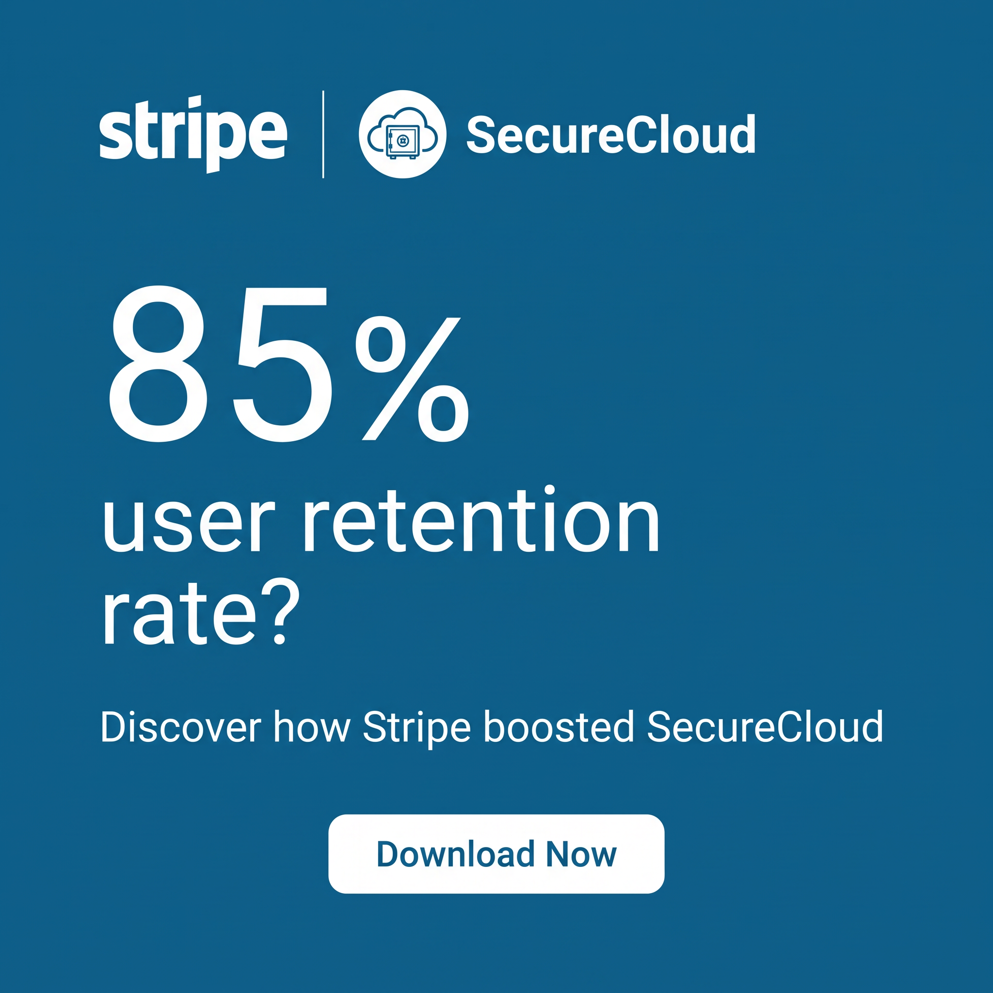
The copy is extremely lean. '85% user retention rate?' leads with the outcome and the metric that SaaS buyers track. The question mark is the key move: it turns a claim into a challenge, as if asking 'could this be you?'. 'Discover how Stripe boosted SecureCloud' names both brands and promises a story with a method, which suits buyers who need proof before change. 'Download Now' is a direct, specific CTA that sets the expectation of a gated asset. There are no adjectives or hype words, which fits a rational, data-driven B2B audience.
Visual design
The design is pure typography on a flat blue background, matching Stripe's brand feel. A strong scale contrast between the giant 85% and the smaller supporting lines creates instant hierarchy. Everything is left-aligned except the centred button, which draws the eye to the action. The white logos and divider at the top read as a partnership lock-up. Generous margins keep it clean and premium.
How to adapt this template for your brand
- Pick your strongest customer result and express it as one number.
- Set the number in very large type and add the metric name below it.
- Add a question mark or a 'how' line to create curiosity.
- Place your logo and your customer's logo side by side at the top.
- Use one high-contrast button with a specific action, like Download, Read or Watch.
Tips for finance & fintech ads on LinkedIn
On LinkedIn, run this as a single image ad with a Lead Gen Form so users download the case study without leaving the platform. Keep intro text under 150 characters with the result in the first line. Test different stats from the same case study to find the strongest hook. On Meta, use it for retargeting site visitors. Make sure the number is approved by the customer and matches the landing page.
About this creative
This Stripe creative promotes a customer case study with SecureCloud using a bold, stat-first layout. The whole background is a solid medium blue. At the top, the white Stripe wordmark sits next to a thin divider and the SecureCloud logo, a cloud with a safe icon, which shows a partnership at a glance. The centre is dominated by a giant '85%', followed by 'user retention rate?' in large white type, so the main result is impossible to miss. The question mark turns the stat into a teaser. A line below invites the viewer to discover how Stripe boosted SecureCloud, and a rounded white button reads 'Download Now'. There is no photography, only type, logos and colour, which makes the message fast to read and easy to recreate. The ad works because it leads with a business outcome buyers care about and promises the method behind it in exchange for a download.
LinkedIn ad · 1200 × 1200 · Finance & Fintech
Case Study Ad Template: Big Stat B2B Customer Story
This square case study ad template leads with one huge number: 85% user retention. Co-branded logos at the top and a white Download Now button at the bottom make it a classic B2B lead-gen creative. Use it to promote customer stories, white papers or gated reports for SaaS, fintech and tech services.
Added
All brand names and logos are property of their owners. Adplaylist is not affiliated with or endorsed by these brands.
Details
Ad copy
Primary text
How did SecureCloud reach an 85% user retention rate? Download the case study to see how Stripe helped them reduce churn and grow recurring revenue.
Description
Discover how Stripe boosted SecureCloud.
On-image text
stripe | SecureCloud | 85% | user retention rate? | Discover how Stripe boosted SecureCloud | Download Now
Headline ideas for this template
- 1How SecureCloud kept 85% of its users
- 2The retention playbook behind 85%
- 3Cut churn like SecureCloud did
- 4From churn to 85% retention: read the story
- 5See how payments drove 85% retention
Meta image ad specs
| Placement | Ratio | Size (px) |
|---|---|---|
| Feed | 1:1 or 4:5 | 1080×1080 / 1080×1350 |
| Marketplace | 1:1 | 1200×1200 |
| Messenger inbox | 1:1 | 1200×1200 |
| Stories & Reels | 9:16 | 1080×1920 |
This template is 1:1. Request 4:5 or 9:16 to cover all placements.
Browse similar by tag