Key takeaways
- Format: Illustrated product shot for a limited-edition colour launch.
- Best for: Lifestyle and drinkware brands dropping seasonal or limited colours.
- Hook: “LIMITED-EDITION” creates scarcity and the colour name sells the mood.
- Reuse it: Illustrate your product in a calm hobby scene drawn entirely in the new colour.
Available sizes
What is a product shot ad?
A product shot ad puts the product itself at the centre of the frame, usually on a clean or styled background with little text. It works best when the packaging or product is distinctive enough to stop the scroll and the viewer already understands what it does.
See all product shot ads →Why this product shot ad works
- 01
Scarcity in the first word
“LIMITED-EDITION” signals urgency and collectability before the viewer sees the product.
- 02
Colour-led storytelling
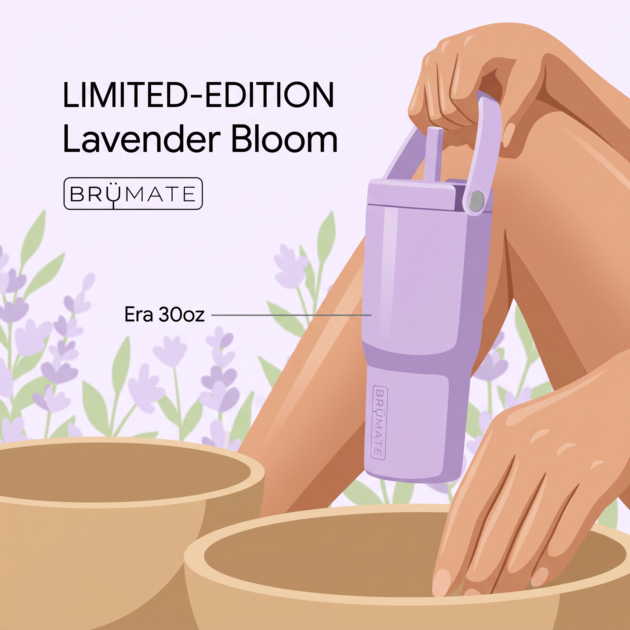
Background, flowers and product share one palette, so the new shade is impossible to miss.
- 03
Illustration stands out
A flat illustrated style breaks the pattern of photo ads and feels gentle and premium.
- 04
Product callout
The thin “Era 30oz” label names the exact model and size without cluttering the art.
Full creative breakdown
Who this ad targets
This ad targets women aged around 18 to 40 who collect or regularly buy trendy tumblers and see them as a lifestyle and colour statement, similar to Stanley and Owala fans. They follow seasonal colour drops, enjoy pastel and aesthetic visuals and often pair hydration with hobbies like pottery, yoga or journaling. Existing BrüMate customers and people interested in self-care and slow living are strong audiences.
Copywriting analysis
The copy is short and focused on scarcity and naming. “LIMITED-EDITION” in uppercase creates urgency and tells collectors this colour will not stay. “Lavender Bloom” is a soft, sensory colour name that evokes spring and calm, which suits the illustration. The product label “Era 30oz” gives practical information in a quiet way. There are no claims about insulation or leakproofing on the image, which keeps it artistic; those benefits and a “while stocks last” line should go in the primary text to support conversion.
Visual design
The palette is almost monochrome: lilac background, lavender tumbler and flowers, with warm tan skin and pottery bowls as contrast. The flat vector illustration with soft highlights feels modern and calm. The headline block sits in the empty top-left space, while the hand and tumbler dominate the right side. The diagonal of the arm leads the eye down from the tumbler to the pottery bowls. Thin black type keeps the text elegant.
How to adapt this template for your brand
- Name your limited colour with an evocative two-word name.
- Commission or create a flat illustration of your product in a calm hobby scene.
- Build the whole palette around the new colour, including background and props.
- Put “LIMITED-EDITION” in uppercase above the colour name and logo.
- Add a thin callout line naming the exact model and size.
Tips for home & living ads on Meta
On Meta, launch with this illustrated version for awareness and follow with photo-based carousel ads for conversion. Use the primary text to add scarcity such as “only available until sold out”. On TikTok, animate the illustration or film an unboxing in the same colour palette. Target past buyers first; limited editions convert best with existing fans, collectors and email subscribers.
About this creative
An illustrated ad from BrüMate in pale lilac tones. The top left carries a black uppercase line, “LIMITED-EDITION”, above the colour name “Lavender Bloom” and the BRÜMATE logo in an outlined box. The scene is drawn in a smooth, flat illustration style: a hand holds a lavender Era tumbler by its fold-down handle, with a straw sticking up from the lid and the brand embossed vertically on the side. Behind it, bent knees suggest someone sitting, and below, another hand works in large tan pottery bowls, hinting at a calm, creative hobby. Purple lavender flowers and green leaves fill the background. A thin grey callout line labels the product as “Era 30oz”. The whole image is colour-coordinated around the new shade, turning a tumbler launch into a soft, aesthetic moment. Illustration instead of photography makes it stand out in a feed full of product photos.
Meta ad · 1200 × 1200 · Home & Living
BrüMate Era 30oz Ad: Limited-Edition Lavender Bloom
This BrüMate ad launches the limited-edition Lavender Bloom colour of the Era 30oz tumbler with a soft, flat illustration. A hand carries the tumbler by its handle while another hand works clay in a pottery bowl, against lavender flowers. Use it as a template for illustrated limited-edition colour drops in drinkware and lifestyle products.
Added
All brand names and logos are property of their owners. Adplaylist is not affiliated with or endorsed by these brands.
Details
Ad copy
Primary text
Lavender Bloom is here for a limited time only. The Era 30oz tumbler keeps drinks ice-cold for hours, fits in your cup holder and comes with a leakproof lid and carry handle. Get yours before it’s gone.
Description
Era 30oz tumbler in a new seasonal colour
On-image text
LIMITED-EDITION Lavender Bloom | BRÜMATE | Era 30oz
Headline ideas for this template
- 1Lavender Bloom: here for a limited time
- 2Your new favourite colour, while it lasts
- 3Sip slow in Lavender Bloom
- 4The Era 30oz, now in lavender
- 5Limited drop. Unlimited cold.
Meta image ad specs
| Placement | Ratio | Size (px) |
|---|---|---|
| Feed | 1:1 or 4:5 | 1080×1080 / 1080×1350 |
| Marketplace | 1:1 | 1200×1200 |
| Messenger inbox | 1:1 | 1200×1200 |
| Stories & Reels | 9:16 | 1080×1920 |
This template is 1:1. Request 4:5 or 9:16 to cover all placements.