Key takeaways
- Format: Single-benefit product shot on a dark premium background
- Best for: B2B card, cashback or rewards offers aimed at founders and CFOs
- Hook: A hard number (7x back) tied to a finance outcome (bottom line)
- Reuse it: Swap the card for your product and the multiplier for your strongest number
Available sizes
What is a product shot ad?
A product shot ad puts the product itself at the centre of the frame, usually on a clean or styled background with little text. It works best when the packaging or product is distinctive enough to stop the scroll and the viewer already understands what it does.
See all product shot ads →Why this product shot ad works
- 01
One number, one promise
7x back is concrete and easy to remember, so the value lands in under a second of scrolling.
- 02
Speaks the buyer's language
Bottom line frames rewards as a profit lever, which resonates with finance decision-makers rather than consumers.
- 03
Premium through restraint
The dark palette and single object signal a high-end product without needing words like premium or exclusive.
- 04
Diagonal composition
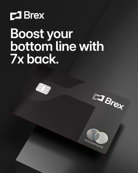
The tilted card creates movement and leads the eye from headline to product, which helps stop the scroll.
Full creative breakdown
Who this ad targets
The ad targets startup founders, CFOs, finance managers and operations leads at venture-backed and fast-growing companies in the US. These people control company spend, care about margin and are comparing corporate card options against traditional bank cards or competitors like Ramp and Amex. The dark, sleek look appeals to a tech-savvy audience that values design and modern software, while the rewards angle gives a rational justification for switching cards.
Copywriting analysis
The headline is short, active and benefit-led. Boost is an energetic verb that implies improvement without effort, and bottom line moves the conversation from personal perks to company performance, which is exactly how a B2B buyer evaluates a card. 7x back is the proof point; the number is specific enough to be credible and large enough to be attention-grabbing. The full stop at the end gives the line a confident, declarative tone. There is no qualifier like up to on the image, which keeps it punchy, though the primary text and landing page should carry the terms. The copy avoids jargon such as points multiplier or rewards tier and keeps the reading level very low.
Visual design
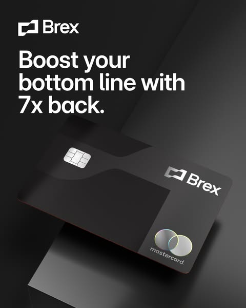
The visual is almost entirely black and charcoal, with a soft spotlight creating a gradient that adds depth. The white sans-serif headline has strong contrast and fills the top third. The card is rendered photorealistically with subtle reflections on the chip and holographic Mastercard logo, giving it a tactile, luxury feel. Negative space is generous, and the diagonal placement breaks the grid. The palette matches the black Brex card itself, so the product and the brand world feel like one.
How to adapt this template for your brand
- Pick your single strongest quantified benefit (multiplier, savings, speed).
- Write a 6–8 word headline that ties the number to a business outcome.
- Shoot or render your product on a dark, softly lit background.
- Place the product on a diagonal below the headline, logo top left.
- Keep terms and qualifiers in the primary text and landing page, not on the image.
Tips for fintech ads on Meta
On Meta, run this 4:5 version in Feed for maximum screen space and pair it with a 9:16 crop for Stories and Reels, keeping the headline inside the safe zone. On LinkedIn, the dark, premium look stands out against the white feed and fits a CFO audience; use a lead-gen form for the CTA. Test the headline against variants with a different number or benefit, and keep disclosures about rewards terms in the primary text.
About this creative
This Brex creative uses a dark, almost monochrome scene to make the corporate card feel like a premium object. The white Brex logo sits top left, followed by a three-line headline in a large, tight sans-serif: Boost your bottom line with 7x back. Below, the matte black Brex Mastercard is angled diagonally across the frame, its silver logo and chip catching a soft highlight while the lower half falls into shadow. There is no button, no price, no fine print and no clutter, only the brand, the benefit and the product. The phrase bottom line speaks directly to founders and CFOs who think in margins, while 7x back gives a concrete, memorable number. The composition guides the eye from the logo to the headline and down the card in one smooth diagonal. It works as a top-of-funnel awareness ad or a retargeting creative for visitors who already know Brex and need one sharp reason to apply.
Meta ad · 338 × 600 · Fintech
Brex Corporate Card Ad: Boost Your Bottom Line With 7x Back
This Brex image ad pairs a single rewards promise with a moody, premium product shot of the black Mastercard. It is a clean example of a fintech product-shot format built for Meta feeds, and a useful template for any B2B card, rewards or cashback offer aimed at finance leaders.
Added
All brand names and logos are property of their owners. Adplaylist is not affiliated with or endorsed by these brands.
Details
Ad copy
Primary text
Every business purchase can work harder for you. Brex corporate cards earn up to 7x points on everyday spend, with no personal guarantee and real-time spend controls built in.
Description
The corporate card that pays you back
On-image text
Brex | Boost your bottom line with 7x back. | Brex | mastercard
Headline ideas for this template
- 1Turn every company purchase into profit
- 2Your corporate card should pay you back
- 37x points on the spend you already have
- 4Rewards your CFO will actually like
- 5Stop leaving rewards on the table
Meta image ad specs
| Placement | Ratio | Size (px) |
|---|---|---|
| Feed | 1:1 or 4:5 | 1080×1080 / 1080×1350 |
| Marketplace | 1:1 | 1200×1200 |
| Messenger inbox | 1:1 | 1200×1200 |
| Stories & Reels | 9:16 | 1080×1920 |
This template is 1:1. Request 4:5 or 9:16 to cover all placements.
Browse similar by tag