Key takeaways
- Format: Pain-point lifestyle photo with problem and solution text split top and bottom
- Best for: Challenger brands selling simplicity against complicated incumbents
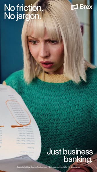
- Hook: A visibly confused face reacting to bank paperwork
- Reuse it: Show your customer's frustration, name it at the top, resolve it at the bottom
Available sizes
What is a lifestyle ad?
A lifestyle ad shows the product being used in a real setting by the kind of person who buys it. Instead of listing features, it sells the feeling or outcome of owning the product, which makes it a strong fit for fashion, home, travel and wellness brands.
See all lifestyle ads →Why this lifestyle ad works
- 01
Relatable frustration
The shocked expression and long statement capture a feeling every business owner has had with their bank.
- 02
Problem, then solution
Text at the top names the pain and text at the bottom delivers the answer, creating a mini story.
- 03
Film-still quality
Cinematic colour and lighting make it feel like editorial content, not a typical bank ad.
- 04
Rhythmic copy
The repeated No... No... Just... structure is memorable and easy to read in a quick scroll.
Full creative breakdown
Who this ad targets
The ad targets small business owners, founders and finance leads in the US who are frustrated with traditional banks: hidden fees, confusing statements, slow transfers and dated interfaces. They may already use Brex cards or be evaluating where to keep company deposits. The vertical, cinematic style suits a slightly younger, mobile-first audience that consumes Instagram Stories and Reels and responds to humour and emotion rather than rate tables.
Copywriting analysis
The copy is built on a rhythm of negation and resolution. No friction. No jargon. uses two short, parallel statements that each remove a pain point, and the full stops slow the reader down. Just business banking lands as the relief: the word just suggests that banking should be simple and that Brex strips it back to the essentials. The headline avoids rates, features or numbers, choosing an emotional promise instead. Friction and jargon are words that sound like complaints customers already make. The compliant disclosure line at the bottom is kept small but legible, which is essential for a banking product. Placing the payoff at the bottom also rewards viewers who watch the whole frame.
Visual design
The image uses warm, cinematic tones with a strong green sweater as the key colour block against a cool blue background. The subject's face is sharply lit and centred, making the emotion the focal point. The curling paper in the foreground adds depth and leads the eye to the circled orange line, which echoes the Brex accent colour. White text with a slight shadow sits in the top and bottom safe areas, leaving the face clear. The vertical framing fills a phone screen.
How to adapt this template for your brand
- Identify the most relatable frustration your customer has with the current alternative.
- Stage a photo with an exaggerated, readable facial reaction to that problem.
- Write a short two-part problem line for the top of the frame.
- Add a short resolution line with your product category at the bottom.
- Include any required legal or regulatory disclosure in small text.
Tips for fintech ads on Meta
Built for Instagram and Facebook Stories and Reels; keep text inside the top and bottom safe zones so platform UI does not cover it. A short video version showing the reaction would perform even better on Reels. For Feed, crop to 4:5 and move the resolution line up. For financial products, keep the disclosure on the creative and add full terms in the comments or landing page, as Brex does.
About this creative
This vertical Brex ad opens on a relatable moment of pain. A woman with a blonde bob and a bright green knit sweater stares at a long, curling bank statement, eyebrows raised and mouth half open in disbelief. A line on the paper is circled in orange marker, hinting at a hidden fee or confusing term. The headline at the top, No friction. No jargon., names the problem in four words, and the resolution sits at the bottom: Just business banking. The Brex logo is placed top right and a small FDIC disclosure runs along the bottom. The cinematic lighting and slightly exaggerated expression give it the feel of a film still rather than stock photography. The ad frames traditional banks as confusing and slow, and positions Brex as the straightforward alternative. The top-and-bottom text split creates a clear before-and-after narrative inside a single image.
Meta ad · 338 × 600 · Fintech
Brex Business Banking Ad: No Friction. No Jargon.
This vertical Brex ad dramatises the frustration of confusing bank paperwork with a woman staring in disbelief at a marked-up statement. It is a pain-point lifestyle format for Stories and Reels, ideal for fintech, banking and SaaS brands selling simplicity against complicated incumbents.
Added
All brand names and logos are property of their owners. Adplaylist is not affiliated with or endorsed by these brands.
Details
Ad copy
Primary text
Business banking shouldn't need a translator. Brex gives you simple accounts, clear fees and fast transfers, without the fine print that makes you squint. Deposits held by Column NA (Member FDIC).
Description
Simple business accounts built for modern companies
On-image text
No friction. No jargon. | Brex | Just business banking. | Deposits held by Column NA (Member FDIC), see comments for full disclosures.
Headline ideas for this template
- 1Business banking without the fine print
- 2Banking that doesn't need a translator
- 3No hidden fees. No confusion.
- 4Finally, a bank statement you understand
- 5Simple banking for busy founders
Meta image ad specs
| Placement | Ratio | Size (px) |
|---|---|---|
| Feed | 1:1 or 4:5 | 1080×1080 / 1080×1350 |
| Marketplace | 1:1 | 1200×1200 |
| Messenger inbox | 1:1 | 1200×1200 |
| Stories & Reels | 9:16 | 1080×1920 |
This template is 1:1. Request 4:5 or 9:16 to cover all placements.
Browse similar by tag