Key takeaways
- Format: Problem-first scene with headline contrast and 4-icon bar
- Best for: Products that promise reliability or comfort versus a common bad experience
- Hook: 'Public bathrooms are a gamble.' – a universally relatable frustration
- Reuse it: Show the frustrating alternative, then promise your product removes the gamble
Available sizes
What is a feature callout ad?
A feature callout ad is a static image that shows a single product with short text labels pointing to its key features or benefits, usually joined to the product by thin lines. It explains several selling points at a glance without a long caption, which is why it's common for supplements, skincare, electronics and kitchenware.
See all feature callouts ads →Why this feature callouts ad works
- 01
Universal pain point
Almost everyone has faced a closed or dirty public restroom. The image triggers instant recognition and emotion.
- 02
Contrast headline
'A gamble… Yours doesn't have to be' sets up a clear before-and-after in two sentences. It positions TUSHY as reliable.
- 03
Product-free intrigue
Leaving the bidet out of the photo makes the ad feel less salesy. Curiosity draws viewers to the benefit bar.
- 04
Consistency benefits
Icons stress daily, consistent comfort. They directly answer the unpredictability shown in the photo.
Full creative breakdown
Who this ad targets
US adults aged 25–55 who care about hygiene and are frustrated by unreliable public restrooms, including commuters, travellers, office workers and people with sensitive digestion who plan their day around bathroom access. Germ-conscious and clean-freak personalities respond strongly to the visual. Women are a key audience given the women's restroom setting. The ad also reaches people with sensitive skin who want consistent comfort at home.
Copywriting analysis
The headline uses a two-sentence contrast: a broad truth ('Public bathrooms are a gamble.') and a personal promise ('Yours doesn't have to be.'). The gambling metaphor captures the uncertainty of public restrooms in one word. 'Yours' shifts the focus to the viewer's own bathroom, setting up the upgrade without naming the product. The icon labels are short and focus on reliability and gentleness: consistent, daily comfort directly counters the gamble idea, while 2X cleaner vs. TP adds a quantified benefit.
Visual design
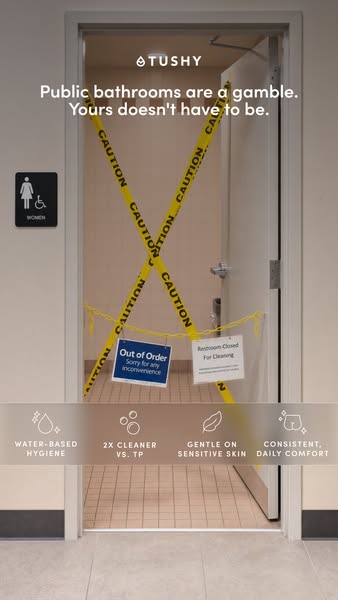
Neutral beige walls and grey floor tiles create a realistic, slightly clinical public-space feel. Bright yellow caution tape in an X shape is the dominant visual element, drawing attention instantly. Signs on the tape add detail and humour. White headline text sits over the upper wall for strong legibility. A translucent warm-taupe icon band at the bottom softens the scene and introduces the brand's benefits.
How to adapt this template for your brand
- Identify a universal frustration your product helps people avoid.
- Photograph or stage that frustrating scene in a dramatic, recognisable way.
- Write a contrast headline: '[Bad experience] is a gamble. Yours doesn't have to be.'
- Leave the product out of the image to build intrigue.
- Add a four-icon bar that promises reliability, quality and comfort.
Tips for bathroom ads on Meta
This problem-first creative works best for cold audiences on Meta Stories and Reels. Test it against a version that includes the product to see whether intrigue or clarity drives more clicks. Travel and commuting seasons, such as summer and holidays, make the message especially relevant. A short video version that zooms into the caution tape before revealing a clean home bathroom could boost engagement. Keep icons above the bottom safe zone.
About this creative
The photo shows the open door of a public women's restroom, complete with a braille sign on the wall, framed in a beige corridor. Two strips of yellow 'CAUTION' tape form a large X across the doorway, with a third strip draped horizontally. A blue 'Out of Order – Sorry for any inconvenience' sign and a white 'Restroom Closed For Cleaning' notice hang from the tape. At the top, the TUSHY logo sits above the headline 'Public bathrooms are a gamble. Yours doesn't have to be.' Near the bottom, a translucent warm-taupe band holds four line icons with labels: water-based hygiene, 2X cleaner vs. TP, gentle on sensitive skin and consistent, daily comfort. Interestingly, the product itself never appears. Instead, the ad dramatises a shared, frustrating experience and then promises that your own bathroom, upgraded with TUSHY, can be dependable, clean and comfortable every day.
Meta ad · 338 × 600 · Bathroom
TUSHY 'Public Bathrooms Are a Gamble' Ad Example
This TUSHY story ad opens on a public women's restroom blocked with yellow caution tape and 'Out of Order' signs, with the line 'Public bathrooms are a gamble. Yours doesn't have to be.' A four-icon benefit bar closes the frame. A useful template for problem-first ads that contrast a bad experience with your product.
Added
All brand names and logos are property of their owners. Adplaylist is not affiliated with or endorsed by these brands.
Details
Ad copy
Primary text
Out of order, out of paper, out of luck. Public bathrooms are a gamble – your home bathroom doesn't have to be. Upgrade to a TUSHY bidet for water-based hygiene that's 2X cleaner than toilet paper.
Description
2X cleaner. Gentle on sensitive skin.
On-image text
TUSHY | Public bathrooms are a gamble. Yours doesn't have to be. | Women | Out of Order – Sorry for any inconvenience | Restroom Closed For Cleaning | Caution | Water-based hygiene | 2X cleaner vs. TP | Gentle on sensitive skin | Consistent, daily comfort
Headline ideas for this template
- 1Public Bathrooms Are a Gamble
- 2Your Bathroom Shouldn't Be
- 3Skip the Gamble, Get a Bidet
- 4Reliable Clean, Every Single Day
- 5Home Is Where the Clean Is
Meta image ad specs
| Placement | Ratio | Size (px) |
|---|---|---|
| Feed | 1:1 or 4:5 | 1080×1080 / 1080×1350 |
| Marketplace | 1:1 | 1200×1200 |
| Messenger inbox | 1:1 | 1200×1200 |
| Stories & Reels | 9:16 | 1080×1920 |
This template is 1:1. Request 4:5 or 9:16 to cover all placements.