Key takeaways
- Format: Circular benefit diagram with empathetic headline and product close-up
- Best for: Comfort, relief and sensitive-care products
- Hook: 'Gentle enough for the days sitting down hurts' – quiet empathy
- Reuse it: Put one soft emotional word at the centre and arrange benefits in a circle around it
Available sizes
What is a feature callout ad?
A feature callout ad is a static image that shows a single product with short text labels pointing to its key features or benefits, usually joined to the product by thin lines. It explains several selling points at a glance without a long caption, which is why it's common for supplements, skincare, electronics and kitchenware.
See all feature callouts ads →Why this feature callouts ad works
- 01
Empathy over humour
The headline acknowledges real discomfort without naming a condition. It makes people in pain feel understood.
- 02
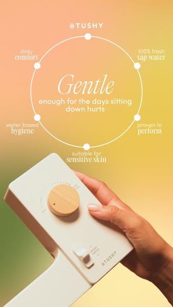
Circular benefit layout
Arranging five benefits around a circle feels balanced and complete. It turns a list into an elegant graphic.
- 03
Soothing colour palette
The peach-to-yellow gradient feels warm and calming. It matches the gentle message and stands out from clinical health ads.
- 04
Product in hand
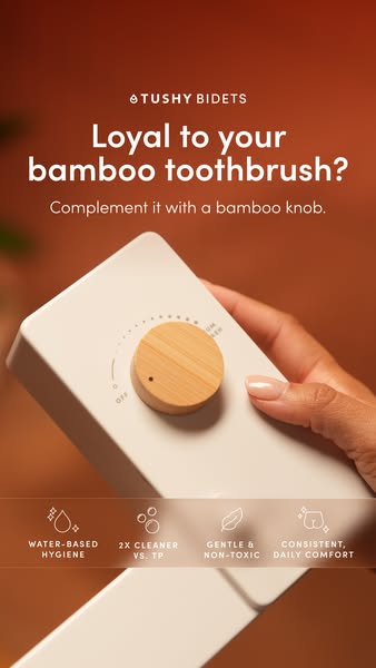
A close-up of the control panel shows simplicity and quality. The bamboo knob adds a natural, premium touch.
Full creative breakdown
Who this ad targets
US adults aged 25–55 who experience recurring discomfort when using the bathroom, such as people with hemorrhoids, IBS, Crohn's, postpartum recovery or very sensitive skin. They want gentle, practical relief rather than jokes. Women are the primary audience given the soft visual style, but the message is universal. The ad also suits caregivers and people researching comfort products for family members.
Copywriting analysis
The headline centres on one emotional word, 'Gentle', set large and in italics. The rest of the line, 'enough for the days sitting down hurts', is honest and empathetic, describing a feeling rather than a diagnosis. That keeps the ad inclusive and compliant with health advertising rules. Benefit labels use a two-tier typographic style – a small descriptor and a larger keyword – which adds sophistication. Benefits mix emotion (daily comfort), purity (fresh tap water), function (water based hygiene), trust (proven to perform) and sensitivity (sensitive skin).
Visual design
The multi-tone gradient feels like a soft-focus sunrise and creates calm, warm emotion. A thin white circle with five dots gives a refined, diagrammatic structure. The serif and sans-serif font pairing adds an editorial, premium look. A hand holding the cream control panel fills the lower half, keeping the product visible and tactile. Generous negative space prevents the design from feeling busy.
How to adapt this template for your brand
- Choose one emotional word that captures how your product feels, such as 'Gentle'.
- Write a supporting line that describes a painful moment without naming a condition.
- Arrange four to six benefits around a circle with small dots.
- Use a soft gradient background that matches the emotional tone.
- Show a close-up of a hand using or holding the product in the lower half.
Tips for bathroom ads on Meta
This empathetic tone works well for broad health and wellness audiences on Meta without relying on sensitive targeting. Test it in Stories and as a 4:5 feed post. Pair it with retargeting for people who viewed sensitive skin or hemorrhoid-related content on your site. A subtle animation where the circle draws itself can increase thumb-stop rate. Keep primary text equally gentle and avoid medical claims.
About this creative
The background is a soft gradient moving from peach and coral at the top left to warm yellow on the right and a hint of green at the bottom, creating a calm, sunrise-like atmosphere. A thin white circle sits in the upper half, with five dots marking benefits around it: daily comfort, 100% fresh tap water, water based hygiene, proven to perform and suitable for sensitive skin. Each label pairs a small sans-serif word with a larger serif word for an elegant, editorial style. In the centre of the circle, 'Gentle' appears in a large italic serif, followed by 'enough for the days sitting down hurts'. In the lower half, a hand with a nude manicure holds the white TUSHY attachment control panel with its bamboo knob and nozzle-wash switch. The ad uses empathy rather than humour, acknowledging painful days caused by conditions like hemorrhoids, IBS or postpartum recovery without naming them.
Meta ad · 338 × 600 · Bathroom
TUSHY 'Gentle' Bidet Ad: Circular Feature Callout Example
This TUSHY story ad pairs an empathetic headline – 'Gentle enough for the days sitting down hurts' – with a circular diagram of five benefits and a close-up of a hand holding the bidet control. A soft peach-to-yellow gradient sets a soothing tone. A great template for comfort and relief products.
Added
All brand names and logos are property of their owners. Adplaylist is not affiliated with or endorsed by these brands.
Details
Ad copy
Primary text
Some days, sitting down hurts. TUSHY's gentle, water-based clean is suitable for sensitive skin and uses 100% fresh tap water – proven to perform, comfortable every day.
Description
Water-based hygiene for sensitive skin.
On-image text
TUSHY | Gentle enough for the days sitting down hurts | Daily comfort | 100% fresh tap water | Water based hygiene | Proven to perform | Suitable for sensitive skin
Headline ideas for this template
- 1Gentle Enough for the Tough Days
- 2Comfort When Sitting Down Hurts
- 3Water-Based Care for Sensitive Skin
- 4Kind to Your Body, Every Day
- 5Soothing Clean, Naturally
Meta image ad specs
| Placement | Ratio | Size (px) |
|---|---|---|
| Feed | 1:1 or 4:5 | 1080×1080 / 1080×1350 |
| Marketplace | 1:1 | 1200×1200 |
| Messenger inbox | 1:1 | 1200×1200 |
| Stories & Reels | 9:16 | 1080×1920 |
This template is 1:1. Request 4:5 or 9:16 to cover all placements.