Key takeaways
- Format: Lifestyle portrait with a bold headline and a four-item benefit list.
- Best for: Rehab centers and behavioral health brands building trust with cold audiences.
- Hook: "Treats the whole person" positions the program as more than detox.
- Reuse it: Swap in your own care pillars and a real, happy client-style portrait.
Available sizes
What is a lifestyle ad?
A lifestyle ad shows the product being used in a real setting by the kind of person who buys it. Instead of listing features, it sells the feeling or outcome of owning the product, which makes it a strong fit for fashion, home, travel and wellness brands.
See all lifestyle ads →Why this lifestyle ad works
- 01
Shows the outcome, not the struggle
The smiling face shows life after treatment. That feels hopeful and avoids the shame that dark addiction imagery can trigger.
- 02
A clear differentiator
"Whole person" sets the center apart from detox-only clinics. It also answers a common fear: that treatment will only deal with the substance.
- 03
Scannable four-part list
Physically, spiritually, mentally and socially are easy to read in a quick scroll. Each word gives the viewer something specific to relate to.
- 04
Branded color overlay
The purple-to-teal gradient makes the ad look calm and premium. It is also instantly recognizable across the brand's whole campaign series.
Full creative breakdown
Who this ad targets
This ad targets adults who are struggling with substance use and are open to treatment but worried it will feel clinical or cold. It also speaks to parents, partners and friends researching options for a loved one. The spiritual and social angles attract people who have tried short programs before and want a more complete approach. With a hopeful tone and no hard sell, it suits top-of-funnel audiences in the US who are just starting to consider rehab.
Copywriting analysis
The headline leads with the category ("Addiction treatment") so the viewer knows what this is right away, then adds the differentiator: it "treats the whole person." That phrase does the heavy lifting. It suggests compassion and depth without making any medical claims. The four adverbs that follow break an abstract idea into concrete pillars, and the Oxford-comma rhythm gives the list a calm, steady pace. The copy avoids words like "addict" and focuses on the person, which follows the person-first language that recovery audiences respond to. There is no CTA on the image, which keeps the creative soft and leaves the action to the Meta button.
Visual design
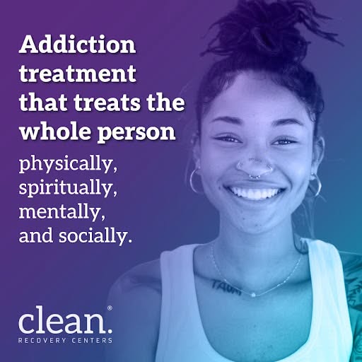
The layout splits the square into a text column on the left and a portrait on the right. A duotone gradient from purple at the top to teal at the bottom covers the whole image, so the text and photo blend into one scene. The headline uses a heavy slab serif in white, while the list is set in a lighter weight to create a clear hierarchy. The logo sits bottom left, anchoring the text column. Strong contrast keeps everything readable on mobile.
How to adapt this template for your brand
- Choose a natural, smiling portrait that reflects your audience and place it on one side of a square canvas.
- Add a brand-color gradient overlay across the whole image to unify the photo and text.
- Write a bold headline that names your service and the one thing that makes your approach different.
- List three or four short care pillars in a lighter font weight under the headline.
- Place your logo in a corner, check text contrast on a phone screen, and keep the CTA in the ad button.
Tips for addiction recovery ads on Meta
On Meta, health and addiction ads are restricted, so avoid claims about cures, success rates or the viewer's personal situation, and make sure your account has the required addiction treatment certification (such as LegitScript) before you run it. Use this square creative in Feed and pair it with a 4:5 version for more screen space. Run it to broad or interest-based audiences with a Learn More button and a landing page that explains your approach in detail.
About this creative
This square Meta ad from Clean Recovery Centers uses a warm, close-up portrait of a smiling young woman, framed on the right half of the canvas. A brand gradient that moves from deep purple to teal is laid over the whole photo, giving the image a calm, unified look and tying it to the brand palette. On the left, a bold white headline reads "Addiction treatment that treats the whole person," followed by a lighter-weight list: physically, spiritually, mentally, and socially. The list breaks the promise into four concrete areas of care, so the viewer understands the approach in seconds. The white Clean Recovery Centers logo sits in the bottom-left corner. There is no price, offer or urgency. The ad is about hope and trust. The portrait shows what recovery can look like rather than what addiction feels like, which makes it suitable for cold audiences, families and people who are still deciding whether to seek help.
Meta ad · 338 × 600 · Addiction Recovery
Addiction Recovery Ad: Whole-Person Treatment Lifestyle Creative
This square lifestyle ad from Clean Recovery Centers promotes addiction treatment by focusing on the whole person rather than the substance. A smiling portrait and a four-part list of benefits make it a strong template for rehab centers, recovery clinics and behavioral health brands running awareness campaigns on Meta.
Added
All brand names and logos are property of their owners. Adplaylist is not affiliated with or endorsed by these brands.
Details
Ad copy
Primary text
Recovery is more than detox. At Clean Recovery Centers, our programs care for your body, mind, spirit and relationships, so the changes last long after treatment ends. Talk to our admissions team today. It's free and confidential.
Description
Free, confidential admissions call
On-image text
Addiction treatment that treats the whole person physically, spiritually, mentally, and socially. | clean. Recovery Centers
Headline ideas for this template
- 1Recovery That Cares for Body, Mind and Spirit
- 2More Than Detox: Treatment for the Whole You
- 3Heal Every Part of Your Life
- 4Addiction Care That Sees the Person First
- 5Rebuild Your Health, Purpose and Relationships
Meta image ad specs
| Placement | Ratio | Size (px) |
|---|---|---|
| Feed | 1:1 or 4:5 | 1080×1080 / 1080×1350 |
| Marketplace | 1:1 | 1200×1200 |
| Messenger inbox | 1:1 | 1200×1200 |
| Stories & Reels | 9:16 | 1080×1920 |
This template is 1:1. Request 4:5 or 9:16 to cover all placements.