Key takeaways
- Format: Two-speaker webinar promo on a dark background
- Best for: B2B SaaS webinars, live events and on-demand talks
- Hook: A named pain point (the design to development gap) plus credible experts
- Reuse it: Swap the topic, speakers and series label; keep the two-portrait layout and single CTA
Available sizes
What is a testimonial ad?
A testimonial ad uses a real customer's words, such as a review, quote or comment, as the main message. It answers a buyer's doubts with social proof rather than brand claims, and works especially well when the testimonial is specific about who the customer is and what changed for them.
See all testimonial ads →Why this testimonial ad works
- 01
Problem-led headline
The headline names a familiar friction between designers and developers, so the target audience instantly recognises the topic as relevant to their daily work.
- 02
Borrowed authority
Featuring a Head of Product Design from Figma next to a Webflow Product Lead adds credibility and signals a cross-brand, expert conversation rather than a sales pitch.
- 03
Visual metaphor
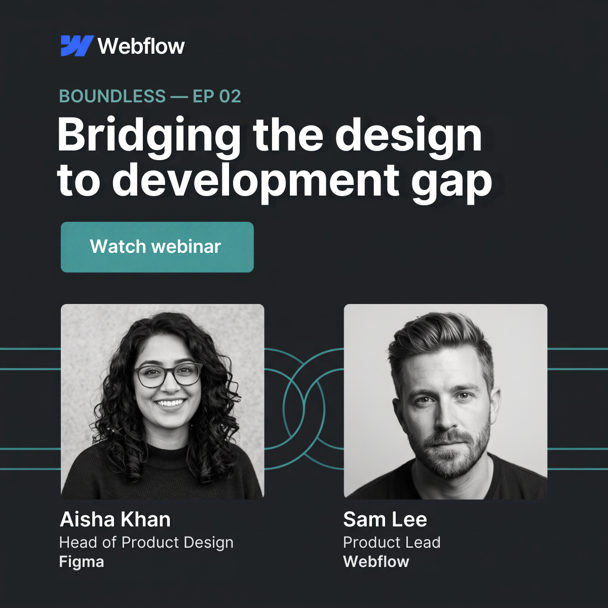
The teal lines and interlocking circles physically connect the two speakers, illustrating the idea of bridging the gap without extra words.
- 04
Series framing
The BOUNDLESS — EP 02 label makes the webinar feel like part of an ongoing show, which builds habit and invites viewers to catch other episodes.
Full creative breakdown
Who this ad targets
The ad targets product designers, front-end developers, product managers and design leads at tech companies and agencies who struggle with handoffs between design and code. These are professionals already familiar with tools like Figma and Webflow and interested in faster, smoother workflows. It also reaches team leads and decision-makers evaluating how their design and development processes could be improved. The professional tone and job-title-heavy layout make it especially suited to LinkedIn, where targeting by role, seniority and industry matches this audience precisely.
Copywriting analysis
The copy is minimal and does the heavy lifting with a single benefit-driven headline. Bridging the design to development gap frames the webinar around a shared problem rather than a product feature, which lowers the sales feel and increases relevance. The series label adds context in a few words, while the call to action, Watch webinar, is direct and low-commitment, suggesting on-demand access rather than a registration hurdle. The speaker details work as copy too: job titles and company names act as proof points, telling the reader why these voices are worth their time. There is no clutter, no discount language and no jargon beyond the target audience's own vocabulary, so the message reads in seconds in a busy feed.
Visual design
The design uses a dark charcoal background with white typography and a single teal accent for the series label, button and connecting lines. This restrained palette feels premium and stands out against bright, busy feeds. Strong hierarchy guides the eye: logo, series label, headline, button, then speakers. Black-and-white portraits keep both speakers visually consistent, and the teal line motif with interlocking circles ties the composition together while visually expressing the bridging theme.
How to adapt this template for your brand
- Write a headline that names one specific problem your audience faces, in under eight words.
- Add a short series or event label above it (e.g. series name and episode number or date).
- Choose two credible speakers, ideally one from your company and one from a recognisable partner brand.
- Use matching black-and-white portraits and one brand accent colour for the button and connecting graphics.
- Keep a single low-friction CTA such as Watch webinar or Save your seat, and list names, titles and companies under each photo.
Tips for saas & tech ads on LinkedIn
On LinkedIn, run this as a single-image sponsored post targeting job titles such as product designer, front-end developer and product manager, and use a Lead Gen Form for live sessions. On Meta, use the square format in feed placements and retarget website visitors and past webinar attendees. Keep the primary text short and mention the speakers' companies early. Test a variant with a date or Live label versus On demand to see which drives more sign-ups.
About this creative
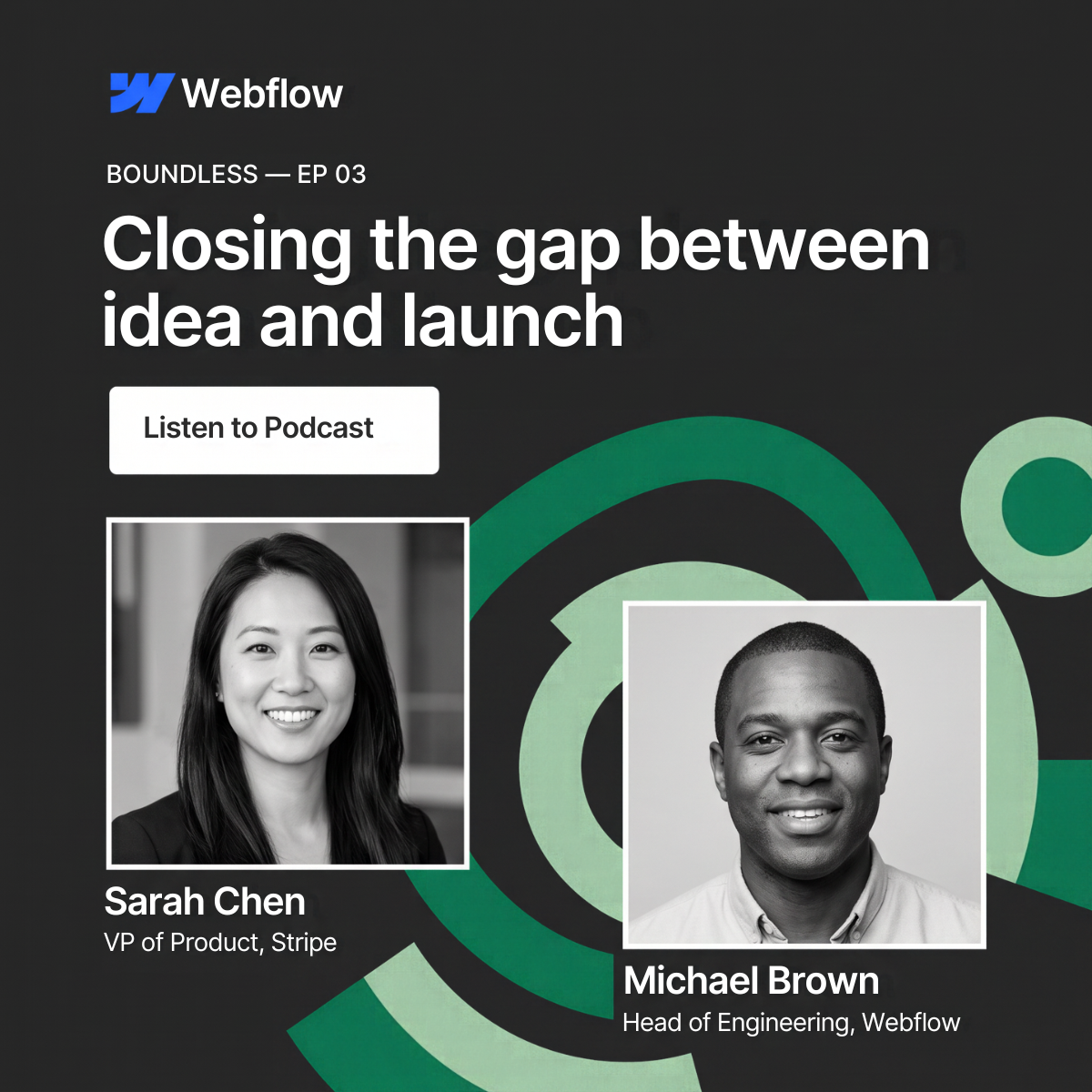
This square ad promotes the second episode of Webflow's Boundless webinar series. The layout sits on a near-black background, with the Webflow logo in the top left and a small teal series label reading BOUNDLESS — EP 02 above the headline. The headline, Bridging the design to development gap, is set in large, bold white type across two lines and immediately names a pain point every product team knows. Directly beneath it, a rounded teal button with the text Watch webinar acts as a clear call to action. The lower half shows two black-and-white speaker portraits: Aisha Khan, Head of Product Design at Figma, and Sam Lee, Product Lead at Webflow. Thin teal lines run behind the photos and loop into interlocking circles between them, visually bridging the two speakers and reinforcing the message. Names, titles and company names sit below each portrait, adding credibility through recognizable brands.
LinkedIn ad · 1200 × 1200 · SaaS & Tech
Webinar Ad Template: SaaS Speaker Promo by Webflow
This square webinar ad from Webflow promotes episode 2 of its Boundless series with two expert speakers side by side. It is a strong template for B2B SaaS brands promoting webinars, live events or on-demand talks on LinkedIn and Meta, where credible faces and a clear topic drive registrations.
Added
All brand names and logos are property of their owners. Adplaylist is not affiliated with or endorsed by these brands.
Details
Ad copy
Primary text
Designers and developers speak different languages. In episode 2 of Boundless, Aisha Khan (Head of Product Design, Figma) and Sam Lee (Product Lead, Webflow) share how teams ship faster by closing the gap between design and code. Watch on demand.
Description
Boundless webinar series – Episode 02
On-image text
Webflow | BOUNDLESS — EP 02 | Bridging the design to development gap | Watch webinar | Aisha Khan, Head of Product Design, Figma | Sam Lee, Product Lead, Webflow
Headline ideas for this template
- 1Close the gap between design and code
- 2From Figma file to live site, faster
- 3Why design handoffs break, and how to fix them
- 4Design and dev, finally on the same page
- 5Ship what you designed, pixel for pixel
Meta image ad specs
| Placement | Ratio | Size (px) |
|---|---|---|
| Feed | 1:1 or 4:5 | 1080×1080 / 1080×1350 |
| Marketplace | 1:1 | 1200×1200 |
| Messenger inbox | 1:1 | 1200×1200 |
| Stories & Reels | 9:16 | 1080×1920 |
This template is 1:1. Request 4:5 or 9:16 to cover all placements.