Key takeaways
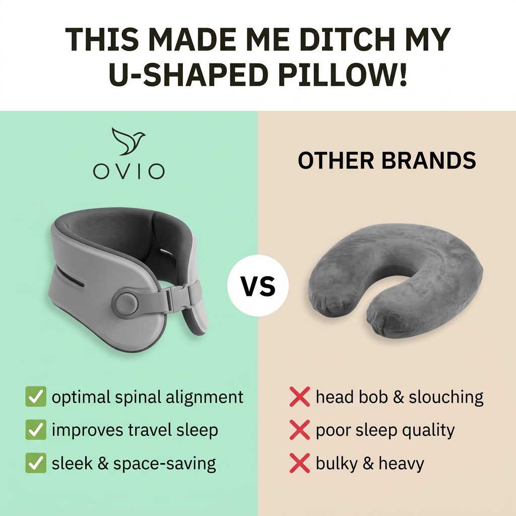
- Format: Split-screen us-vs-them comparison with checks and crosses.
- Best for: Products replacing a familiar, flawed alternative.
- Hook: UGC-style confession: this made me ditch my old product.
- Reuse it: Swap in your product and its common rival, keep three mirrored pros and cons.
Available sizes
What is a comparison ad?
A comparison ad sets the product against an alternative, such as a competitor, the old way of doing things or a cheaper option, usually in a two-column layout or table. It helps buyers who are already weighing options see quickly why this one is the better choice.
See all comparison ads →Why this comparison ad works
- 01
Familiar enemy
Almost every traveller owns or knows the U-shaped pillow and its flaws. Naming it makes the problem instantly relatable.
- 02
Testimonial-style hook
The first-person headline reads like a real customer review. It feels more like UGC and less like a brand boast.
- 03
Mirrored pros and cons
Each check on the left has a matching cross on the right. Viewers compare point by point in seconds.
- 04
Colour codes the verdict
Fresh mint and green checks feel positive, while beige and red crosses feel dull and negative. The winner is clear before any text is read.
Full creative breakdown
Who this ad targets
The ad targets frequent flyers, commuters and road-trippers, roughly 25 to 60, who struggle to sleep while travelling and are frustrated with standard neck pillows. They may have neck or posture concerns and value comfort and packability. Business travellers on red-eye flights and long-haul holidaymakers are prime prospects. The space-saving angle also appeals to carry-on-only travellers who hate bulky accessories hanging off their bags.
Copywriting analysis
The headline borrows the voice of a satisfied customer, which builds social proof and curiosity. Ditch implies a decisive switch, and naming the U-shaped pillow speaks directly to people who own one. The comparison copy is tightly mirrored: alignment vs head bob, better sleep vs poor sleep, sleek vs bulky. Each pair maps a feature to a pain point, so the benefits feel earned. The language is short and lowercase for scannability. Spinal alignment adds a health-oriented credibility cue without making medical claims. One improvement would be adding proof, such as a rating or number of customers, to support the testimonial tone.
Visual design
The layout is a clean vertical split with mint green for the hero and beige for the competitor, with a white VS circle as the pivot. Both products are cut out on plain backgrounds at a similar scale, so the comparison feels fair. Green checks and red crosses use universally understood icons. A bold, condensed black headline in a white band grabs attention at the top. The overall look is simple, high-contrast and readable on a small phone screen.
How to adapt this template for your brand
- Identify the product most of your audience uses today and its top three frustrations.
- Write three short benefits for your product that directly mirror those frustrations.
- Split the canvas into two colours: fresh and positive for you, dull and neutral for them.
- Add a first-person, UGC-style headline about switching from the old product.
- Test generic Other Brands versus naming the product type, and avoid naming competitors directly.
Tips for travel ads on Meta
Comparison ads perform strongly on Meta and TikTok, especially for cold audiences. Use Shop Now and back up the testimonial headline with reviews in primary text. On TikTok, turn it into a creator video showing both pillows on a flight. Avoid naming specific competitor brands to stay within platform and legal guidelines. Avoid medical claims beyond comfort and posture to prevent ad rejections. Create a 9:16 version with the split stacked top and bottom.
About this creative
This square comparison ad promotes Ovio, a travel neck support. A white header band carries a bold, black, all-caps headline written as a customer quote: This made me ditch my U-shaped pillow! Below, the image splits into two halves. The left half has a mint green background with the Ovio bird logo and a sleek grey wrap-around neck support with an adjustable buckle and dial. Under it, three green check marks list optimal spinal alignment, improved travel sleep and a sleek, space-saving design. The right half has a beige background headed OTHER BRANDS, showing a plush grey U-shaped memory foam pillow, with three red crosses listing head bob and slouching, poor sleep quality and bulky, heavy design. A white circle with VS sits on the centre line. The layout is instantly readable, mirrored and balanced, and the colour-coded icons make the verdict clear even without reading.
Meta ad · 1200 × 1200 · Travel
Travel Pillow Comparison Ad: Us vs Them with Checks and Crosses
Ovio's ad compares its structured travel neck support against a classic U-shaped memory foam pillow. A testimonial-style headline sits above a split screen with green checks for Ovio and red crosses for other brands. It is a classic us-vs-them comparison template for products replacing a familiar but flawed alternative.
Added
All brand names and logos are property of their owners. Adplaylist is not affiliated with or endorsed by these brands.
Details
Ad copy
Primary text
I tried every neck pillow out there. Then I found Ovio. ✈️ It actually keeps my head up, I sleep on flights now, and it packs flat in my bag. Never going back to the U-shape.
Description
Better support, better sleep, less bulk
On-image text
THIS MADE ME DITCH MY U-SHAPED PILLOW! | OVIO | VS | OTHER BRANDS | ✓ optimal spinal alignment | ✓ improves travel sleep | ✓ sleek & space-saving | ✗ head bob & slouching | ✗ poor sleep quality | ✗ bulky & heavy
Headline ideas for this template
- 1Finally sleep on your next flight
- 2Why travellers are ditching U-shaped pillows
- 3No more head bob on long flights
- 4Neck support that packs flat
- 5Your old travel pillow can't do this
Meta image ad specs
| Placement | Ratio | Size (px) |
|---|---|---|
| Feed | 1:1 or 4:5 | 1080×1080 / 1080×1350 |
| Marketplace | 1:1 | 1200×1200 |
| Messenger inbox | 1:1 | 1200×1200 |
| Stories & Reels | 9:16 | 1080×1920 |
This template is 1:1. Request 4:5 or 9:16 to cover all placements.