Key takeaways
- Format: UGC-style selfie with headline and product banner overlay
- Best for: Annual multi-trip plans aimed at frequent travelers and backpackers
- Hook: Two-part headline promising one plan for unlimited trips
- Reuse it: Use any authentic traveler selfie and keep the translucent product band
Available sizes
What is a UGC ad?
A UGC (user-generated content) ad looks like something a real customer posted: phone-quality photos, casual wording and a personal point of view. Because it blends into the feed and reads as genuine experience, it often earns more trust than a polished brand ad.
See all ugc ads →Why this ugc ad works
- 01
Feels native to the feed
A selfie looks like content from a friend, so it earns attention before viewers realize it is an ad.
- 02
Simple value proposition
"One plan" versus "limitless journeys" contrasts effort and reward, making the annual model instantly clear.
- 03
Product named explicitly
The banner removes guesswork by stating exactly what is sold: global multi-trip annual cover.
- 04
Aspirational destination
The tropical bay signals bucket-list travel and makes the viewer picture their own next trip.
Full creative breakdown
Who this ad targets
This ad targets frequent travelers who take three or more trips a year, from digital nomads and backpackers to young professionals with regular holidays. They are typically 20 to 40, active on Instagram and TikTok, and value convenience over comparing single-trip policies every time. The creative speaks to people who see travel as part of their identity and want one set-and-forget solution. It also works for retargeting single-trip buyers who could upgrade.
Copywriting analysis
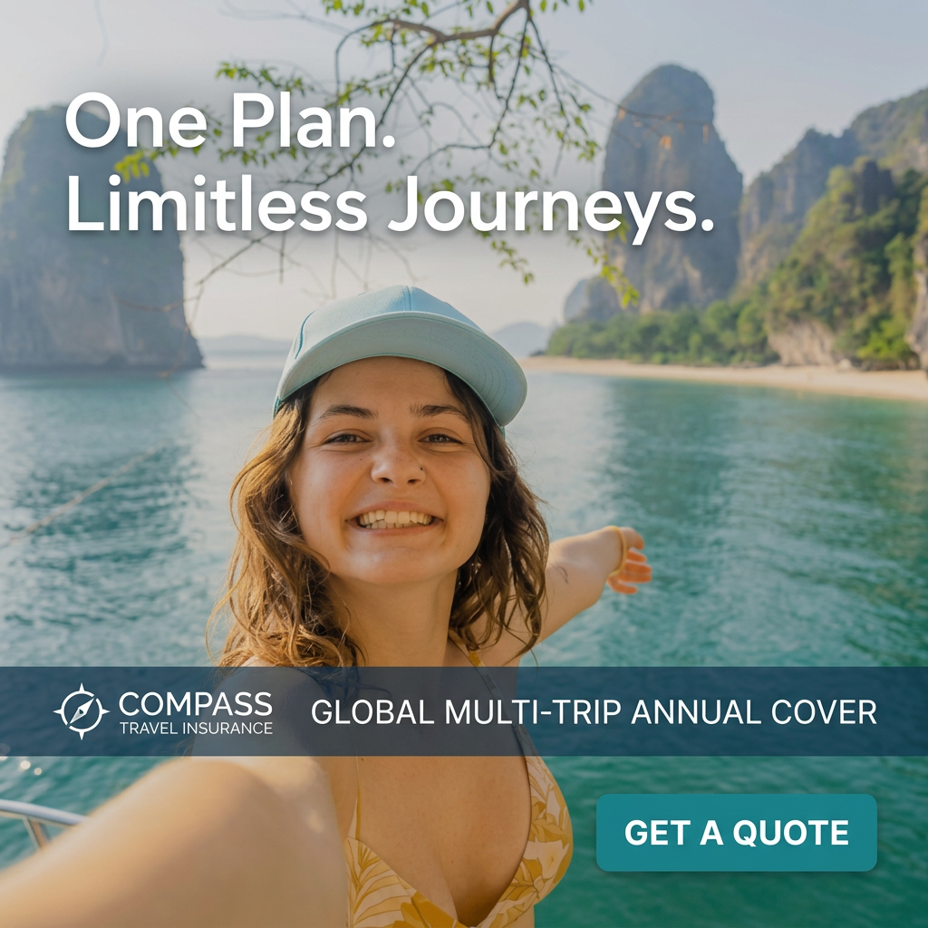
The headline uses a punchy two-sentence structure: "One Plan. Limitless Journeys." The contrast between one and limitless captures the core benefit of an annual policy without any jargon. Full stops add rhythm and confidence. The banner copy "Global Multi-Trip Annual Cover" is purely descriptive and works as a product label, which is useful because the headline alone is abstract. Together they cover emotion and clarity. The CTA "Get a Quote" keeps the commitment low. A possible improvement would be adding a price anchor or a per-trip saving, such as "from 5 a month", to strengthen the rational case for buying annual cover.
Visual design
The visual leans on a bright, airy palette of turquoise water, pale sky and green cliffs, giving the ad a fresh blue-dominated look. The selfie framing with an outstretched arm and slight wide-angle distortion signals authenticity. A navy translucent band separates the brand area from the photo without hiding it. White type is used for the headline and banner for consistency, while the teal button picks up the water color, creating a harmonious and calm composition.
How to adapt this template for your brand
- Source or shoot an authentic selfie of a traveler in an aspirational location.
- Write a short contrast headline that sums up the plan's key benefit.
- Add a translucent color band with your logo and the exact product name.
- Place the CTA button just below the band in a color pulled from the photo.
- Test variants with different destinations and traveler demographics.
Tips for travel insurance ads on Meta
On Meta and Instagram, place this in Feed, Stories and Reels with a 9:16 version that keeps the selfie face central and moves the banner lower. Pair it with primary text that explains annual savings versus single-trip cover. Target interests like backpacking, digital nomads and frequent flyers. On Google Display, the banner text may get small, so supply a separate headline asset stating annual multi-trip cover clearly.
About this creative
This square ad for the fictional Compass Travel Insurance mimics a real traveler's selfie, the kind people post from island-hopping trips. A young woman in a light blue cap grins at the camera from the deck of a boat, one arm outstretched toward towering limestone karsts and a turquoise bay that recall Southeast Asia. The headline "One Plan. Limitless Journeys." sits in large white type across the hazy sky at the top. A semi-transparent navy band across the lower third carries the compass logo on the left and the product name "Global Multi-Trip Annual Cover" on the right. Beneath it, a teal "Get a Quote" button sits in the bottom right corner. The creative balances a native, user-generated feel with clear product information. It works well for insurers promoting annual policies to frequent travelers who would otherwise buy single-trip cover each time.
Meta ad · 1200 × 1200 · Travel Insurance
Annual Multi-Trip Travel Insurance Ad Template: UGC Selfie
This travel insurance ad template uses a UGC-style selfie of a smiling traveler on a boat among limestone cliffs to promote annual multi-trip cover. The square UGC format blends into social feeds, while a translucent product banner names the plan clearly. It suits frequent travelers and backpackers on Meta and Instagram.
Added
All brand names and logos are property of their owners. Adplaylist is not affiliated with or endorsed by these brands.
Details
Ad copy
Primary text
One trip or twenty, one plan covers them all. Compass Global Multi-Trip Annual Cover protects every journey you take this year. No more buying a policy before each holiday. Get your quote today.
Description
Global multi-trip annual cover
On-image text
One Plan. Limitless Journeys. | COMPASS TRAVEL INSURANCE | GLOBAL MULTI-TRIP ANNUAL COVER | GET A QUOTE
Headline ideas for this template
- 1Cover Every Trip This Year
- 2One Policy, Endless Adventures
- 3Stop Buying Insurance Every Trip
- 4Travel More, Worry Less All Year
- 5Your Passport to Year-Round Cover
Meta image ad specs
| Placement | Ratio | Size (px) |
|---|---|---|
| Feed | 1:1 or 4:5 | 1080×1080 / 1080×1350 |
| Marketplace | 1:1 | 1200×1200 |
| Messenger inbox | 1:1 | 1200×1200 |
| Stories & Reels | 9:16 | 1080×1920 |
This template is 1:1. Request 4:5 or 9:16 to cover all placements.
Browse similar by tag