Key takeaways
- Format: Framed lifestyle photo on a dark premium background
- Best for: Frequent-traveler and group travel insurance offers
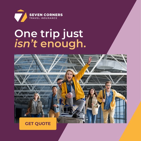
- Hook: Friends turning an airport trolley into a joyride
- Reuse it: Keep the dark frame and gold accents, swap the photo for any group travel moment
Available sizes
What is a lifestyle ad?
A lifestyle ad shows the product being used in a real setting by the kind of person who buys it. Instead of listing features, it sells the feeling or outcome of owning the product, which makes it a strong fit for fashion, home, travel and wellness brands.
See all lifestyle ads →Why this lifestyle ad works
- 01
Premium framing
The charcoal and gold palette makes an everyday product feel upscale and trustworthy.
- 02
Playful energy
The trolley ride captures the excitement of departure and makes insurance feel part of the fun.
- 03
Parallel headline structure
"Explore further" and "protect more" link ambition with protection in a memorable rhythm.
- 04
Contained photo block
Framing the photo separates text and image, so both remain legible on any device.
Full creative breakdown
Who this ad targets
This ad targets frequent travelers aged about 22 to 38 who travel in groups, from university friends on budget trips to young professionals on long weekends. They fly often enough that single-trip policies feel repetitive, and they respond to brands that look modern and premium. The group shot widens appeal to shared trips, making it a fit for audiences interested in group holidays, festivals, airlines and travel apps, as well as lookalikes of existing annual policyholders.
Copywriting analysis
The headline "Explore Further. Protect More." uses parallel structure: two verbs, two comparatives, two short sentences. It links the customer's ambition to the brand's promise, suggesting that more travel deserves more protection. The supporting line "Coverage for all your frequent adventures" clarifies the audience and hints at multi-trip value. The CTA "Get a Quote Now" adds urgency with "now" and the chevron reinforces motion. The copy is compact and confident. One weakness is that it lacks a specific benefit or price, so pairing it with strong primary text that names concrete covers would help conversion.
Visual design
The layout is a strict three-part stack: brand and headline on top, a large rounded photo in the middle, and the CTA at the bottom. The charcoal background with faint geometric facets gives depth without noise, and gold-cream typography in a geometric sans adds luxury. The bright white terminal photo pops strongly against the dark frame. Rounded corners on the image and button soften the design and keep it consistent and modern.
How to adapt this template for your brand
- Set a dark brand background and add a subtle pattern or geometric shapes for depth.
- Place your logo and a two-part parallel headline across the top.
- Frame a bright, energetic lifestyle photo in a rounded rectangle at the center.
- Use one accent color, like gold or cream, for headline and button.
- Add a short CTA with urgency, such as "Get a Quote Now", centered at the bottom.
Tips for travel insurance ads on Meta
On Meta, the framed layout survives well in Feed and Marketplace placements, and the dark background stands out among bright travel content. For Stories, extend the frame vertically and move the CTA above the safe zone. On Google Display, supply the photo and logo as separate assets so responsive ads keep the premium look. Target interest groups like frequent flyers, group travel and festivals, and test against a light-background version.
About this creative
This square ad for the fictional JourneyGuard Travel Insurance contrasts a bright, energetic photo with a dark, premium frame. In the center, a rounded-corner photo shows five young friends racing through a sunlit glass-roofed terminal. One woman sits on a suitcase on a luggage trolley, laughing at a tablet, while a friend pushes her and others jog alongside with rolling bags. Above the photo, a gold shield logo featuring an airplane and compass star sits top left, with the headline "Explore Further. Protect More." in cream capitals on the right and a supporting line about frequent adventures. Below, a cream "Get a Quote Now" button with a chevron completes the layout. Subtle geometric shapes in the charcoal background add depth. The combination of black and gold signals a premium brand, while the photo keeps the mood fun and youthful, a useful balance for insurers courting frequent travelers.
Meta ad · 1200 × 1200 · Travel Insurance
Travel Insurance Ad Template: Friends Having Fun at the Airport
This travel insurance ad template frames a joyful airport scene, friends pushing one another on a luggage trolley, inside a dark, premium-looking layout with gold accents. The square lifestyle format targets frequent group travelers on Meta and Google, combining a confident two-part headline with a cream CTA button that stands out against black.
Added
All brand names and logos are property of their owners. Adplaylist is not affiliated with or endorsed by these brands.
Details
Ad copy
Primary text
The more you travel, the more you need cover you can count on. JourneyGuard protects all your frequent adventures, from weekend escapes to long-haul trips with friends. Get your quote now.
Description
Coverage for all your frequent adventures
On-image text
JOURNEYGUARD TRAVEL INSURANCE | EXPLORE FURTHER. PROTECT MORE. | Coverage for all your frequent adventures. | GET A QUOTE NOW >
Headline ideas for this template
- 1Travel More, Stress Less
- 2Frequent Flyer? Get Frequent Cover
- 3Every Trip Covered, Together
- 4Adventure More, Worry Less
- 5Protection That Keeps Up With You
Meta image ad specs
| Placement | Ratio | Size (px) |
|---|---|---|
| Feed | 1:1 or 4:5 | 1080×1080 / 1080×1350 |
| Marketplace | 1:1 | 1200×1200 |
| Messenger inbox | 1:1 | 1200×1200 |
| Stories & Reels | 9:16 | 1080×1920 |
This template is 1:1. Request 4:5 or 9:16 to cover all placements.
Browse similar by tag