Key takeaways
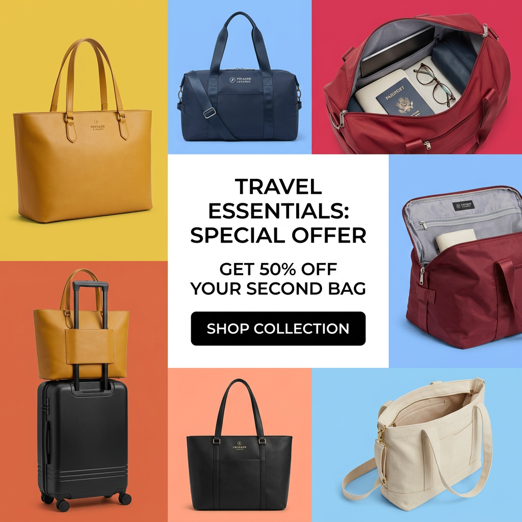
- Format: Multi-product color-block grid with a central offer panel.
- Best for: Collections with several products and a bundle or second-item discount.
- Hook: A bright patchwork of bags that invites the eye to browse.
- Reuse it: Place your products in colored tiles around a white panel with one clear deal and button.
Available sizes
What is an offer ad?
An offer ad leads with a deal, such as a percentage off, free shipping or a first-order discount, as the main hook. It's built to convert people who already know the brand or are close to buying, and works best with a clear deadline or condition.
See all offer / discount ads →Why this offer / discount ad works
- 01
The offer raises order value
"50% off your second bag" encourages a two-item basket instead of a straight discount on one product.
- 02
Range at a glance
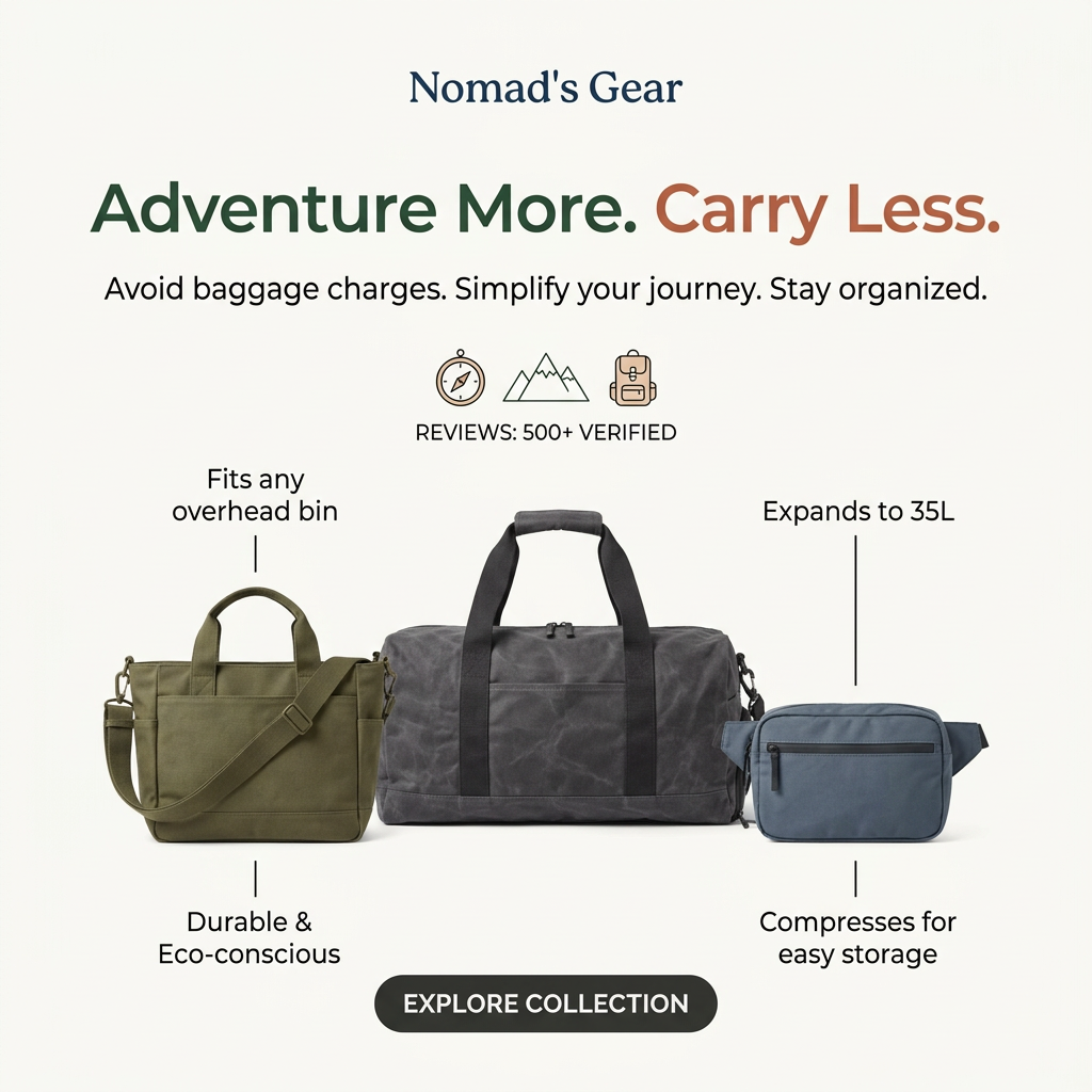
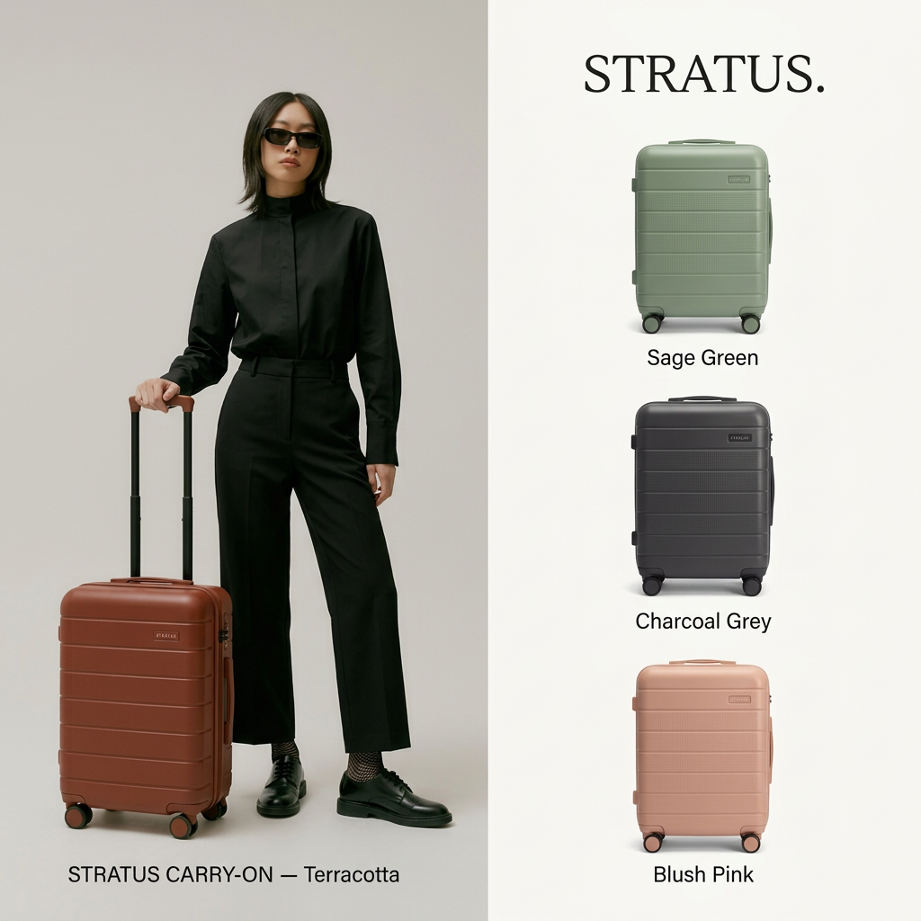
Showing totes, duffels and a carry-on in one image lets each viewer find a bag that fits their trip.
- 03
Interiors build trust
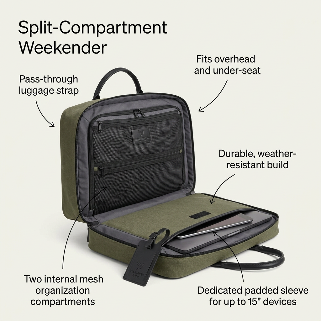
Open bags show pockets, laptop sleeves and lining, answering practical questions before the click.
- 04
Central focus point
The white panel in the middle of the colorful grid naturally draws the eye straight to the offer and button.
Full creative breakdown
Who this ad targets
The ad targets travelers and commuters, mostly women aged 25 to 45, who need different bags for different occasions: a work tote, a weekender and a carry-on. They value organization, quality materials and a coordinated look. The second-bag deal appeals to people who already planned to buy one bag and can be nudged to add another, as well as gift shoppers buying for themselves and someone else. It suits sale periods and retargeting of collection-page visitors.
Copywriting analysis
The copy is concise and structured as a classic promo stack. "Travel Essentials" names the collection and frames the bags as must-haves, while "Special Offer" signals a deal. "Get 50% off your second bag" is the real hook: it is specific, easy to calculate and pushes customers to buy two items. The black "Shop Collection" button gives a clear next step and suggests browsing a range rather than one product. The all-caps type adds energy but can feel shouty, and "Special Offer" is generic. Adding a deadline or "this weekend only" would add urgency, and a brand logo in the central panel would improve recall.
Visual design
The layout is a 3×3 grid with the offer in the center tile. Saturated yellow, blue, red, orange and peach backgrounds create a cheerful, energetic patchwork. Each bag is photographed cleanly with soft shadows, alternating between closed product shots and open interior views. The white center with black text and a black pill button contrasts strongly with the colors around it. The varied angles keep the grid from feeling repetitive.
How to adapt this template for your brand
- Choose six to eight products from your collection and photograph each on a bold color.
- Include a few open or in-use shots to show details and versatility.
- Arrange them in a grid around a central white panel.
- Write a bundle offer such as "50% off your second item" with a short collection name.
- Add a solid button-style CTA and your logo in the center.
Tips for travel ads on Meta
On Meta, this grid works as a single image, but a carousel or collection ad with each bag as its own card can lift click-through to specific products. Use it in catalogue-driven retargeting with the offer as an overlay. On Google Display and Performance Max, supply the individual product images separately because the grid may be cropped. Make sure the bundle discount is set up in your checkout so the promise is honored automatically.
About this creative
The ad is a grid of eight color blocks around a central white panel. Each block shows a different travel bag on a bold background: a mustard leather tote on yellow, a navy duffel on light blue, an open red duffel revealing a laptop, passport and glasses on red, an open burgundy bag with grey lining on blue, a mustard tote slipped over the handle of a black hard-shell carry-on on orange, a black leather tote on peach, and an open cream canvas tote on light blue. Small embossed logos appear on several bags. In the center, black capital letters read "Travel Essentials: Special Offer" and "Get 50% off your second bag", followed by a black rounded button with "Shop Collection" in white. The open bags show interior pockets and organization, while the tote-on-suitcase shot shows how pieces work together, supporting the idea of buying two.
Meta ad · 1200 × 1200 · Travel
Travel Bags Offer Ad: 50% Off Your Second Bag
This travel bag ad uses a colorful grid of totes, duffels and a carry-on around a central white offer panel: 50% off your second bag. It shows the full range at once and pushes a higher order value. Use it as a template for multi-product collections with a bundle or second-item deal.
Added
All brand names and logos are property of their owners. Adplaylist is not affiliated with or endorsed by these brands.
Details
Ad copy
Primary text
One bag is never enough. Pick your favourite tote, duffel or carry-on and get 50% off your second bag. Mix, match and pack smarter for every trip.
Description
Totes, duffels and carry-ons for every trip
On-image text
Travel Essentials: Special Offer | Get 50% off your second bag | Shop Collection
Headline ideas for this template
- 1One bag for work, one for the weekend
- 2Buy one bag, get the second half price
- 3Pack smarter with a perfect pair
- 4Your travel duo, 50% off the second
- 5Mix and match your travel essentials
Meta image ad specs
| Placement | Ratio | Size (px) |
|---|---|---|
| Feed | 1:1 or 4:5 | 1080×1080 / 1080×1350 |
| Marketplace | 1:1 | 1200×1200 |
| Messenger inbox | 1:1 | 1200×1200 |
| Stories & Reels | 9:16 | 1080×1920 |
This template is 1:1. Request 4:5 or 9:16 to cover all placements.
Browse similar by tag