Key takeaways
- Format: Advertorial teaser that looks like an article, not an ad
- Best for: Ingredient-led products that need education before purchase
- Hook: An 'Insider's Guide' framing promises exclusive, useful knowledge
- Reuse it: Swap the topic and hero photo for any 'how to' or 'what to know' guide
Available sizes
What is a listicle ad?
A listicle ad presents the product's benefits or reasons to buy as a short numbered list, like an article headline ("5 reasons…"). The list format is easy to scan in a feed and lets one creative answer several objections at once.
See all listicle ads →Why this listicle ad works
- 01
Native editorial look
Read time and date cues make it feel like content, which lowers the defences people have against ads.
- 02
Ingredient curiosity
Naming hydroxyapatite gives a specific, slightly technical hook that makes readers want to learn more.
- 03
Result-focused visual
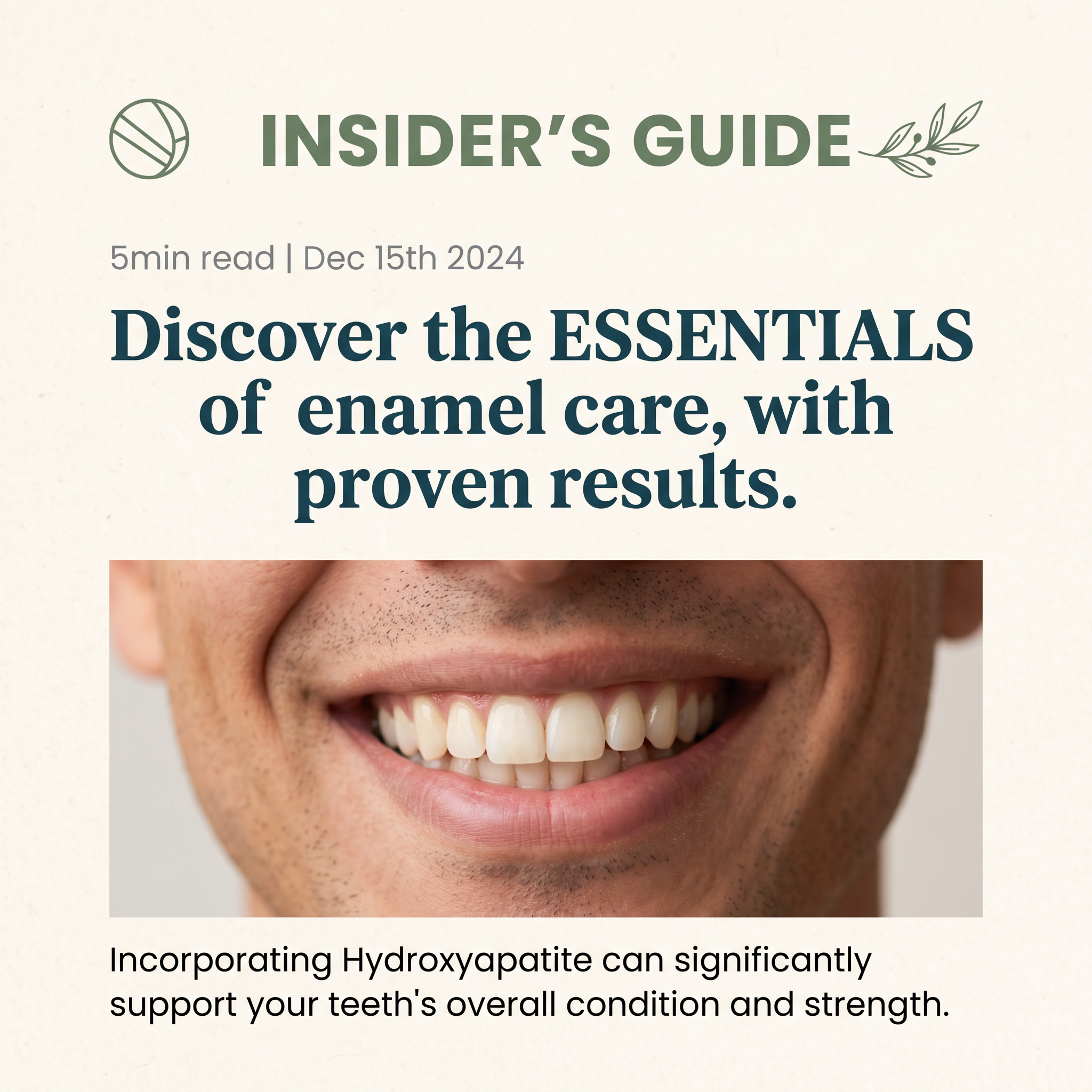
The close-up smile shows the end benefit, healthy teeth, without needing to show a product.
- 04
Low-commitment ask
A 5-minute read is an easy click, which warms people up before they see the offer.
Full creative breakdown
Who this ad targets
Health-conscious adults aged roughly 25 to 55 who care about clean or natural personal care and may be looking for fluoride-free alternatives. They read labels, are curious about ingredients and like to understand why something works before switching brands. It also reaches people with sensitive teeth or worries about enamel wear from coffee, whitening or acidic foods. They respond better to education than to discounts.
Copywriting analysis
The copy borrows the voice of a publication. 'Insider's Guide' promises exclusive knowledge, while the read-time line sets clear, low effort expectations. The headline uses the verb 'Discover', capitalises 'ESSENTIALS' for emphasis and adds 'with proven results' as a credibility claim. The body line names the hero ingredient and states a soft benefit with hedged wording ('can significantly support'), which helps stay within health claim rules. A weak point is the old date (Dec 2024), which can make the content look stale; update it regularly or remove it. There is no explicit CTA on the image, which keeps the native feel.
Visual design
The design copies an editorial layout: a section title with icons, small grey metadata, a large serif headline and a wide photo with a caption-style line below. The cream paper texture and sage green accents feel natural and clean. The heavy teal serif adds authority. The tight crop on the smile removes identity and keeps focus on the teeth. The lack of logo or product is a deliberate choice for native-style placements.
How to adapt this template for your brand
- Pick an educational topic linked to your hero ingredient or method.
- Add editorial cues: a section label, read time and a recent date.
- Write a 'Discover the…' or 'What you need to know about…' headline.
- Use a close-up photo of the result, not the product.
- Send clicks to a real advertorial or blog page that introduces your product.
Tips for health & fitness ads on Meta
On Meta, use 'Learn More' as the CTA and send traffic to an advertorial or listicle landing page, not a product page. Keep health wording hedged to pass review. Refresh the date often so it looks current, or remove it. This style also works on native networks like Taboola and Outbrain, and on Google Discover via Demand Gen. Test it against a product-shot ad to see whether education-first lowers your cost per purchase.
About this creative
A warm, paper-textured cream square designed to look like the opening of a magazine article rather than an ad. At the top, a sage green 'INSIDER'S GUIDE' title is framed by a line-art tooth or ball icon on the left and a leafy olive branch on the right. Below sits grey metadata, '5min read | Dec 15th 2024', which mimics a blog post. The main headline, in a heavy dark teal serif, reads 'Discover the ESSENTIALS of enamel care, with proven results', with 'ESSENTIALS' in capitals for emphasis. A wide crop of a smiling man with light stubble shows healthy, natural-looking teeth. A short body line underneath introduces the key ingredient, hydroxyapatite, and says it supports teeth strength. No product, price or brand logo appears; the creative is built to earn a click to a longer advertorial page where the product is introduced.
Meta ad · 1200 × 1200 · Health & Fitness
Toothpaste Ad Template: Hydroxyapatite Insider's Guide Advertorial
This oral care ad looks like an article teaser instead of a product ad. With a '5 min read' tag, a publish date and an educational headline, it drives clicks to an advertorial landing page. It is a square format for Meta, ideal for ingredient-led brands that need to educate before they sell.
Added
All brand names and logos are property of their owners. Adplaylist is not affiliated with or endorsed by these brands.
Details
Ad copy
Primary text
Your enamel can't grow back, but you can protect it. Our insider's guide explains how hydroxyapatite supports stronger, healthier teeth and what to look for in your toothpaste.
Description
A 5-minute guide to stronger teeth
On-image text
INSIDER'S GUIDE. 5min read | Dec 15th 2024. Discover the ESSENTIALS of enamel care, with proven results. Incorporating Hydroxyapatite can significantly support your teeth's overall condition and strength.
Headline ideas for this template
- 1What Your Dentist Wishes You Knew About Enamel
- 2The Ingredient Rebuilding Smiles in 2026
- 35 Signs Your Enamel Needs Support
- 4Why People Are Switching to Hydroxyapatite
- 5Stronger Teeth Start With One Ingredient
Meta image ad specs
| Placement | Ratio | Size (px) |
|---|---|---|
| Feed | 1:1 or 4:5 | 1080×1080 / 1080×1350 |
| Marketplace | 1:1 | 1200×1200 |
| Messenger inbox | 1:1 | 1200×1200 |
| Stories & Reels | 9:16 | 1080×1920 |
This template is 1:1. Request 4:5 or 9:16 to cover all placements.
Browse similar by tag