Key takeaways
- Format: Lifestyle – behind-the-scenes moment at the clothing rail.
- Best for: Menswear basics and brands announcing new arrivals or early access.
- Hook: Be the first to explore – an inside look before the collection goes live.
- Reuse it: Show someone prepping your new collection and frame it as a first look.
Available sizes
What is a lifestyle ad?
A lifestyle ad shows the product being used in a real setting by the kind of person who buys it. Instead of listing features, it sells the feeling or outcome of owning the product, which makes it a strong fit for fashion, home, travel and wellness brands.
See all lifestyle ads →Why this lifestyle ad works
- 01
Behind-the-scenes intimacy
Seeing someone arrange the rail feels like a private preview, making viewers feel like insiders.
- 02
Early access hook
Be the first to explore taps into curiosity and the fear of missing out on new arrivals.
- 03
Product colours on display
The rail shows the full colour range of the tees without a separate product grid.
- 04
Retail details add credibility
The barcode and compass logo give a tag-like, streetwear authenticity.
Full creative breakdown
Who this ad targets
This ad targets men roughly 22–40 who build their wardrobe around quality basics like tees and knit polos and like to be early to new collections. They follow minimalist menswear brands, appreciate natural, calm aesthetics and are likely to sign up for drops or newsletters. The ad suits warm audiences such as followers, subscribers and past buyers for early access, and prospecting on menswear and basics interests.
Copywriting analysis
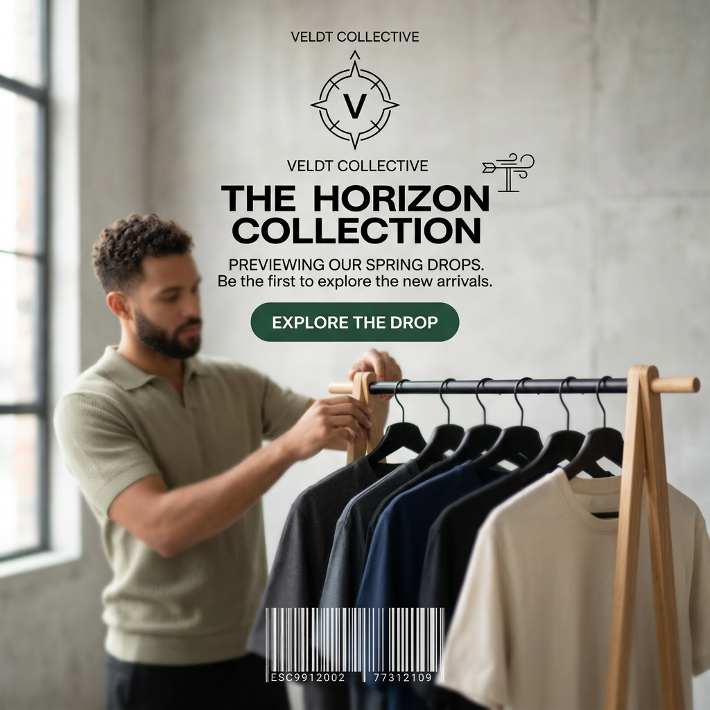
The copy is structured as an announcement. The brand name and compass logo set a travel and exploration theme, carried through by The Horizon Collection, which suggests new beginnings and fits spring. Previewing our spring drops tells viewers what is happening and when. Be the first to explore the new arrivals is the key persuasion line, using exclusivity and FOMO. The CTA, Explore the drop, continues the exploration theme consistently. A clear weakness is that Veldt Collective appears twice around the logo, which looks like a layout error and wastes space; remove one. The copy also never names the product type, so adding tees and polos would help relevance.
Visual design
The layout puts all text in the upper centre over the plain concrete wall, keeping it readable, while the model and rail fill the lower half. A shallow depth of field blurs the foreground tees and keeps the man sharp, adding depth. The palette is neutral and natural – concrete grey, oak wood, sage and soft daylight – with the dark green button as the only accent. Bold geometric sans-serif typography and line icons give a modern outdoor-brand feel.
How to adapt this template for your brand
- Shoot a team member or model styling or arranging your new collection in a bright space.
- Keep the products visible but slightly out of focus to tease the drop.
- Name the collection with a theme word that fits the season.
- Add an early-access line such as Be the first to explore and a matching CTA.
- Show your logo once and add one authentic retail detail, such as a tag or barcode.
Tips for apparel ads on Meta
On Meta, this works as a teaser before launch day, ideally targeted at followers and email subscribers. Use Stories with a countdown or a Remind me sticker. On TikTok, turn the scene into a short behind-the-scenes clip of the rail being filled. After launch, switch the copy to Now available and follow with a product carousel. Fix the duplicated brand name before running.
About this creative
The creative shows a bright, minimalist studio with a concrete wall and a tall window letting in soft daylight from the left. A man with short curly hair and a trimmed beard, wearing a sage-green knit polo, adjusts a wooden clothing rail with black hangers. On the rail hang T-shirts in charcoal, mid-grey, navy, black and cream, slightly out of focus in the foreground. The upper centre holds the branding: a compass-style V logo with Veldt Collective above and again below it, plus a small weathervane icon. Under that, a bold black headline reads The Horizon Collection, followed by Previewing our spring drops. Be the first to explore the new arrivals. A dark green pill button says Explore the drop. At the bottom, a barcode with reference numbers adds a retail-tag, streetwear touch. The mood is calm, natural and behind-the-scenes, like a first look inside the brand's studio.
Meta ad · 1200 × 1200 · Apparel
Spring Drop Ad: The Veldt Collective Horizon Collection
This square lifestyle ad from Veldt Collective shows a man arranging T-shirts on a wooden rail in a sunlit studio to preview a spring collection. Use it as a template for new-arrival announcements, basics brands and early-access campaigns that want a warm, behind-the-scenes feel on Meta and TikTok.
Added
All brand names and logos are property of their owners. Adplaylist is not affiliated with or endorsed by these brands.
Details
Ad copy
Primary text
Previewing our spring drops. The Horizon Collection brings soft, everyday tees and knit polos in a palette made for warmer days. Be the first to explore the new arrivals from Veldt Collective.
Description
Be first to explore the new arrivals
On-image text
VELDT COLLECTIVE | VELDT COLLECTIVE | THE HORIZON COLLECTION | PREVIEWING OUR SPRING DROPS. Be the first to explore the new arrivals. | EXPLORE THE DROP | ESC9912002 77312109
Headline ideas for this template
- 1The Horizon Collection Has Landed
- 2Be First to the Spring Drop
- 3New Tees for Warmer Days
- 4A First Look at Spring
- 5Explore the Drop Before Anyone Else
Meta image ad specs
| Placement | Ratio | Size (px) |
|---|---|---|
| Feed | 1:1 or 4:5 | 1080×1080 / 1080×1350 |
| Marketplace | 1:1 | 1200×1200 |
| Messenger inbox | 1:1 | 1200×1200 |
| Stories & Reels | 9:16 | 1080×1920 |
This template is 1:1. Request 4:5 or 9:16 to cover all placements.
Browse similar by tag