Key takeaways
- Format: Four-panel listicle grid showing a whole product range.
- Best for: Launching collections, variant ranges or "shop by" navigation.
- Hook: "You have a type. We have a flight." plays on personal preference.
- Reuse it: Color-code four variants in a grid around one central badge.
Available sizes
What is a listicle ad?
A listicle ad presents the product's benefits or reasons to buy as a short numbered list, like an article headline ("5 reasons…"). The list format is easy to scan in a feed and lets one creative answer several objections at once.
See all listicle ads →Why this listicle ad works
- 01
Color as navigation
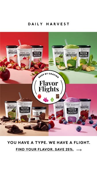
Each quadrant's color signals a flavor family, so viewers find their craving instantly without reading labels.
- 02
Self-identification hook
"You have a type" invites people to see themselves in one panel, which drives engagement and click-through.
- 03
Central badge unifies
The badge in the middle binds four photos into one campaign and builds recognition for the Flavor Flights name.
- 04
Offer at the end
The 25% discount comes after the choice is made, rewarding the decision rather than leading with price.
Full creative breakdown
Who this ad targets
This ad targets people who already have strong flavor preferences: chocolate lovers, green-smoothie regulars, berry fans. It suits both new prospects browsing for a starting point and existing customers who know what they like and want an easier reorder. The audience skews toward health-aware millennials and Gen Z who enjoy personality-style framing ("your type") and visual browsing, and who respond to a curated set rather than an endless menu.
Copywriting analysis
The headline borrows dating language, "You have a type," and twists it with "We have a flight," a word from wine and beer tasting that makes smoothies feel curated and fun. The parallel sentence structure is punchy and memorable. "Shop by Craving" on the badge is a clear navigation cue that frames the product around desire rather than nutrition. The CTA, "Find your flavor. Save 25%.", repeats the two-short-sentence rhythm and adds value at the end. Copy is minimal, letting the grid carry the information while words add personality.
Visual design
A white background frames a tightly cropped two-by-two grid, giving a magazine or catalog feel. Each panel uses a saturated backdrop matched to its ingredients, creating four distinct moods that still feel consistent through shared lighting and the three-cup arrangement. The circular badge sits exactly on the grid intersection, pulling focus to the center. Bold black sans-serif type beneath the grid contrasts with the colorful photos and keeps the message readable.
How to adapt this template for your brand
- Pick four variants, flavors or use cases in your range.
- Shoot each on its own color backdrop with matching ingredients or props.
- Arrange the shots in a two-by-two grid on a neutral background.
- Place a round badge with your collection name at the center.
- Add a playful "you have a type" style line and an offer CTA below.
Tips for food ads on Meta
This grid works best in Meta Stories and Reels, where the vertical canvas gives each panel room. For Feed at 4:5 or 1:1, enlarge the grid and drop the top wordmark. Pair the static with a carousel version where each card is one flight, letting viewers swipe to their favorite. Use it for broad prospecting, then retarget engagers with the single-flight ads that match the panel they tapped.
About this creative
This vertical Daily Harvest ad presents the full Flavor Flights collection on a clean white canvas. The spaced brand wordmark sits at the top, and the middle of the frame is a two-by-two grid of product photos. Each quadrant has its own color world: a red set with strawberry smoothies, a green set with green smoothies, avocado and ginger, a brown set with dark chocolate smoothies and a protein oat bowl among chocolate chunks, and a pink set with mixed-berry and cherry protein smoothies surrounded by blueberries and cherries. Each panel shows three cups, one open with a straw. A round white badge in the center reads "Shop by Craving – Flavor Flights" with four small icons for strawberry, berries, greens and chocolate. Beneath the grid, a bold all-caps line says "You have a type. We have a flight." followed by an underlined call to action to find your flavor and save 25%, with an arrow.
Meta ad · 338 × 600 · Food
Daily Harvest Flavor Flights Four-Grid Ad
This Daily Harvest ad introduces its Flavor Flights range with a four-panel grid, each panel a color-coded smoothie bundle: strawberry, green, chocolate and berry. A central badge ties them together. Use this template to show a full product range, multiple variants or a collection launch in one scroll-stopping frame.
Added
All brand names and logos are property of their owners. Adplaylist is not affiliated with or endorsed by these brands.
Details
Ad copy
Primary text
Strawberry fan? Green-smoothie devotee? Chocolate all the way? Our new Flavor Flights group your favorite smoothies by craving, so finding your next box is easy. Pick your flight and save 25%.
Description
Shop smoothie flights by craving
On-image text
DAILY HARVEST | SHOP BY CRAVING | Flavor Flights | YOU HAVE A TYPE. WE HAVE A FLIGHT. | FIND YOUR FLAVOR. SAVE 25%. →
Headline ideas for this template
- 1Which Flight Are You?
- 2Four Flights. Pick Your Craving.
- 3Chocolate, Greens, Berry or Strawberry?
- 4Your Smoothie Personality, Bundled
- 5Shop by Craving and Save 25%
Meta image ad specs
| Placement | Ratio | Size (px) |
|---|---|---|
| Feed | 1:1 or 4:5 | 1080×1080 / 1080×1350 |
| Marketplace | 1:1 | 1200×1200 |
| Messenger inbox | 1:1 | 1200×1200 |
| Stories & Reels | 9:16 | 1080×1920 |
This template is 1:1. Request 4:5 or 9:16 to cover all placements.