Key takeaways
- Format: Native iPhone Notes screenshot listicle written in first person.
- Best for: Products with several clear benefits that need to feel authentic and peer-recommended.
- Hook: "Why ScanWatch 2 finally made it click for me" – a personal conversion story.
- Reuse it: Write four first-person reasons in a Notes screenshot, each answering one objection.
Available sizes
What is a listicle ad?
A listicle ad presents the product's benefits or reasons to buy as a short numbered list, like an article headline ("5 reasons…"). The list format is easy to scan in a feed and lets one creative answer several objections at once.
See all listicle ads →Why this listicle ad works
- 01
Native camouflage
It looks like user content, not an ad, so people stop scrolling and read instead of skipping.
- 02
Objection handling
Each line removes a barrier: value, medical credibility, charging fatigue and cost.
- 03
Authentic imperfections
The cursor, typo and casual tone make it feel real and unpolished.
- 04
Price reframe
HSA & FSA eligibility turns the purchase into using benefits rather than spending money.
Full creative breakdown
Who this ad targets
This ad targets US adults aged 30 to 60 who have tried fitness trackers or smartwatches before and given up because of daily charging or data that felt meaningless. It reaches people with heart health concerns who want something to share with their doctor, and benefit-savvy employees with HSA or FSA accounts looking for eligible purchases. The native format especially fits Instagram and Facebook users who are blind to polished brand ads and respond to peer-style recommendations.
Copywriting analysis
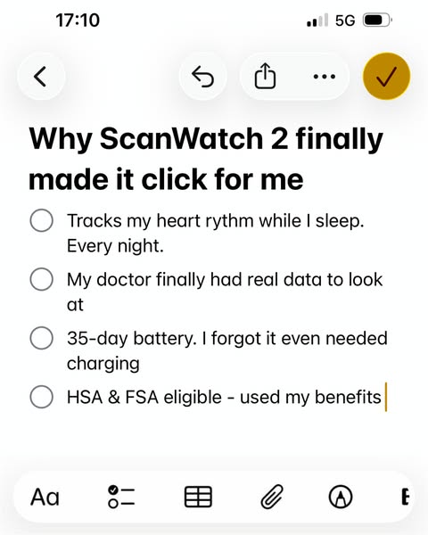
The headline "Why ScanWatch 2 finally made it click for me" works because "finally" implies past frustration with other products and "for me" makes it personal. The four checklist lines each follow a pattern of benefit plus human detail: "Every night" emphasizes consistency, "My doctor finally had real data" adds medical legitimacy through a third party, "I forgot it even needed charging" makes the 35-day battery tangible, and "used my benefits" signals smart spending. The writing is conversational, short and slightly imperfect, which feels like authentic user voice rather than marketing copy.
Visual design
The design is intentionally lo-fi: a real iPhone Notes interface in light mode with white background, black bold title and grey circular checkboxes. The status bar and toolbar icons stay in place to confirm authenticity. The yellow checkmark button in the top right adds the only color accent. There is no product image or logo, which makes the ad blend completely with organic content. Large text size ensures readability on mobile even at small preview sizes.
How to adapt this template for your brand
- Open the Notes app on an iPhone and write a title like "Why [product] finally made it click for me".
- Add four checklist items in first person, each answering a common objection to buying.
- Keep the status bar, toolbar and cursor visible so it looks like a real screenshot.
- Include one money-related reason (benefits, savings, discount) as the last item.
- Pair the screenshot with primary text that names the product and links to the shop page.
Tips for smartwatches ads on Meta
Notes app ads perform best in Instagram and Facebook Feed and Stories where they mimic shared screenshots. Keep the brand name inside the note so it's not lost. Run them as part of a UGC-style test against polished creatives; they often win on cost per click. Refresh the reasons often to avoid fatigue. Avoid making medical claims in the note that you can't support; keep statements personal. Not suited for Google Display.
About this creative
This creative for Withings ScanWatch 2 looks nothing like a typical brand ad. It is a screenshot of the iPhone Notes app, complete with status bar showing 17:10 and 5G, the toolbar icons and a blinking cursor at the end of the last line. The note is titled "Why ScanWatch 2 finally made it click for me" and contains four unchecked checklist items written in a casual first-person voice: heart rhythm tracking while sleeping every night, finally giving the doctor real data, a 35-day battery so long the user forgot it needed charging, and HSA & FSA eligibility. There is no product image, no logo and no brand styling. Even the small typo "rythm" adds authenticity. The format exploits native familiarity: it looks like something a friend would share in a story or a group chat. Each line answers a common objection – usefulness, medical value, charging hassle and price – making it an objection-handling listicle disguised as a personal note.
Meta ad · 338 × 600 · Smartwatches
Withings ScanWatch 2 Notes App Ad: "Why It Finally Made It Click"
This Withings ad mimics an iPhone Notes screenshot listing four personal reasons to love ScanWatch 2: sleep heart rhythm tracking, data for your doctor, a 35-day battery and HSA/FSA eligibility. It is a lo-fi, native listicle format that blends into feeds and works for almost any product.
Added
All brand names and logos are property of their owners. Adplaylist is not affiliated with or endorsed by these brands.
Details
Ad copy
Primary text
"I tried so many trackers. ScanWatch 2 is the one that stuck." It tracks your heart rhythm while you sleep, gives your doctor real data, lasts up to 35 days on one charge – and it's HSA & FSA eligible.
Description
35-day battery. HSA & FSA eligible.
On-image text
17:10 | 5G | Why ScanWatch 2 finally made it click for me | Tracks my heart rythm while I sleep. Every night. | My doctor finally had real data to look at | 35-day battery. I forgot it even needed charging | HSA & FSA eligible - used my benefits
Headline ideas for this template
- 1The smartwatch I actually kept wearing
- 24 reasons I switched to ScanWatch 2
- 3My doctor finally had real data
- 4I forgot it needed charging
- 5Bought it with my HSA – here's why
Meta image ad specs
| Placement | Ratio | Size (px) |
|---|---|---|
| Feed | 1:1 or 4:5 | 1080×1080 / 1080×1350 |
| Marketplace | 1:1 | 1200×1200 |
| Messenger inbox | 1:1 | 1200×1200 |
| Stories & Reels | 9:16 | 1080×1920 |
This template is 1:1. Request 4:5 or 9:16 to cover all placements.