Key takeaways
- Format: Side-by-side comparison of two outcomes.
- Best for: Wearables and apps that give daily recommendations.
- Hook: Know when to pause and when to push.
- Reuse it: Show the same metric in two states and let the product bridge them.
Available sizes
What is a comparison ad?
A comparison ad sets the product against an alternative, such as a competitor, the old way of doing things or a cheaper option, usually in a two-column layout or table. It helps buyers who are already weighing options see quickly why this one is the better choice.
See all comparison ads →Why this comparison ad works
- 01
Two decisions, one device
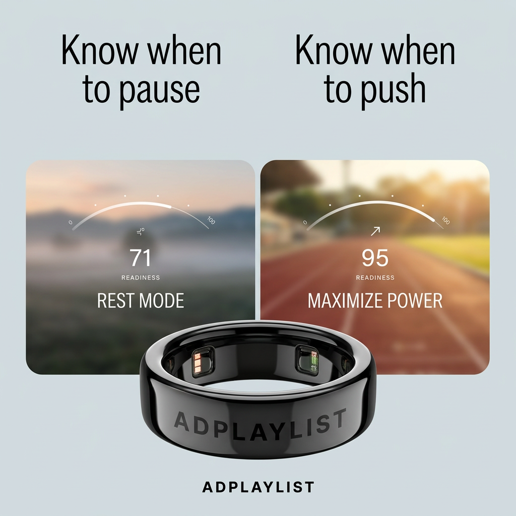
The split layout shows the ring helps in both directions, rest and effort, rather than only pushing harder.
- 02
Mood photography matches the score
Misty dawn for 71 and a sunny track for 95 make the numbers feel intuitive.
- 03
Parallel headlines
Repeating 'Know when to' with a single changed word is quick to read and memorable.
- 04
Product as the bridge
The ring overlaps both panels, visually linking the two states to one device.
Full creative breakdown
Who this ad targets
Runners, gym-goers and endurance athletes aged 25–45 who train several times a week and worry about overtraining or wasting good days. They already think in terms of recovery and are curious about data-driven training. The rest-mode message also reaches busy professionals who want permission to slow down without guilt, making the ad relevant beyond hardcore athletes to anyone balancing energy across a demanding week.
Copywriting analysis
The two headlines, “Know when to pause” and “Know when to push,” are a parallel pair that changes just one word. This structure makes the message instantly scannable and positions the ring as a coach rather than a tracker. “Pause” is notably non-judgmental, giving permission to rest. The panel labels, “Rest Mode” and “Maximize Power,” translate the scores into actions, and the numbers 71 and 95 make readiness tangible. There is no CTA or price on the image, so the primary text needs to explain how the score is calculated and give a clear next step such as shopping or learning more.
Visual design
The canvas divides into two equal columns, each with a headline and photo panel, creating perfect symmetry. Muted, cool tones on the left contrast with warm, saturated tones on the right, reinforcing rest versus energy. White semi-transparent gauges sit over the photos for an app-like feel. The glossy black ring breaks the symmetry by sitting in front of both panels, becoming the visual anchor. The pale blue-grey background keeps everything calm and clean.
How to adapt this template for your brand
- Pick one metric your product produces and show it in a low and a high state.
- Write two parallel headlines that change only one word.
- Pair each state with a photo whose mood matches the number.
- Overlay a simple gauge and action label on each photo.
- Place the product in front, overlapping both panels.
Tips for health & fitness ads on Meta
Works well in Meta Feed and Instagram, where the split layout reads clearly on mobile. Turn it into a two-card carousel, one state per card, with a product card at the end. In Reels and Stories, animate the gauge moving from 71 to 95. Target running, cycling, CrossFit and wellness-tracking interests, and use it in the consideration stage for people who have already engaged with wearable content.
About this creative
This square ad for a smart ring uses a split comparison layout on a pale blue-grey background. Two headlines sit at the top: “Know when to pause” on the left and “Know when to push” on the right, set in a tall, condensed sans-serif. Below each headline is a rounded photo panel. The left panel shows a misty, muted landscape at dawn with a gauge reading 71 readiness and the label “Rest Mode.” The right panel shows a sunlit running track with a gauge reading 95 readiness and the label “Maximize Power.” A glossy black ring, engraved with ADPLAYLIST and showing its inner sensors, sits in front of both panels, overlapping their bottom edges and tying the two states together. The wordmark repeats at the bottom. The ad turns an abstract metric into two relatable decisions: rest today, or go all out. It sells guidance rather than hardware specs.
Meta ad · 1200 × 1200 · Health & Fitness
Smart Ring Ad: Two Scores, Two Kinds of Day
This comparison ad shows two readiness scores side by side, 71 for a misty rest day and 95 for a sunny track day, with a glossy black smart ring placed in front of both panels. It sells guidance, not hardware. Use it for any product that tells people what to do next.
Added
All brand names and logos are property of their owners. Adplaylist is not affiliated with or endorsed by these brands.
Details
Ad copy
Primary text
Some days call for rest. Others are made for a personal best. The ADPLAYLIST ring reads your sleep, heart rate and recovery overnight and gives you a daily readiness score, so you know exactly when to pause and when to push.
Description
Your daily readiness score, on your finger.
On-image text
Know when to pause | Know when to push | 0 | 100 | 71 Readiness | Rest Mode | 95 Readiness | Maximize Power | ADPLAYLIST (on ring) | ADPLAYLIST
Headline ideas for this template
- 1Rest Smarter. Train Harder.
- 2Your Ring Knows When You're Ready
- 3Stop Guessing Your Training Days
- 4One Score Tells You When to Go
- 5Recovery Today, Records Tomorrow
Meta image ad specs
| Placement | Ratio | Size (px) |
|---|---|---|
| Feed | 1:1 or 4:5 | 1080×1080 / 1080×1350 |
| Marketplace | 1:1 | 1200×1200 |
| Messenger inbox | 1:1 | 1200×1200 |
| Stories & Reels | 9:16 | 1080×1920 |
This template is 1:1. Request 4:5 or 9:16 to cover all placements.
Browse similar by tag