Key takeaways
- Format: Text-only offer ad with a negative-to-positive twist
- Best for: Sitewide sales, flash events and promo announcements
- Hook: 'BAD NEWS' in giant type triggers curiosity
- Reuse it: Swap the joke subject and discount, keep the black-white-red system
Available sizes
What is an offer ad?
An offer ad leads with a deal, such as a percentage off, free shipping or a first-order discount, as the main hook. It's built to convert people who already know the brand or are close to buying, and works best with a clear deadline or condition.
See all offer / discount ads →Why this offer / discount ad works
- 01
Pattern interrupt
A stark black screen with alarming words breaks the rhythm of colourful product posts.
- 02
Humour builds affinity
Joking about the warehouse crew gives the brand a relatable, human voice.
- 03
Clear offer hierarchy
Hook, explanation, then a red discount label means the eye lands on 30% last.
- 04
Zero production cost
Pure typography is fast to make, test and adapt for any sale.
Full creative breakdown
Who this ad targets
Existing Kitsch fans and warm social audiences, mostly women aged 18 to 40, who already know the product range and are waiting for a deal. A sitewide 30% discount appeals to shoppers who want to stock up on hair accessories and care products or try new items at lower risk. The humorous tone fits younger, meme-literate users on Instagram and Facebook Stories who respond to brands that do not take themselves too seriously.
Copywriting analysis
The copy uses a classic bait-and-switch structure. 'BAD NEWS' sets up a negative expectation, then the next line reframes it: the bad news is only for the warehouse crew, because shoppers are about to place lots of orders. 'Summer Black Friday' borrows the urgency of the biggest shopping day of the year and moves it to an off-season moment. The offer itself is stated plainly in the red label, with 'sitewide' removing any doubt about exclusions. The whole message is under 20 words, making it ideal for a two-second story view. The only missing element is a deadline, which could add extra urgency.
Visual design
The layout is pure typographic hierarchy on a black canvas. Giant white headline type takes up roughly half the frame, with generous negative space around it. Supporting copy is set much smaller in caps, then a single red block highlights the discount as the only colour in the design. The thin serif logo at the bottom contrasts the heavy sans and signals the brand without competing for attention.
How to adapt this template for your brand
- Choose a surprising negative headline (BAD NEWS, WE MESSED UP) and set it huge in white on black.
- Add one line that reveals the twist and who the 'victim' really is.
- Name the sale event so it borrows urgency, e.g. Summer Black Friday or Christmas in July.
- Place the discount in a single high-contrast colour block as the only accent colour.
- Finish with a small logo and test it against a product-shot version of the same offer.
Tips for haircare ads on Meta
Built as a 9:16 vertical for Instagram and Facebook Stories and Reels; keep key text inside the central safe zone, away from the top 14% and bottom 20% where UI overlays appear, and crop a 1:1 or 4:5 version for feed. Put the discount and end date in the first line of primary text, and use retargeting audiences plus a lookalike of past buyers. Keep the primary text under 125 characters so it isn't truncated, use the 'Shop Now' button, and refresh the creative every two to three weeks to limit ad fatigue.
About this creative
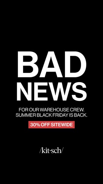
A minimalist vertical story ad with no product imagery at all. The background is solid black. Two enormous words, 'BAD NEWS', dominate the upper half in heavy white sans-serif type, stopping the scroll with an alarming tone. Below, smaller caps explain the joke: the bad news is for the warehouse crew, because Summer Black Friday is back. A red rectangular label then delivers the actual offer, '30% OFF SITEWIDE', in white caps. The slashed /kit·sch/ logo sits quietly near the bottom in a thin serif. The ad borrows the visual language of a breaking announcement or apology notice and subverts it with humour, making the brand feel human and self-aware. Because there is nothing but text, it is cheap to produce, quick to read and easy to localise for any sale event. It works as a strong pattern interrupt in a feed full of glossy product shots.
Meta ad · 338 × 600 · Haircare
Kitsch 'Bad News' Sale Ad: A Text-Only Pattern Interrupt
This Kitsch story ad announces a 30% Summer Black Friday sale with nothing but bold type on black. The 'Bad News' headline flips into good news for shoppers, joking that only the warehouse crew suffers. Use this offer format for sitewide sales, flash promotions and mid-season events.
Added
All brand names and logos are property of their owners. Adplaylist is not affiliated with or endorsed by these brands.
Details
Ad copy
Primary text
Sorry to our warehouse team 📦 Summer Black Friday is BACK: 30% off everything sitewide. Stock up on your favourite claw clips, scrunchies, shampoo bars and hair perfumes before it's over.
Description
Every product, 30% off. Limited time.
On-image text
BAD NEWS | FOR OUR WAREHOUSE CREW. SUMMER BLACK FRIDAY IS BACK. | 30% OFF SITEWIDE | /kit·sch/
Headline ideas for this template
- 1Bad news for our warehouse: 30% off everything
- 2Sorry, warehouse team. The sale is back.
- 3Summer Black Friday is here: 30% off sitewide
- 4Our packers hate this one trick: 30% off
- 5Black Friday came early. 30% off it all.
Meta image ad specs
| Placement | Ratio | Size (px) |
|---|---|---|
| Feed | 1:1 or 4:5 | 1080×1080 / 1080×1350 |
| Marketplace | 1:1 | 1200×1200 |
| Messenger inbox | 1:1 | 1200×1200 |
| Stories & Reels | 9:16 | 1080×1920 |
This template is 1:1. Request 4:5 or 9:16 to cover all placements.