Key takeaways
- Format: Check-and-cross comparison table against two alternatives.
- Best for: Services that clearly beat familiar alternatives on several points.
- Hook: Social-proof headline: 'Why sellers prefer…'.
- Reuse it: List your top five benefits and compare against the two options your buyers already consider.
Available sizes
What is a comparison ad?
A comparison ad sets the product against an alternative, such as a competitor, the old way of doing things or a cheaper option, usually in a two-column layout or table. It helps buyers who are already weighing options see quickly why this one is the better choice.
See all comparison ads →Why this comparison ad works
- 01
Instant visual verdict
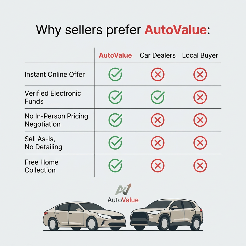
A column of green checks next to columns of red crosses tells the story in under a second, even before anyone reads the rows.
- 02
Compares real alternatives
Dealers and local buyers are exactly the options a car seller is weighing, so the comparison feels relevant and honest.
- 03
One fair concession
Giving car dealers a check for verified funds makes the table feel balanced and more believable than a clean sweep.
- 04
Answers objections
Each row tackles a known pain of selling a car: waiting, payment fraud, haggling, cleaning and logistics.
Full creative breakdown
Who this ad targets
The ad targets private car owners aged 25 to 60 who are about to sell their car and are comparing their options. They have heard stories about lowball dealer offers, time-wasting buyers and payment scams, and want a safe, simple process. They are rational decision makers who respond to clear comparisons. Busy parents and professionals who lack time to clean their car or meet buyers are a key segment, as are people selling an older or slightly damaged car as-is.
Copywriting analysis
The headline 'Why sellers prefer AutoValue:' implies that other people already chose the brand, adding light social proof, and the colon promises an explanation. The row labels are written as benefits, not features: 'Instant online offer', 'Verified electronic funds', 'No in-person pricing negotiation', 'Sell as-is, no detailing', 'Free home collection'. Each one removes a specific pain point. Words like 'instant', 'verified' and 'free' are strong trust and value triggers. Competitors are named generically as 'Car dealers' and 'Local buyer', which avoids legal issues while still being instantly recognizable.
Visual design
The design is clean and structured, built around a simple grid with thin dividing lines. A light grey background keeps it neutral, while red for the brand name and green and red icons provide the only strong colors. Using red for the brand and red for crosses is a risk, but the green checks clearly mark the winner. The flat beige car illustrations at the bottom add a friendly, approachable touch without distracting from the table. The logo sits centered between the table and the cars as a visual anchor.
How to adapt this template for your brand
- Identify the two alternatives your customers usually consider instead of you.
- List five benefits where you clearly win, phrased as pain points removed.
- Build a three-column table with your brand first and highlighted in your brand color.
- Use green checks and red crosses, and give competitors one honest check for credibility.
- Add a 'Why [customers] prefer [brand]' headline and your logo below the table.
Tips for automotive ads on Meta
Comparison ads perform well as retargeting creatives on Meta for people who visited your site but didn't convert, since they are already weighing options. On Google Display, keep the table at five rows or fewer so it stays readable in small placements. Test a version with review stars or a customer count to strengthen the social proof. For Stories, stack the table vertically and enlarge the icons. Make sure all comparison claims are accurate and defensible.
About this creative
The creative uses a light grey background with a clean comparison table. At the top, a headline reads 'Why sellers prefer AutoValue:' with the brand name in bold red. The table has three columns: AutoValue in red, Car Dealers and Local Buyer in black. Five rows list benefits: instant online offer, verified electronic funds, no in-person pricing negotiation, sell as-is with no detailing, and free home collection. AutoValue gets a green outlined checkmark in every row. Car dealers only get a green check for verified electronic funds and red crosses for the rest. Local buyers get red crosses in every row. Thin grey lines separate the rows. Below the table, the AutoValue logo, a stylized 'AV' mark with an upward arrow suggesting rising value, sits in the center above two flat beige illustrations of a sedan and an SUV facing each other. The overall look is clean, rational and easy to scan.
Meta ad · 1200 × 1200 · Automotive
Comparison Ad: Why Sellers Prefer AutoValue
This comparison ad from AutoValue pits its online car-buying service against car dealers and local buyers in a simple check-and-cross table. Five benefits run down the left, from instant online offers to free home collection, and AutoValue wins every row. It is a proven template for any service that beats familiar alternatives.
Added
All brand names and logos are property of their owners. Adplaylist is not affiliated with or endorsed by these brands.
Details
Ad copy
Primary text
Selling your car? Compare your options. AutoValue gives you an instant online offer, verified electronic payment, no haggling and free collection from your home – no detailing needed. See what your car is worth today.
Description
Instant online offer and free home collection
On-image text
Why sellers prefer AutoValue: | AutoValue | Car Dealers | Local Buyer | Instant Online Offer | Verified Electronic Funds | No In-Person Pricing Negotiation | Sell As-Is, No Detailing | Free Home Collection | AutoValue
Headline ideas for this template
- 1Dealer, buyer or AutoValue? The choice is clear.
- 2Sell your car without the hassle
- 3Five reasons sellers switch to AutoValue
- 4Skip the haggling, keep the value
- 5The easiest way to sell your car, compared
Meta image ad specs
| Placement | Ratio | Size (px) |
|---|---|---|
| Feed | 1:1 or 4:5 | 1080×1080 / 1080×1350 |
| Marketplace | 1:1 | 1200×1200 |
| Messenger inbox | 1:1 | 1200×1200 |
| Stories & Reels | 9:16 | 1080×1920 |
This template is 1:1. Request 4:5 or 9:16 to cover all placements.