Key takeaways
- Format: Two-column 'us vs them' comparison.
- Best for: Homeowners comparing multiple roofing quotes.
- Hook: Mr. Roof's promises vs other roofers' common problems.
- Reuse it: Match each of your benefits to a competitor pain point.
Available sizes
What is a comparison ad?
A comparison ad sets the product against an alternative, such as a competitor, the old way of doing things or a cheaper option, usually in a two-column layout or table. It helps buyers who are already weighing options see quickly why this one is the better choice.
See all comparison ads →Why this comparison ad works
- 01
Instant contrast
Parallel bullet lists let viewers compare at a glance without reading paragraphs.
- 02
Names the real fears
Hidden costs, messes and delays are exactly what homeowners dread about contractors.
- 03
No named competitor
'Other Roofing Companies' keeps it safe legally while letting viewers fill in their bad experiences.
- 04
Clear next step
The footer CTA turns the comparison straight into a free inspection request.
Full creative breakdown
Who this ad targets
This ad targets homeowners in the consideration phase who are actively collecting quotes or have had a bad experience with a contractor before. They are skeptical, price-aware and worried about surprises. The comparison format speaks to analytical buyers who want to justify their choice, and it works well for retargeting people who visited pricing or service pages without converting.
Copywriting analysis
Each Mr. Roof bullet is a concrete promise ('Never Overpay Promise', '1-Day Installations', 'Lifetime Warranty'), while each competitor bullet is the matching fear ('High Prices', 'Long-Drawn Out Projects'). This one-to-one mirroring makes the argument feel logical. The final Mr. Roof point adds social proof with numbers. Keeping the competitor side generic avoids attacking anyone directly. The CTA 'Get A Free Inspection Today!' is urgent and low-risk. Note that '40+ Years' differs from the '60 Years in Business' claim in other ads, so claims should be kept consistent.
Visual design
A blurred house-and-garden photo sets a residential context behind two crisp white cards. Contrasting header boxes, navy for Mr. Roof and light blue for competitors, separate the sides while staying on-brand. Small light-blue square bullets keep lists tidy. The large 'VS' badge anchors the center, and a navy footer bar frames the CTA in bold white type for strong readability.
How to adapt this template for your brand
- List your top five benefits and the matching competitor pain points.
- Create two side-by-side cards with contrasting header colors.
- Keep the competitor column generic, such as 'Other Companies'.
- Place a bold 'VS' badge between the columns.
- Add a footer bar with a clear, low-risk CTA.
Tips for roofing ads on Meta
On Meta, comparison ads perform well in feed placements where users pause to read, so use the square format for Facebook and Instagram feeds. Keep competitor claims generic and truthful to stay within ad policies. Pair with a 'Get Quote' CTA and a landing page that repeats the comparison. Test a version with a star rating or customer count in the header to boost trust.
About this creative
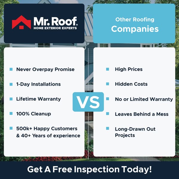
This square Mr. Roof ad uses a classic two-column comparison layout over a softened photo of a house and trees. The left column is headed by a navy box with the Mr. Roof logo, while the right column is headed by a light-blue box labelled 'Other Roofing Companies'. Each column is a white card with five bullet points. Mr. Roof's side lists the Never Overpay Promise, 1-Day Installations, Lifetime Warranty, 100% Cleanup, and 500k+ Happy Customers with 40+ years of experience. The competitor side mirrors each point with a negative: High Prices, Hidden Costs, No or Limited Warranty, Leaves Behind a Mess, and Long-Drawn Out Projects. A bold light-blue 'VS' badge sits between the columns. A navy footer bar carries the CTA 'Get A Free Inspection Today!'. The parallel structure makes the contrast instant and positions Mr. Roof as the safe, transparent choice.
Meta ad · 338 × 600 · Roofing
Mr. Roof vs Other Roofers Comparison Ad Template
This square comparison ad from Mr. Roof puts its promises side by side with the common pain points of other roofing companies. It's a classic 'us vs them' format that helps service brands stand out in a crowded, low-trust market. Use it for consideration campaigns and retargeting homeowners comparing quotes.
Added
All brand names and logos are property of their owners. Adplaylist is not affiliated with or endorsed by these brands.
Details
Ad copy
Primary text
Not all roofers are created equal. With Mr. Roof you get our Never Overpay Promise, 1-day installations, a lifetime warranty and a 100% cleanup – no hidden costs, no mess. See the difference with a free inspection.
Description
Lifetime warranty. 1-day installs. No hidden costs.
On-image text
Mr. Roof – Home Exterior Experts | Other Roofing Companies | Never Overpay Promise | 1-Day Installations | Lifetime Warranty | 100% Cleanup | 500k+ Happy Customers & 40+ Years of experience | VS | High Prices | Hidden Costs | No or Limited Warranty | Leaves Behind a Mess | Long-Drawn Out Projects | Get A Free Inspection Today!
Headline ideas for this template
- 1Why Homeowners Switch to Mr. Roof
- 2No Hidden Costs. No Mess. No Delays.
- 3See How Mr. Roof Compares
- 4The Roofer Without the Headaches
- 5Lifetime Warranty vs Limited Warranty
Meta image ad specs
| Placement | Ratio | Size (px) |
|---|---|---|
| Feed | 1:1 or 4:5 | 1080×1080 / 1080×1350 |
| Marketplace | 1:1 | 1200×1200 |
| Messenger inbox | 1:1 | 1200×1200 |
| Stories & Reels | 9:16 | 1080×1920 |
This template is 1:1. Request 4:5 or 9:16 to cover all placements.