Key takeaways
- Format: Brand-named feature callout with behind-the-scenes proof
- Best for: Positioning against a free or default alternative
- Hook: What your city can't – a gap everyone recognises
- Reuse it: Show your sorting or production process under a positioning line
Available sizes
What is a feature callout ad?
A feature callout ad is a static image that shows a single product with short text labels pointing to its key features or benefits, usually joined to the product by thin lines. It explains several selling points at a glance without a long caption, which is why it's common for supplements, skincare, electronics and kitchenware.
See all feature callouts ads →Why this feature callouts ad works
- 01
Clear positioning
Comparing to city recycling explains the value without listing features.
- 02
Behind-the-scenes proof
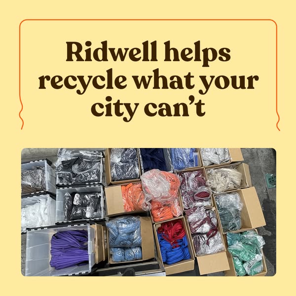
Sorted boxes show the work actually happens, building trust.
- 03
Colour grid
The rainbow of boxes is visually satisfying and stops the scroll.
- 04
Brand named
Putting Ridwell in the headline builds name recall in a crowded feed.
Full creative breakdown
Who this ad targets
This ad targets households in Ridwell's service areas who already recycle at the curb but are frustrated by everything their city refuses, such as textiles, cords and plastic film. They are motivated but sceptical people who want proof that their efforts matter. The organised, behind-the-scenes look appeals to detail-oriented, practical buyers in their thirties and forties who research before signing up.
Copywriting analysis
Ridwell helps recycle what your city can't is a clean positioning statement. The verb helps keeps the tone modest and collaborative rather than boastful. What your city can't defines the brand by the gap it fills, so viewers instantly understand where it fits alongside their existing curbside bin. Naming the city as the limitation also avoids blaming the customer. Putting the brand name first is a good choice for later-funnel or retargeting audiences who need recall. The primary text adds emotional reasons to act: community, planet and convenience.
Visual design
A two-panel layout places the headline in a warm yellow card with a hand-drawn orange outline, consistent with the rest of the Ridwell set. The overhead photo below works almost like a pattern because of the repeating boxes and varied colours. Rounded corners keep the look soft. The cool tones of the textiles contrast nicely with the warm yellow panel above.
How to adapt this template for your brand
- Write one line that positions you against the default alternative
- Include your brand name in the line for recall
- Photograph your process from above for a pattern-like grid
- Sort items by colour to make the photo more satisfying
- Use the same frame and font as your other ads to build a series
Tips for recycling ads on Meta
Run this square creative in Meta Feed on Facebook and Instagram, where 1:1 fills the screen without cropping. Keep the on-image headline in the top half so it stays readable in the preview. Pair it with a Learn More or Sign Up button and a zip-code-targeted audience, because Ridwell only serves selected US cities. Rotate it with two or three sibling cards from the same set every two weeks to avoid ad fatigue, and test Advantage+ placements against Feed-only.
About this creative
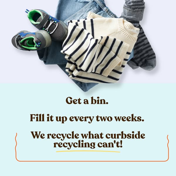
This square ad combines a brand promise with visible proof. The top half is a warm butter-yellow panel framed by a thin hand-drawn orange line, holding a three-line headline in the dark-brown rounded serif: Ridwell helps recycle what your city can't. Below, a wide rounded photo shows an overhead view of a warehouse floor covered with cardboard boxes and clear plastic bins. Each one holds a different colour of bagged textiles or cords: purple, orange, blue, red, burgundy, teal and white. The orderly grid of colour makes the sorting process look careful and organised. It is one of the few ads in the set that names the brand directly on the image. The creative answers the common doubt about whether items collected for recycling are really processed, showing that items are sorted by type, ready for a second life.
Meta ad · 338 × 600 · Recycling
Ridwell Helps Recycle What Your City Can't
This square feature callout ad shows boxes of sorted clothing and textiles under the headline Ridwell helps recycle what your city can't. It positions the brand against municipal recycling. Use this format to show proof of sorting and highlight your unique service gap.
Added
All brand names and logos are property of their owners. Adplaylist is not affiliated with or endorsed by these brands.
Details
Ad copy
Primary text
Wasting less, made easy. Get pickups from your 🏠 Keep stuff out of the landfill 🌿 Do good in your community ❤️ Save the 🌎
Description
Pickups from your doorstep
On-image text
Ridwell helps recycle what your city can't
Headline ideas for this template
- 1Your city can't recycle it. We can.
- 2Old clothes, cords and more – picked up from home
- 3See where your textiles go next
- 4Recycling beyond the curb
- 5We sort it so you don't have to
Meta image ad specs
| Placement | Ratio | Size (px) |
|---|---|---|
| Feed | 1:1 or 4:5 | 1080×1080 / 1080×1350 |
| Marketplace | 1:1 | 1200×1200 |
| Messenger inbox | 1:1 | 1200×1200 |
| Stories & Reels | 9:16 | 1080×1920 |
This template is 1:1. Request 4:5 or 9:16 to cover all placements.