Key takeaways
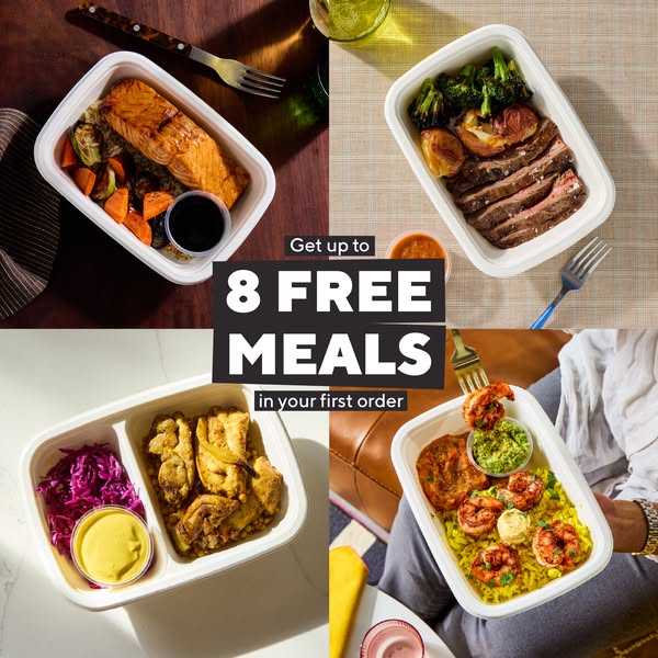
- Format: 2x2 product grid with a centred offer label
- Best for: Acquisition campaigns for services with a broad, varied menu
- Hook: Free: "Get up to 8 free meals in your first order"
- Reuse it: Use four of your most varied products and put your strongest first-order offer in the centre
Available sizes
What is an offer ad?
An offer ad leads with a deal, such as a percentage off, free shipping or a first-order discount, as the main hook. It's built to convert people who already know the brand or are close to buying, and works best with a clear deadline or condition.
See all offer / discount ads →Why this offer / discount ad works
- 01
Variety at a glance
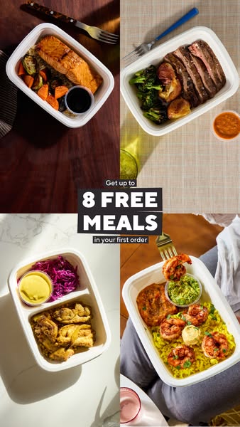
Four different cuisines in one frame show there is something for everyone without a single word of copy.
- 02
Centre-weighted offer
Placing the label where the grid lines meet makes it the natural focal point.
- 03
Free beats percent
"8 free meals" feels more tangible and generous than an equivalent discount percentage.
- 04
Real-life settings
Different tables and a lap shot make the meals feel like everyday dinners, not catalogue items.
Full creative breakdown
Who this ad targets
Deal-motivated households, couples and singles aged roughly 25–50 who want variety without cooking. The ad appeals to people who get bored of repeating the same few dinners and want salmon one night and shrimp the next. Because the offer is about free meals rather than a feature, it suits cold audiences and broad targeting where people have not heard of CookUnity yet. It also fits lapsed meal kit users looking for a better first-order deal.
Copywriting analysis
The copy is stripped to a single offer and nothing else. "Get up to" softens the claim legally while keeping the headline number big. "8 FREE MEALS" is set in heavy capitals so it can be read at thumbnail size. "In your first order" qualifies the deal without sounding like small print. By leaving out features and the brand slogan, the ad lets the food photography communicate quality and variety while the copy handles only motivation. The brand name lives in the primary text and page name instead.
Visual design
The 2x2 grid uses four contrasting backgrounds – dark wood, beige weave, white marble and a sofa scene – which keeps each quadrant distinct while the identical white trays tie them together. The central black label with white and outlined text sits on top of the grid seams, creating a strong focal point. Natural window light and soft shadows give an editorial, appetising feel. Colour comes from the food itself: orange salmon, red cabbage, yellow rice and green guacamole.
How to adapt this template for your brand
- Select four products that look clearly different from each other in colour, shape and type.
- Shoot each one on a different surface or setting, keeping the packaging consistent.
- Arrange them in a 2x2 grid with no gaps and a strong centre point.
- Place a solid-colour label in the centre with your offer in three stacked lines.
- Test the number in the offer (e.g. 6 vs 8 free) and the label colour against your brand palette.
Tips for ready meals ads on Meta
This works best on Meta as a cold-audience prospecting ad with broad or Advantage+ targeting, because the offer and variety carry the message without needing prior awareness. Use primary text to name the dishes for extra appetite appeal. Rotate in new dish combinations every few weeks to fight creative fatigue while keeping the centred label identical for recognition. The square version also runs on Facebook right column and Marketplace, so check the offer stays legible at thumbnail size.
About this creative
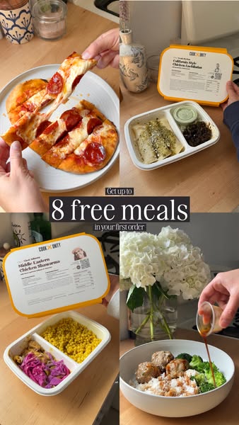
The creative is built as a 2x2 grid, with each quadrant showing a different CookUnity meal in its white tray: glazed salmon with roasted vegetables on a dark wooden table, sliced steak with broccoli and potatoes on a woven placemat, chicken shawarma with red cabbage and yellow sauce on white marble, and garlic shrimp over yellow rice with guacamole held on someone's lap. Each quadrant has its own surface, light and props such as forks and drinks, so the grid feels like four real moments rather than one studio shot. In the exact centre, a black label block stacks the offer: "Get up to", a large white "8 FREE MEALS", and "in your first order". The offer is the only text, so the message is impossible to miss, while the food grid answers the question of what you actually get. This version is a 1:1 square layout that works across feed, right column and Marketplace placements.
Meta ad · 338 × 600 · Ready Meals
Ready Meals Ad Template: Four-Dish Grid With Free Meals Offer
This CookUnity ad places four very different ready meals in a 2x2 grid and stamps a bold "8 free meals" offer in the centre. Use this offer-led format when your strength is variety and you want a generous first-order deal to do the selling.
Added
All brand names and logos are property of their owners. Adplaylist is not affiliated with or endorsed by these brands.
Details
Ad copy
Primary text
Salmon, steak, chicken shawarma, garlic shrimp – chef-crafted meals delivered fresh and ready in minutes. Get up to 8 free meals in your first order.
Description
Chef-made meals, delivered fresh
On-image text
Get up to | 8 FREE MEALS | in your first order
Headline ideas for this template
- 1Get up to 8 free meals in your first order
- 2Four cuisines, zero cooking
- 3Dinner for the week, on us
- 4Salmon tonight, shrimp tomorrow
- 5Your first 8 meals are free
Meta image ad specs
| Placement | Ratio | Size (px) |
|---|---|---|
| Feed | 1:1 or 4:5 | 1080×1080 / 1080×1350 |
| Marketplace | 1:1 | 1200×1200 |
| Messenger inbox | 1:1 | 1200×1200 |
| Stories & Reels | 9:16 | 1080×1920 |
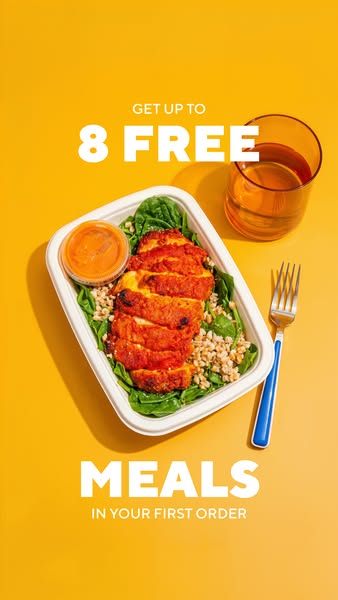
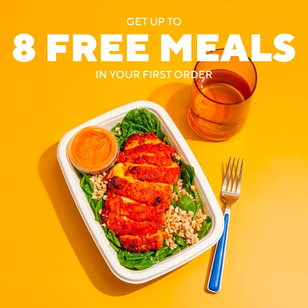
This template is 1:1. Request 4:5 or 9:16 to cover all placements.