Key takeaways
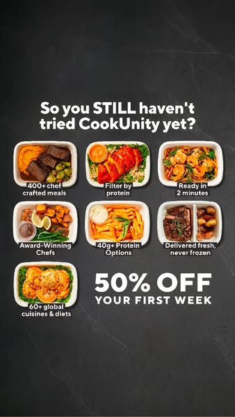
- Format: Dark-background feature callout grid with one product photo per benefit
- Best for: Retargeting warm audiences who visited the site but did not subscribe
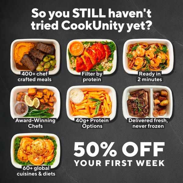
- Hook: Callout: "So you STILL haven't tried CookUnity yet?"
- Reuse it: Swap the dishes and captions for your own top benefits and keep the teasing headline
Available sizes
What is a feature callout ad?
A feature callout ad is a static image that shows a single product with short text labels pointing to its key features or benefits, usually joined to the product by thin lines. It explains several selling points at a glance without a long caption, which is why it's common for supplements, skincare, electronics and kitchenware.
See all feature callouts ads →Why this feature callouts ad works
- 01
Calls out the viewer
The direct, slightly cheeky question makes undecided prospects feel seen and nudges them to act.
- 02
Benefit stacking
Seven short callouts answer most objections – speed, quality, protein, freshness, variety – in one image.
- 03
Proof through pictures
Each claim sits on a real meal photo, so the benefits feel concrete rather than abstract.
- 04
Offer fills the gap
Using the empty grid slot for 50% off ends the scan path on the call to action.
Full creative breakdown
Who this ad targets
Warm prospects who have seen CookUnity ads, visited the site or started sign-up without finishing. They are typically 25–50, health- and time-conscious, and comparing meal delivery services. The protein callouts speak to fitness-minded buyers, while chef quality and freshness speak to foodies who doubt frozen meals. The headline only fully lands with people who already know the brand, which makes it ideal for retargeting rather than cold audiences.
Copywriting analysis
The headline is the star: a conversational question that sounds like a friend teasing you, with STILL in capitals for emphasis. It assumes awareness, which is exactly right for retargeting. The seven captions are written in two to five words each, starting with numbers or verbs for fast scanning (400+, Filter, Ready, 40g+, Delivered, 60+). Numbers add credibility. "Delivered fresh, never frozen" directly tackles a key objection. The offer is set in the biggest type after the headline, ending the read on value.
Visual design
The dark slate texture creates a premium, chalkboard-menu feel and makes the bright food the brightest thing in the frame. All trays are cut out and shown at similar angles and sizes, keeping the grid tidy. White bold sans-serif text with a subtle shadow stays readable over both slate and photos. The layout follows a clear top-to-bottom flow: headline, benefits, offer. Consistent white trays tie seven very different dishes into one system.
How to adapt this template for your brand
- Write a teasing headline that speaks to people who know you but have not bought, like "Still thinking about it?"
- List your six or seven strongest benefits in five words or fewer each.
- Pair every benefit with a product photo cut out on a consistent background.
- Use a dark or textured background so colourful products stand out.
- Place the offer in the last grid slot and test against a version with a guarantee instead.
Tips for ready meals ads on Meta
Use this on Meta for retargeting audiences such as 30-day website visitors, add-to-cart abandoners and video viewers. Exclude existing subscribers so the headline never insults customers. The busy grid has a lot of text, so keep primary text short. Watch frequency closely, as the teasing tone can become annoying after several views. In Stories and Reels, keep the top 14% and bottom 20% free of key text so the profile bar and CTA sticker do not cover it.
About this creative
The creative sits on a dark charcoal slate background with a bold white headline across the top: "So you STILL haven't tried CookUnity yet?" The capitalised STILL adds a teasing, slightly impatient tone. Below, seven meal trays are arranged in a grid, each with a short white caption that turns the photo into a feature callout: 400+ chef crafted meals, filter by protein, ready in 2 minutes, award-winning chefs, 40g+ protein options, delivered fresh never frozen, and 60+ global cuisines and diets. The dishes range from short rib with sweet potato mash to shrimp pasta, salmon, penne and ravioli, so every caption is backed by an appetising image. The empty final grid slot holds the offer in large white letters: 50% OFF YOUR FIRST WEEK. The dark background makes the colourful food pop and gives a premium, restaurant-menu feel. This version is cut in a 9:16 vertical layout built for Stories and Reels placements.
Meta ad · 338 × 600 · Ready Meals
Ready Meals Ad Template: "So You STILL Haven't Tried" Feature Callouts
This CookUnity ad calls out undecided prospects with a playful "STILL haven't tried" headline, then lists seven benefits under seven meal photos. Use this feature callout format for retargeting people who already know your brand but have not converted yet.
Added
All brand names and logos are property of their owners. Adplaylist is not affiliated with or endorsed by these brands.
Details
Ad copy
Primary text
400+ chef-crafted meals, 40g+ protein options, delivered fresh and ready in 2 minutes. What are you waiting for? Get 50% off your first week.
Description
50% off your first week
On-image text
So you STILL haven't tried CookUnity yet? | 400+ chef crafted meals | Filter by protein | Ready in 2 minutes | Award-Winning Chefs | 40g+ Protein Options | Delivered fresh, never frozen | 60+ global cuisines & diets | 50% OFF YOUR FIRST WEEK
Headline ideas for this template
- 1So you STILL haven't tried CookUnity?
- 27 reasons you'll wish you tried this sooner
- 3Still cooking every night? Why?
- 4400+ chef meals are waiting for you
- 5You looked. Now try it for 50% off
Meta image ad specs
| Placement | Ratio | Size (px) |
|---|---|---|
| Feed | 1:1 or 4:5 | 1080×1080 / 1080×1350 |
| Marketplace | 1:1 | 1200×1200 |
| Messenger inbox | 1:1 | 1200×1200 |
| Stories & Reels | 9:16 | 1080×1920 |
This template is 1:1. Request 4:5 or 9:16 to cover all placements.