Key takeaways
- Format: Centred product shot with wordplay headline
- Best for: Protein, supplement and better-for-you drink brands
- Hook: Wordplay: all the sweetness, none of the sweets
- Reuse it: Swap the tub and fruit, keep the centred layout and two-line headline
Available sizes
What is a product shot ad?
A product shot ad puts the product itself at the centre of the frame, usually on a clean or styled background with little text. It works best when the packaging or product is distinctive enough to stop the scroll and the viewer already understands what it does.
See all product shot ads →Why this product shot ad works
- 01
Clever wordplay
Sweetness versus sweets turns a sugar claim into a memorable line.
- 02
Benefit repeated twice
0g added sugar appears on the label and as the closing line, so it can't be missed.
- 03
Fruit signals flavour
Fresh grapes make the drink look light and fruity rather than chalky.
- 04
Line art adds personality
The illustrated drinker shows the product as a refreshing drink and adds a friendly touch.
Full creative breakdown
Who this ad targets
This ad targets fitness-minded adults aged 20 to 40 who track protein but are tired of thick milkshake-style powders. It also reaches people trying to cut sugar who crave sweet drinks and want a healthier alternative. They shop online, often on Amazon or brand stores, and compare protein per serving and price. The light, fruity look appeals to people who prefer refreshing post-workout drinks, especially in warm weather.
Copywriting analysis
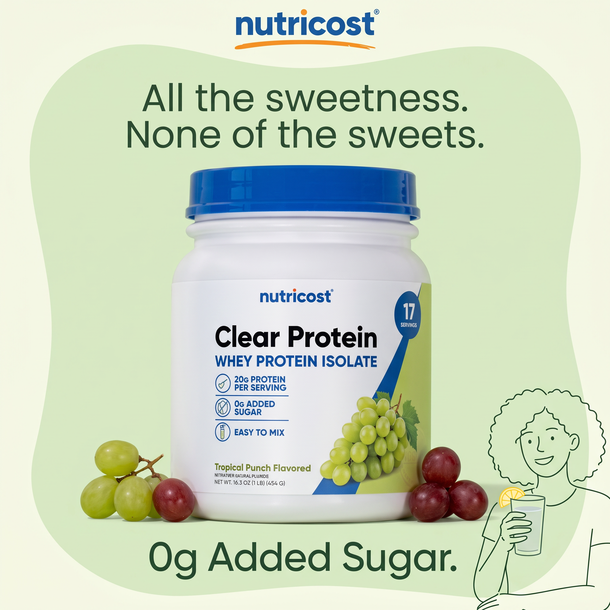
The headline is a neat contrast: all the sweetness, none of the sweets. It promises the pleasure of a sweet treat without the downside of sugar, in six short words. The closing line, 0g Added Sugar, turns the joke into a hard fact. The label adds the rational details: 20g protein, easy to mix and 17 servings. The copy is friendly and simple, avoiding gym jargon. One small issue is the label says Tropical Punch while grapes are shown, which could confuse viewers about the flavour.
Visual design
The tub sits dead centre, giving it full attention. A pale green background and darker green blob create soft depth and match the label colors. The blue lid and logo stand out as the strongest colors. Grapes frame the base and add texture. The line drawing overlaps the frame edge, adding a playful, hand-drawn element. Text is stacked top and bottom, leaving the middle clear for the product.
How to adapt this template for your brand
- Place your product in the centre on a soft background shape in your brand color.
- Write a two-line headline using a contrast or wordplay about your main benefit.
- Add fresh ingredients or fruit around the product to show flavour.
- Repeat the key benefit as a short closing line at the bottom.
- Add a small illustration of someone enjoying the product for personality.
Tips for health & fitness ads on Meta
On Meta, this works as a feed ad for cold audiences interested in fitness and healthy eating. Make sure the fruit matches the flavour on the label to avoid confusion. For Google Shopping and display, use the clean tub shot with the headline. Test a summer version with ice and a glass for Reels and Stories, and compare it to the plain tub shot.
About this creative
This square ad for Nutricost promotes its Clear Protein whey isolate. A white tub with a blue lid stands in the centre on a pale green background with a soft organic blob shape behind it. The Nutricost logo sits at the top with its orange swoosh. Above the tub, the headline All the sweetness. None of the sweets. is set in large dark green type over two lines. Green and red grapes surround the base of the tub and echo the grapes on the label. The label lists 20g protein per serving, 0g added sugar and easy to mix, with a 17 servings badge. In the bottom right, a line drawing of a smiling woman with curly hair holds a glass of drink with a lemon slice. The closing line 0g Added Sugar. repeats the main benefit at the bottom. The ad positions clear protein as a refreshing, sweet-tasting drink rather than a heavy shake.
Meta ad · 1200 × 1200 · Health & Fitness
Protein Powder Ad Template: Nutricost Clear Protein Product Shot
This Nutricost ad places a tub of clear whey protein in the centre, framed by grapes and a light green blob, with a wordplay headline and a bold 0g added sugar line. It is a simple product shot template for protein and supplement brands that want to sell flavour and health together.
Added
All brand names and logos are property of their owners. Adplaylist is not affiliated with or endorsed by these brands.
Details
Ad copy
Primary text
Craving something sweet? Nutricost Clear Protein tastes like a fruity drink, not a heavy shake. 20g of whey protein isolate per serving, 0g added sugar and easy to mix. All the sweetness, none of the sweets.
Description
20g protein, 0g added sugar, easy to mix.
On-image text
nutricost | All the sweetness. None of the sweets. | 0g Added Sugar. | Pack: nutricost – Clear Protein – WHEY PROTEIN ISOLATE – 20g PROTEIN PER SERVING – 0g ADDED SUGAR – EASY TO MIX – 17 SERVINGS – Tropical Punch Flavored – NET WT. 16.3 OZ (1 LB) (454 G)
Headline ideas for this template
- 1Protein that tastes like juice
- 220g protein, 0g added sugar
- 3Ditch the heavy shake
- 4Your sweet tooth's new best friend
- 5Refreshing protein, finally
Meta image ad specs
| Placement | Ratio | Size (px) |
|---|---|---|
| Feed | 1:1 or 4:5 | 1080×1080 / 1080×1350 |
| Marketplace | 1:1 | 1200×1200 |
| Messenger inbox | 1:1 | 1200×1200 |
| Stories & Reels | 9:16 | 1080×1920 |
This template is 1:1. Request 4:5 or 9:16 to cover all placements.