Key takeaways
- Format: Poster-style offer ad: headline banner, full outfit photo, outlined discount box.
- Best for: Tiered or bundle promotions that aim to raise average order value.
- Hook: 'Add more, save more' plus a concrete 'up to $80 off' number.
- Reuse it: Show a complete outfit so the offer feels like buying the whole look.
Available sizes
What is an offer ad?
An offer ad leads with a deal, such as a percentage off, free shipping or a first-order discount, as the main hook. It's built to convert people who already know the brand or are close to buying, and works best with a clear deadline or condition.
See all offer / discount ads →Why this offer / discount ad works
- 01
Clear offer mechanics
'Add more, save more' explains the promotion in four words, so shoppers instantly know bigger baskets mean bigger savings.
- 02
Concrete dollar value
'Up to $80 off' is more tangible than a percentage and anchors high value in the shopper's mind.
- 03
Full look sells the bundle
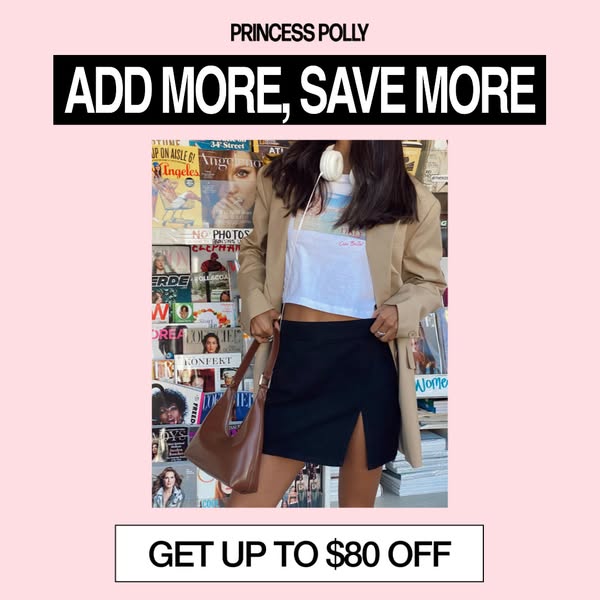
Blazer, tee, skirt and bag in one photo show several products at once, nudging people to buy the complete outfit.
- 04
Thumb-stopping pink
The soft pink background with black blocks is on-brand and stands out from photo-heavy feeds.
Full creative breakdown
Who this ad targets
The ad targets young women around 18 to 30 who shop fast fashion regularly and respond to deals, especially during sale periods like back to school, Black Friday or seasonal events. It works for both prospecting and retargeting: new shoppers see a reason to try the brand, and warm audiences with items in their cart get a push to add more. Shoppers interested in city style, blazers and off-duty looks will find the outfit relevant.
Copywriting analysis
The copy is built around a simple cause-and-effect promise. 'Add more, save more' uses repetition and rhythm, which makes it memorable and easy to scan. Placing it in a black banner makes it the headline, while 'Get up to $80 off' in the bottom box delivers the payoff like a call to action. The word 'up to' keeps the offer honest while still leading with the biggest number. The primary text should explain the tiers briefly and add time pressure. A clear CTA like 'Shop Now' or 'Shop the Sale' completes the structure.
Visual design
The layout is a centered, poster-like stack on a pastel pink background. A solid black banner at the top and an outlined white box at the bottom frame the photo, creating a strong visual hierarchy: headline, image, offer. The busy magazine wall behind the model adds colour and urban energy, contrasting with the clean pink frame. Condensed bold sans-serif type in black and white matches Princess Polly's brand style and stays legible on small screens.
How to adapt this template for your brand
- Define a simple tiered offer and its maximum saving in dollars.
- Choose a photo showing a complete outfit with several products from your range.
- Place a solid banner headline at the top with a short, rhythmic offer line.
- Add the maximum saving in an outlined box at the bottom like a button.
- Use a soft brand colour background and link to a sale page that explains the tiers.
Tips for fashion ads on Meta
On Meta, run this during promotion windows and pair it with a sale landing page that shows the discount tiers clearly. Use it in prospecting and in add-to-cart retargeting, where it can lift order value. Create a 9:16 Stories version with the offer box above the bottom safe zone. Keep on-image text short as here, and put tier details in the primary text. Test the dollar figure against a percentage version.
About this creative
This square Princess Polly sale ad uses a pastel pink background with three stacked elements. At the top, PRINCESS POLLY appears in small black capitals above a solid black banner with the white headline ADD MORE, SAVE MORE. In the middle is a portrait photo of a model standing in front of a colourful wall of magazines at a newsstand. She wears an oversized beige blazer over a white cropped graphic tee, a black mini skirt with a front slit, white over-ear headphones around her neck and a brown leather shoulder bag, a complete off-duty city outfit. At the bottom, a white box with a thin black outline holds the offer: GET UP TO $80 OFF. The model's face is cropped above the lips, keeping the focus on the clothes. The layout reads like a poster: headline, outfit, offer. It encourages shoppers to buy a full look rather than one item, which is exactly what a tiered discount needs.
Meta ad · 338 × 600 · Fashion
Princess Polly 'Add More, Save More' Tiered Discount Ad
This Princess Polly ad promotes a tiered discount: add more items and save up to $80. A street-style photo of a model in a beige blazer and black mini skirt sits between a bold black headline banner and an outlined offer box, all on a soft pink background. Use it to lift average order value.
Added
All brand names and logos are property of their owners. Adplaylist is not affiliated with or endorsed by these brands.
Details
Ad copy
Primary text
The more you add, the more you save 💸 Get up to $80 off when you stock up on new-season blazers, skirts and tees. Limited time only – fill that cart.
Description
Tiered savings, limited time.
On-image text
PRINCESS POLLY; ADD MORE, SAVE MORE; GET UP TO $80 OFF
Headline ideas for this template
- 1Get Up to $80 Off
- 2Add More, Save More
- 3Bigger Cart, Bigger Savings
- 4Stock Up and Save Up to $80
- 5Buy the Whole Look for Less
Meta image ad specs
| Placement | Ratio | Size (px) |
|---|---|---|
| Feed | 1:1 or 4:5 | 1080×1080 / 1080×1350 |
| Marketplace | 1:1 | 1200×1200 |
| Messenger inbox | 1:1 | 1200×1200 |
| Stories & Reels | 9:16 | 1080×1920 |
This template is 1:1. Request 4:5 or 9:16 to cover all placements.