Key takeaways
- Format: Side-by-side us-vs-them comparison with three benefits each.
- Best for: DTC accessories and products that win on slimness or simplicity.
- Hook: A side-on view that makes the thickness gap visible in one second.
- Reuse it: Pick your one visible advantage and shoot both products from the angle that shows it.
Available sizes
What is a comparison ad?
A comparison ad sets the product against an alternative, such as a competitor, the old way of doing things or a cheaper option, usually in a two-column layout or table. It helps buyers who are already weighing options see quickly why this one is the better choice.
See all comparison ads →Why this comparison ad works
- 01
Visual proof first
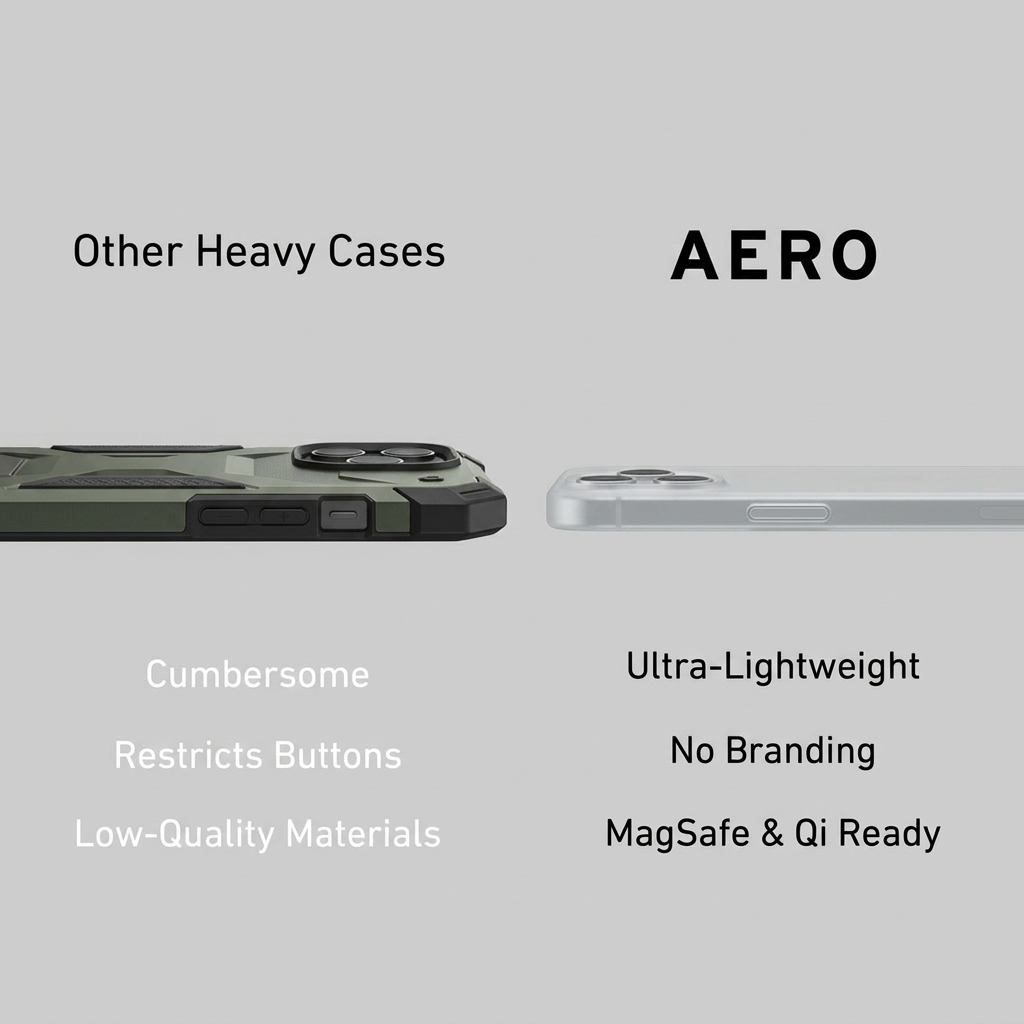
Shooting both cases side-on turns 'slim' from a claim into a fact. The viewer sees the difference before reading a word.
- 02
Parallel benefit lists
Each competitor weakness has a matching Aero strength on the same row. That makes scanning the comparison effortless.
- 03
Faded vs bold text
The competitor side uses pale, low-contrast text while Aero's is solid black. Typography itself signals the winner.
- 04
Unnamed competitor
'Other Heavy Cases' attacks a category, not a brand. It avoids legal risk and lets every rugged-case owner see themselves.
Full creative breakdown
Who this ad targets
The ad targets smartphone owners, especially iPhone users, who already use a rugged case and find it bulky. It speaks to design-conscious people in their 20s and 30s who want their phone to look clean and fit in a pocket, and who use MagSafe chargers or wallets. Interest targeting around Apple, minimalist design, tech accessories and new phone launches works well, as does timing campaigns around new iPhone releases when people buy new cases.
Copywriting analysis
The copy is built entirely on contrast. The left headline 'Other Heavy Cases' names the problem category, while 'AERO' on the right stands alone in bold capitals as the answer. The benefit lists are single words or short phrases, which keeps the ad readable at thumb-scroll speed. Negative words like 'Cumbersome' and 'Restricts' paint the old habit as annoying, while the Aero side combines a physical benefit (lightweight), an aesthetic one (no branding) and a technical one (MagSafe & Qi). 'No Branding' is a smart, less common angle that appeals to minimalists. A clearer protection claim would help reassure people switching away from rugged cases.
Visual design
The layout is a clean two-column grid on a flat light-grey background with no props. Both phones sit on the same horizontal axis at mid-height, inviting direct comparison. Headlines sit above and benefits below, perfectly mirrored. Colour is used sparingly: the olive-green rugged case is the only strong colour, which subtly makes it look heavy, while the frosted white Aero case blends into the background. Typography is a simple sans-serif, with weight and contrast doing the persuasive work.
How to adapt this template for your brand
- Find the single physical advantage your product has over the category norm.
- Shoot your product and a generic competitor from the exact angle that shows that difference.
- Place them side by side on a plain background, on the same horizontal line.
- Write three matching pairs of short benefits, competitor weakness vs your strength.
- Use faded text for the competitor and bold text for your brand to steer the eye.
Tips for e-commerce / dtc ads on Meta
On Meta, this works best in Feed at 1:1 or 4:5; keep the products large and centred so they survive small screens. For TikTok and Reels, turn it into a short video where a hand swaps the bulky case for Aero and slides the phone into a pocket. Avoid naming competitor brands in copy to stay within ad policies. Test it in retargeting too, since comparison ads help people who already know you overcome doubts before purchase.
About this creative
This Aero ad uses a classic 'us vs them' split on a flat light-grey background. On the left, labelled 'Other Heavy Cases', a thick olive-green rugged case is shown from the side, with chunky button covers and a raised camera bump. On the right, under the bold wordmark 'AERO', a frosted, almost invisible slim case sits on the same horizontal line, its profile a fraction of the rugged one. The side-on angle is the key decision: it turns thickness, the core benefit, into something you can see instantly. Below each product, three lines stack the argument. The competitor side reads 'Cumbersome', 'Restricts Buttons' and 'Low-Quality Materials' in faded white text, while Aero's side lists 'Ultra-Lightweight', 'No Branding' and 'MagSafe & Qi Ready' in solid black. The contrast in text weight quietly tells the viewer which side wins before they finish reading.
Meta ad · 1200 × 1200 · E-commerce / DTC
Phone Case Ad Template: Us vs Them Comparison
This square comparison ad for Aero puts a bulky rugged phone case side by side with an ultra-thin one. Three short benefit lines per side make the choice obvious. The format works for DTC accessories and any product that wins on weight, simplicity or design versus a clunky category norm.
Added
All brand names and logos are property of their owners. Adplaylist is not affiliated with or endorsed by these brands.
Details
Ad copy
Primary text
Still carrying a brick in your pocket? Aero is the ultra-light phone case that protects without the bulk. No logos, full button access and MagSafe & Qi ready. Your phone, just better protected.
Description
Ultra-light, logo-free, MagSafe ready
On-image text
Other Heavy Cases | AERO | Cumbersome | Restricts Buttons | Low-Quality Materials | Ultra-Lightweight | No Branding | MagSafe & Qi Ready
Headline ideas for this template
- 1Ditch the brick. Keep the protection.
- 2Your phone, minus the bulk
- 3Why carry extra weight?
- 4Slim enough to forget it's there
- 5The case that doesn't shout your logo
Meta image ad specs
| Placement | Ratio | Size (px) |
|---|---|---|
| Feed | 1:1 or 4:5 | 1080×1080 / 1080×1350 |
| Marketplace | 1:1 | 1200×1200 |
| Messenger inbox | 1:1 | 1200×1200 |
| Stories & Reels | 9:16 | 1080×1920 |
This template is 1:1. Request 4:5 or 9:16 to cover all placements.