Key takeaways
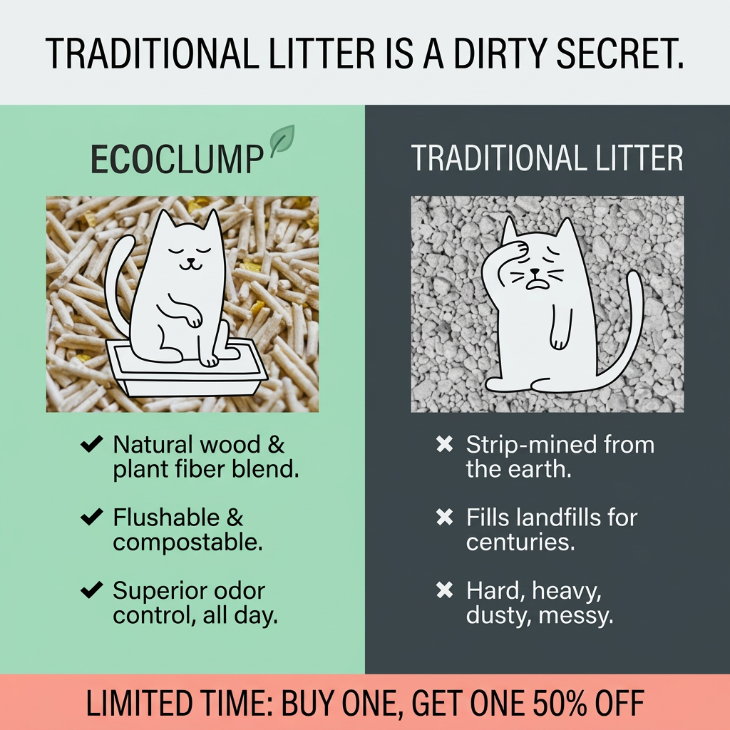
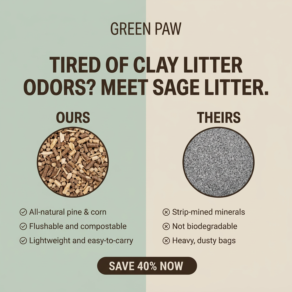
- Format: Comparison: problem product vs solution with texture panels.
- Best for: Eco alternatives with a strong environmental story.
- Hook: The clay problem. A better way.
- Reuse it: Name the category problem, then mirror three crosses with three ticks.
Available sizes
What is a comparison ad?
A comparison ad sets the product against an alternative, such as a competitor, the old way of doing things or a cheaper option, usually in a two-column layout or table. It helps buyers who are already weighing options see quickly why this one is the better choice.
See all comparison ads →Why this comparison ad works
- 01
Problem-solution headline
Two short sentences set up the conflict and promise the fix before any detail is read.
- 02
Upcycled ingredients
Pea and millet sound natural and familiar, making the litter feel safe and responsible.
- 03
Long-term impact framing
"Landfill for centuries" makes the environmental cost vivid and hard to ignore.
- 04
Editorial styling
Serif headline and paper texture give it the credibility of a magazine feature.
Full creative breakdown
Who this ad targets
Eco-conscious cat owners aged 25–45 who already buy sustainable products for themselves and feel uneasy about clay litter's environmental impact. They also want practical benefits such as less dust and lighter bags. Owners with respiratory sensitivities, apartment dwellers carrying litter upstairs and people who like supporting innovative, upcycled products are strong segments. Most of them discover new pet brands through social media and are comfortable buying online.
Copywriting analysis
The headline uses two punchy fragments, creating a clear narrative arc from problem to solution. "Their clay" vs "our revolutionary pellet" contrasts plain description with bold language to elevate the product. Each cross and tick pair covers the same theme: raw material, biodegradability and dust or weight. Parenthetical detail (landfill for centuries) adds emotional weight. "Revolutionary" and "zero dust" are strong claims that need support. The closing line summarises the category the product belongs to, but there's no brand name or CTA on the image.
Visual design
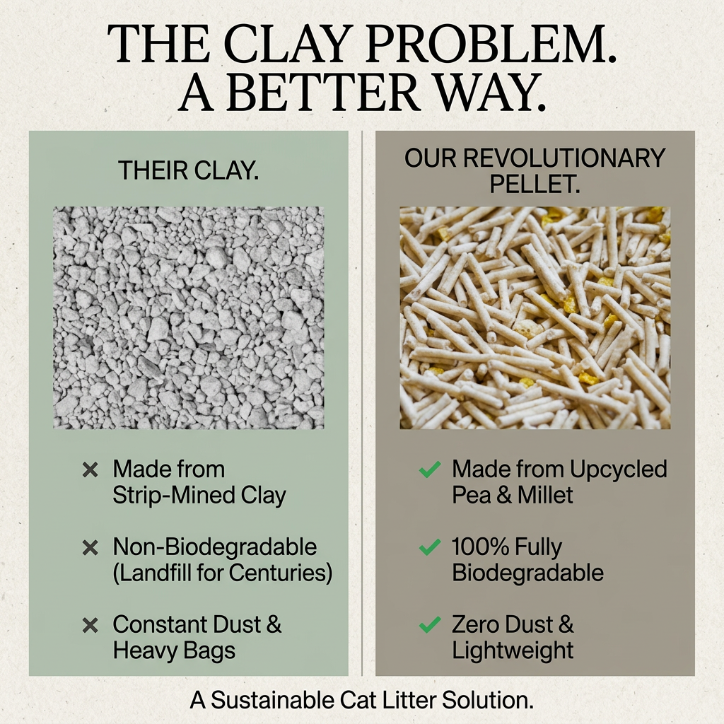
A textured paper background and large serif headline feel like a print editorial. The two panels in sage and taupe have equal size and structure for a fair-looking comparison. Square texture photos act as hard evidence: grey, dusty clay vs warm, natural pellets with yellow millet. Grey crosses are understated, while green ticks pop. A thin centre divider and bottom tagline frame the composition neatly.
How to adapt this template for your brand
- Write a two-part headline naming the category problem and your better way.
- Create two equal panels in muted colours, theirs on the left.
- Add a square texture close-up of each product.
- List three crosses and three matching ticks covering the same themes.
- Add your logo and a short CTA at the bottom for conversion versions.
Tips for pets ads on Meta
Use on Meta for cold eco-interested audiences, ideally linking to a page explaining the upcycling story. Add your logo and an offer for conversion campaigns, since this version is unbranded. Keep claims such as 100% biodegradable and zero dust accurate. For video, show a dust test pouring both litters. A carousel could expand each point into its own card. Also test a 4:5 crop for extra feed height.
About this creative
An editorial comparison ad for an upcycled cat litter on a textured off-white paper background. A large black serif headline at the top reads: the clay problem, a better way. Two tall panels sit side by side, separated by a thin vertical line. The left panel is sage green, labelled their clay, with a square close-up of grey clay granules. Below are three grey crosses: made from strip-mined clay, non-biodegradable (landfill for centuries), and constant dust and heavy bags. The right panel is warm taupe, labelled our revolutionary pellet, with a close-up of cream cylindrical pellets mixed with yellow millet pieces. Below are three green ticks: made from upcycled pea and millet, 100% fully biodegradable, and zero dust and lightweight. A closing line at the bottom says a sustainable cat litter solution. There is no logo, product pack or offer, so the ad works as a brand-neutral template focused on education.
Meta ad · 1200 × 1200 · Pets
Sustainable Cat Litter Ad: The Clay Problem Comparison
This ad frames clay litter as a problem and an upcycled pea and millet pellet as the better way, using two side-by-side panels with texture close-ups and three crosses against three ticks. It is a comparison format for eco brands that want to educate buyers about the hidden costs of the default product.
Added
All brand names and logos are property of their owners. Adplaylist is not affiliated with or endorsed by these brands.
Details
Ad copy
Primary text
Clay litter is strip-mined, sits in landfill for centuries and fills your home with dust. Our revolutionary pellet is made from upcycled pea and millet: 100% biodegradable, dust-free and lightweight. A better way to litter.
Description
Upcycled, biodegradable, dust-free litter
On-image text
THE CLAY PROBLEM. A BETTER WAY. | THEIR CLAY. | OUR REVOLUTIONARY PELLET. | Made from Strip-Mined Clay | Non-Biodegradable (Landfill for Centuries) | Constant Dust & Heavy Bags | Made from Upcycled Pea & Millet | 100% Fully Biodegradable | Zero Dust & Lightweight | A Sustainable Cat Litter Solution.
Headline ideas for this template
- 1Clay Litter Has a Dirty Secret
- 2Upcycled Litter, Zero Dust
- 3Made From Peas, Not Mines
- 4The Lightweight, Biodegradable Switch
- 5A Better Way to Litter
Meta image ad specs
| Placement | Ratio | Size (px) |
|---|---|---|
| Feed | 1:1 or 4:5 | 1080×1080 / 1080×1350 |
| Marketplace | 1:1 | 1200×1200 |
| Messenger inbox | 1:1 | 1200×1200 |
| Stories & Reels | 9:16 | 1080×1920 |
This template is 1:1. Request 4:5 or 9:16 to cover all placements.