Key takeaways
- Format: Lifestyle scene with a pain-highlight overlay and keyword-coloured question.
- Best for: Physio clinics targeting a specific profession with repetitive strain or posture pain.
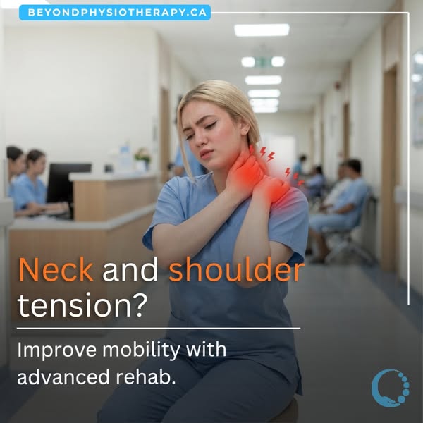
- Hook: Glowing red pain on a nurse mid-shift – a scene healthcare workers live daily.
- Reuse it: Swap the profession and setting, keep the pain glow and coloured keywords.
Available sizes
What is a lifestyle ad?
A lifestyle ad shows the product being used in a real setting by the kind of person who buys it. Instead of listing features, it sells the feeling or outcome of owning the product, which makes it a strong fit for fashion, home, travel and wellness brands.
See all lifestyle ads →Why this lifestyle ad works
- 01
Profession-specific targeting
Showing a nurse in a hospital tells healthcare workers this clinic understands their job, which is more persuasive than a generic patient.
- 02
Visible pain points
Red glows and lightning bolts make an invisible symptom visible, so the problem is understood in a split second.
- 03
Colour-coded keywords
Orange 'Neck' and 'shoulder' link the headline to the pain glow, guiding the eye from image to text.
- 04
Consistent brand series
The same layout, pill, frame and logo as the back-pain ad build recognition across a multi-condition campaign.
Full creative breakdown
Who this ad targets
The ad primarily targets nurses, healthcare assistants and other hospital staff, aged roughly 22–50, who work long shifts involving lifting, bending and stress that cause neck and shoulder tension. More broadly, it appeals to anyone with a physically and mentally demanding job. These viewers are often time-poor, have extended health benefits that cover physiotherapy, and tend to put others' care before their own, so the ad gives them permission to prioritise their recovery.
Copywriting analysis
The headline is a short, symptom-led question, 'Neck and shoulder tension?', that lets viewers self-diagnose. Choosing 'tension' rather than 'pain' feels relatable and less alarming, matching how people describe everyday stiffness. Colouring the body parts in orange makes the headline scannable and ties it to the visual. The sub-line, 'Improve mobility with advanced rehab', uses 'advanced' to suggest expertise and modern techniques, differentiating from basic massage. The copy doesn't mention nurses explicitly – the image does that work – keeping the text broad enough for other audiences. The CTA is left to the platform button.
Visual design
The nurse is centred with the blurred corridor providing context and depth. Blue scrubs and the hospital's cool palette dominate, making the warm red-orange pain glow and orange keywords stand out by contrast. A darkened lower band keeps the white headline readable. The blue website pill, thin white frame and corner logo repeat the brand's template for series consistency. The lightning-bolt icons add a graphic, almost illustrative layer to a photographic scene.
How to adapt this template for your brand
- Pick a profession you want to reach and show them in their workplace.
- Pose the model touching the affected area and add a red glow over it.
- Write a symptom-led question naming the body parts.
- Colour the body-part words in the same warm tone as the glow.
- Keep your brand pill, frame and logo consistent across each condition you promote.
Tips for physiotherapy ads on Meta
Run this on Meta Feed with targeting around healthcare job titles, hospitals and nursing interests within a local radius. Schedule delivery around shift patterns, such as evenings and weekends, when staff are scrolling after work. In the primary text, mention flexible or extended hours and health benefits coverage. Run it alongside the back-pain ad as a multi-condition campaign and let Meta optimise towards the best performer. Keep claims factual to avoid health ad policy issues.
About this creative
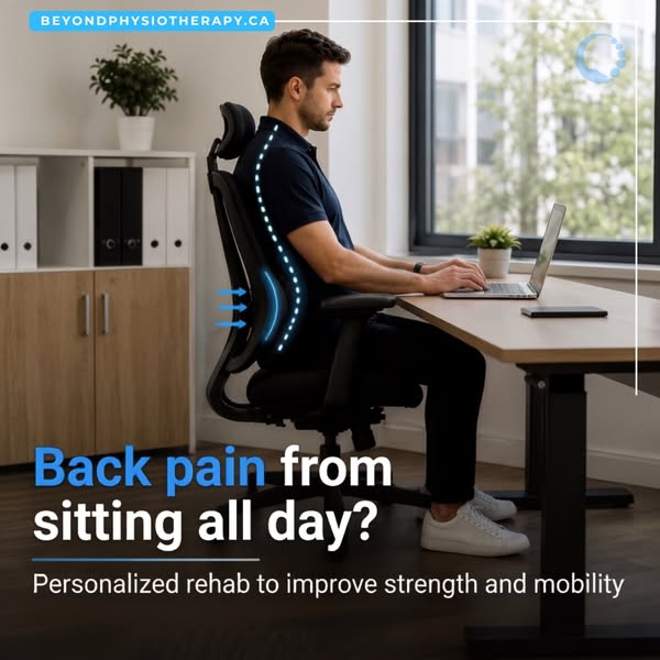
This square ad from Beyond Physiotherapy, the same Canadian clinic behind the desk back-pain ad, targets healthcare professionals. A young blonde nurse in light blue scrubs sits in a busy hospital corridor, grimacing as she presses both hands against her neck and shoulder. A glowing red-orange highlight and small lightning-bolt icons mark the pain point, a common visual shorthand in physio advertising. In the blurred background, colleagues in matching scrubs work at a reception desk and patients wait, reinforcing the setting. The website sits in a blue pill at the top left, with a thin white frame line and the clinic's circular logo in the bottom right corner. The headline at the bottom asks 'Neck and shoulder tension?', with 'Neck' and 'shoulder' in orange to match the pain glow. A short line underneath offers the solution: improve mobility with advanced rehab. The image appears AI-assisted and is consistent with the brand's series.
Meta ad · 338 × 600 · Physiotherapy
Neck and Shoulder Tension Physio Ad – Lifestyle Template
This square ad from Beyond Physiotherapy targets healthcare workers with neck and shoulder pain. A nurse in blue scrubs rubs her neck in a hospital corridor, with glowing red highlights marking the pain. A question headline with key words in orange makes the problem unmissable. It is a useful template for clinics targeting a specific profession.
Added
All brand names and logos are property of their owners. Adplaylist is not affiliated with or endorsed by these brands.
Details
Ad copy
Primary text
Long shifts, heavy lifting and constant movement take a toll on your neck and shoulders. Our physiotherapists use advanced rehab techniques to release tension and restore mobility, so you can get back to caring for others. Book with Beyond Physiotherapy.
Description
Improve mobility with advanced rehab
On-image text
BEYONDPHYSIOTHERAPY.CA · Neck and shoulder tension? · Improve mobility with advanced rehab.
Headline ideas for this template
- 1Nurses: Your Neck Deserves Care Too
- 2Release Shift-Work Shoulder Tension
- 3Stiff Neck After Long Shifts?
- 4Advanced Rehab for Busy Healthcare Workers
- 5Move Freely Through Your Next Shift
Meta image ad specs
| Placement | Ratio | Size (px) |
|---|---|---|
| Feed | 1:1 or 4:5 | 1080×1080 / 1080×1350 |
| Marketplace | 1:1 | 1200×1200 |
| Messenger inbox | 1:1 | 1200×1200 |
| Stories & Reels | 9:16 | 1080×1920 |
This template is 1:1. Request 4:5 or 9:16 to cover all placements.