Key takeaways
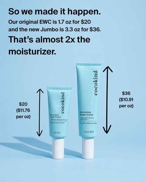
- Format: Side-by-side size comparison with arrows and unit prices.
- Best for: Bigger sizes, bundles or value packs that cost more upfront.
- Hook: 'That's almost 2x the moisturizer' with visible proof.
- Reuse it: Place both sizes next to each other and label each with total and per-unit price.
Available sizes
What is a comparison ad?
A comparison ad sets the product against an alternative, such as a competitor, the old way of doing things or a cheaper option, usually in a two-column layout or table. It helps buyers who are already weighing options see quickly why this one is the better choice.
See all comparison ads →Why this comparison ad works
- 01
Visual proof of size
Seeing the tubes together with arrows makes 'almost twice as big' instantly believable.
- 02
Price per ounce justifies the cost
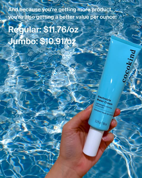
Showing the lower per-ounce price reframes the higher $36 price as the smarter buy.
- 03
Story payoff
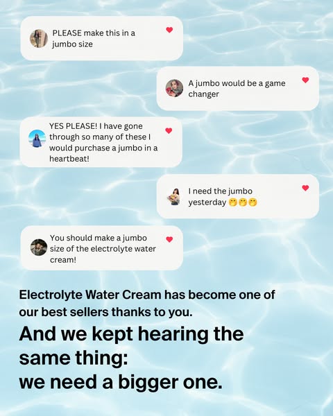
'So we made it happen' resolves the customer requests from the previous card, completing the narrative.
- 04
Honest, transparent numbers
Giving exact sizes and prices fits Cocokind's transparent brand and builds trust with value-conscious shoppers.
Full creative breakdown
Who this ad targets
This card targets value-conscious skincare shoppers, especially existing users of the Electrolyte Water Cream who already buy the regular size and want to know whether the jumbo is worth it. It also helps new customers decide between the two sizes. The audience is mostly women aged 18 to 40 who compare prices, appreciate transparent brands and like the idea of buying less often while saving a little money per ounce.
Copywriting analysis
The copy opens with 'So we made it happen', a short, satisfying line that pays off the customer requests from the previous card and makes the brand look responsive. The middle line is purely factual, listing both sizes and prices with no exaggeration, which builds credibility. The abbreviation EWC suggests insider familiarity with fans. The closing line, 'That's almost 2x the moisturizer', is honest rather than hyped: 'almost' acknowledges it is not quite double, which is more believable. The per-ounce labels do the persuasive work silently. Together the copy shifts the conversation from 'the jumbo costs more' to 'the jumbo gives more and costs less per ounce'.
Visual design
The flat blue background keeps attention on the two tubes, whose teal stands out clearly. Placing the small and jumbo side by side at the same baseline makes the height difference obvious. Hand-drawn arrows add a friendly, informal feel, like a note from a friend. Text hierarchy is clear: two large bold lines frame a smaller factual line, and price labels sit beside each product. Soft shadows give depth without clutter.
How to adapt this template for your brand
- Photograph both product sizes side by side on the same baseline and background.
- Add simple arrows to highlight the size difference.
- Label each with its total price and price per unit.
- Write a headline stating the difference honestly, such as 'almost 2x'.
- Open with a line that links back to why you created the larger size.
Tips for skincare ads on Meta
Use this as the third card in a Meta Feed carousel, after the announcement and the customer requests. It also works as a standalone retargeting ad for people who bought the regular size. Make sure the prices match your website exactly, as mismatches cause disapprovals and lost trust. On mobile, the per-ounce labels are small, so check readability in the preview. For Stories, add extra top padding so the headline is not covered by the profile bar.
About this creative
This portrait feed ad from Cocokind is the third card of the JUMBO Electrolyte Water Cream carousel, and it delivers the payoff. The background is a flat, medium sky blue. Two teal tubes stand cap-down side by side in the lower half: the original 1.7 oz tube on the left and the much taller 3.3 oz jumbo on the right, both casting soft shadows to the left. A black hand-drawn double-headed arrow runs alongside each tube, highlighting their height. Next to the small tube, text reads $20 with $11.76 per ounce; next to the jumbo, $36 with $10.91 per ounce. At the top, a bold black headline says 'So we made it happen.', followed by a smaller line explaining that the original EWC is 1.7 oz for $20 and the jumbo is 3.3 oz for $36. A second bold line concludes that this is almost twice the moisturizer. The design is simple, factual and easy to understand in seconds.
Meta ad · 338 × 600 · Skincare
Cocokind Moisturizer Ad: Regular vs Jumbo Size Comparison
This Cocokind carousel card compares the regular 1.7 oz and new jumbo 3.3 oz Electrolyte Water Cream side by side. Hand-drawn arrows show the height difference, and price-per-ounce labels prove the value. It is a clear comparison template for brands introducing a bigger size or bundle and wanting to justify the higher price.
Added
All brand names and logos are property of their owners. Adplaylist is not affiliated with or endorsed by these brands.
Details
Ad copy
Primary text
Our original Electrolyte Water Cream is 1.7 oz for $20. The new JUMBO is 3.3 oz for $36. That's almost twice the moisturizer at a better price per ounce.
Description
Clean, conscious skincare for all
On-image text
So we made it happen. | Our original EWC is 1.7 oz for $20 and the new Jumbo is 3.3 oz for $36. | That's almost 2x the moisturizer. | $20 ($11.76 per oz) | $36 ($10.91 per oz)
Headline ideas for this template
- 1Almost double the cream, better value
- 2Regular vs Jumbo: see the difference
- 3More cream, less per ounce
- 4The jumbo pays off
- 5Buy less often, save per ounce
Meta image ad specs
| Placement | Ratio | Size (px) |
|---|---|---|
| Feed | 1:1 or 4:5 | 1080×1080 / 1080×1350 |
| Marketplace | 1:1 | 1200×1200 |
| Messenger inbox | 1:1 | 1200×1200 |
| Stories & Reels | 9:16 | 1080×1920 |
This template is 1:1. Request 4:5 or 9:16 to cover all placements.
Browse similar by tag