Key takeaways
- Format: Minimal product shot framed by a problem question and objection-handling copy.
- Best for: Digital wellbeing products, minimalist devices and lifestyle-change offers.
- Hook: Wanting less phone noise but fearing the loss of essentials.
- Reuse it: Name the fear of switching, then show the product that removes it.
Available sizes
What is a product shot ad?
A product shot ad puts the product itself at the centre of the frame, usually on a clean or styled background with little text. It works best when the packaging or product is distinctive enough to stop the scroll and the viewer already understands what it does.
See all product shot ads →Why this product shot ad works
- 01
Objection as the hook
The question voices the exact hesitation buyers have, so the viewer feels understood before seeing the product.
- 02
Three icons say it all
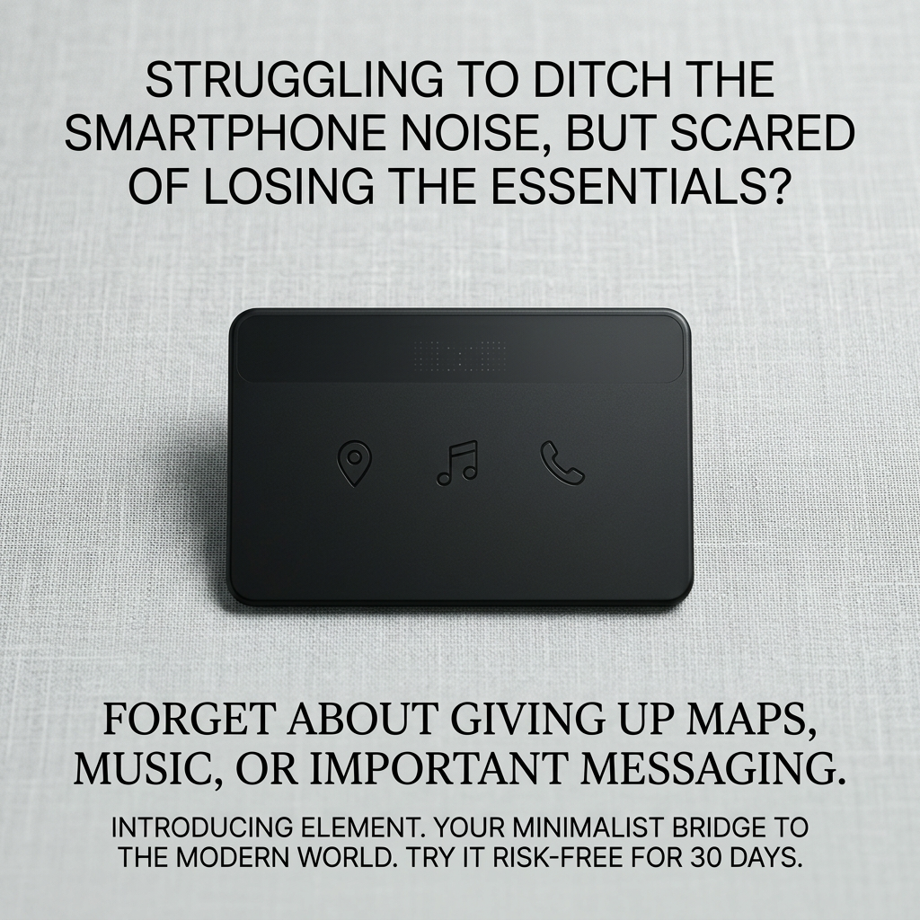
Embossed map, music and phone icons prove the essentials stay, without a features list.
- 03
Design mirrors the promise
White space and a quiet palette visually contrast with a noisy smartphone screen.
- 04
Risk reversal
A 30-day risk-free trial lowers the barrier for a big behaviour change.
Full creative breakdown
Who this ad targets
The ad targets people aged 25–45 who feel addicted to their smartphones and want to reduce screen time, including professionals, parents and digital minimalism followers. They are interested in mindfulness, productivity and wellbeing, but they depend on navigation, music and messaging for daily life. They are hesitant to buy a dumbphone because it feels like a step backwards, so they need reassurance that the device still fits modern life.
Copywriting analysis
The copy follows a problem–objection–solution structure. The opening question pairs a desire (ditch the noise) with a fear (losing the essentials), which captures ambivalent buyers. The second line directly dismisses that fear by naming maps, music and messaging, mirroring the icons on the device. The final line introduces the brand with a memorable positioning statement, "your minimalist bridge to the modern world", and closes with a 30-day risk-free trial. Using three different type treatments separates the stages of the argument. The copy is longer than usual for an image ad, but the calm layout keeps it readable.
Visual design
The palette is almost monochrome: light grey linen, a black device and black type. Soft overhead lighting gives the product subtle shadows and a tactile, premium feel. The text is split into top and bottom blocks with the device in the centre, creating a symmetrical, calm composition. Mixing a sans-serif question with a serif reassurance adds editorial elegance.
How to adapt this template for your brand
- Write a question that combines your audience's desire with their biggest fear of switching.
- Show the product alone on a neutral textured surface with soft, even light.
- Add a reassurance line naming the three things customers think they'll lose.
- Close with a positioning statement and a risk-free trial or guarantee.
- Test the same layout with a logo and button against this cleaner version.
Tips for saas & tech ads on Meta
On Meta, this works best for cold audiences in Feed; use the primary text to repeat the trial offer and link to a comparison page. On Google Display and Discovery, shorten the copy to the question and the trial line. Target digital wellbeing, minimalism and productivity interests. A short video showing a day with Element – navigation, music, a call, no scrolling – is a natural next test.
About this creative
This Element creative is pared back to match the product it sells. A matte black, card-shaped device rests at a slight angle on a light grey linen surface, lit softly from above. On its face are three embossed icons for location, music and phone, plus a small dot-matrix display strip at the top – a visual promise that only the essentials remain. Above the device, an uppercase sans-serif question asks whether the viewer is struggling to ditch smartphone noise but scared of losing the essentials. Below, a serif line reassures them they won't have to give up maps, music or important messaging. A final small block introduces Element as a minimalist bridge to the modern world and offers a 30-day risk-free trial. The neutral palette, generous white space and absence of a logo or button give it a calm, editorial tone that feels like the opposite of a busy smartphone screen.
Meta ad · 1200 × 1200 · SaaS & Tech
Minimalist Phone Ad Template That Handles Objections
This Element ad sells a minimalist phone by naming the audience's fear first: giving up the smartphone means losing maps, music and messaging. It is a clean square product shot for Meta and Google, and a strong template for digital wellbeing devices and any product that asks customers to give something up.
Added
All brand names and logos are property of their owners. Adplaylist is not affiliated with or endorsed by these brands.
Details
Ad copy
Primary text
Want less screen time without going off the grid? Element keeps maps, music and calls – and drops the endless scroll. Try it risk-free for 30 days.
Description
Minimalist phone with maps, music and calls. 30-day risk-free trial.
On-image text
STRUGGLING TO DITCH THE SMARTPHONE NOISE, BUT SCARED OF LOSING THE ESSENTIALS? | FORGET ABOUT GIVING UP MAPS, MUSIC, OR IMPORTANT MESSAGING. | INTRODUCING ELEMENT. YOUR MINIMALIST BRIDGE TO THE MODERN WORLD. TRY IT RISK-FREE FOR 30 DAYS.
Headline ideas for this template
- 1Less Phone. Same Life.
- 2Keep Maps, Music and Calls – Lose the Scroll
- 3The Phone That Gives You Your Time Back
- 4Go Minimal Without Going Off-Grid
- 5Try a Calmer Phone, Risk-Free for 30 Days
Meta image ad specs
| Placement | Ratio | Size (px) |
|---|---|---|
| Feed | 1:1 or 4:5 | 1080×1080 / 1080×1350 |
| Marketplace | 1:1 | 1200×1200 |
| Messenger inbox | 1:1 | 1200×1200 |
| Stories & Reels | 9:16 | 1080×1920 |
This template is 1:1. Request 4:5 or 9:16 to cover all placements.