Key takeaways
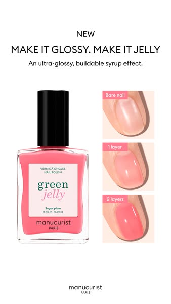
- Format: Full product bottle beside a three-step before/after swatch column.
- Best for: Sheer or buildable cosmetics where intensity changes with each layer.
- Hook: The bare-to-juicy swatch progression shows the jelly effect at a glance.
- Reuse it: Place your full pack on one side and stacked result swatches on the other.
Available sizes
What is a before and after ad?
A before and after ad shows the same subject in two states side by side, so the result of using the product is visible at a glance. It's common in skincare, cleaning, fitness and home improvement, but claims shown must be realistic and typical to stay within ad platform policies.
See all before / after ads →Why this before / after ad works
- 01
Clear side-by-side logic
Product on the left, result on the right is a layout the brain reads instantly: this bottle gives that effect.
- 02
Buildability proven
The three swatches turn the abstract word buildable into a visible scale, helping shoppers choose how they will wear it.
- 03
White space feels premium
Plenty of empty space around the bottle and swatches makes the ad feel calm and high-end rather than busy.
- 04
Full pack builds recognition
Showing the whole bottle helps shoppers recognise the product later on the website or in store.
Full creative breakdown
Who this ad targets
Trend-aware women aged roughly 18–40 who follow nail trends on Instagram, TikTok and Pinterest and want the popular 'jelly nails' look at home. They like playful, glossy, sheer colour that can be worn subtle or bold, and they care about cleaner, plant-based formulas without giving up on fun. The ad also reaches existing Manucurist customers looking for something new for spring and summer, and gift shoppers drawn to a pretty, photogenic bottle.
Copywriting analysis
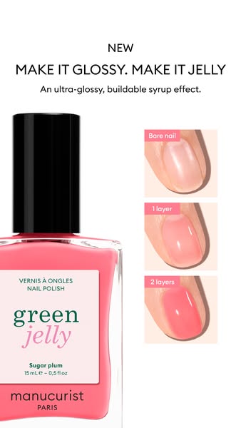
The copy is identical to the cropped-bottle version, which makes it a clean layout test. MAKE IT GLOSSY. MAKE IT JELLY is a short, rhythmic double imperative that taps directly into the jelly nails trend. The subline adds three concrete benefits, ultra-glossy, buildable and syrup effect, in under ten words. A small NEW tag signals a launch without needing an offer. The swatch labels, Bare nail, 1 layer and 2 layers, act as micro-copy that explains the product better than another sentence could. Product details such as the shade name stay on the bottle, keeping the overall text load low and the message focused.
Visual design
The layout uses a plain white canvas with two clear columns. On the left, the full bottle stands upright at a natural scale, its coral pink liquid and black cap providing the main colour accent. On the right, three swatch cards are stacked with even spacing and small pink label tabs. Centred black headline type sits at the top, and a small logo sits at the bottom. The generous white space gives the creative a minimalist, catalogue-like feel.
How to adapt this template for your brand
- Photograph your full product upright on a white background.
- Shoot three swatches or close-ups showing the result at increasing intensity.
- Place the product on the left and stack the swatches in a column on the right.
- Label each swatch clearly and add a short headline and benefit line at the top.
- Leave plenty of white space and finish with a small logo at the bottom.
Tips for beauty ads on Meta
Built for Meta Stories and Reels at 9:16, so keep the headline and labels inside the safe zone, clear of the top 14% and bottom 20% where interface elements sit. A/B test this full-bottle version against the cropped-bottle version to see whether scale or clarity drives more clicks. For Feed placements, crop to 4:5 and keep the key visual centred. Retarget product page visitors and test the creative against a single close-up variant.
About this creative
This vertical Manucurist ad introduces Green Jelly, a new sheer and glossy nail polish, in the coral-pink shade Sugar Plum. Unlike a tight crop, this version shows the full bottle at a natural size on the left, with its black cap, pink liquid and white label reading green jelly and Sugar plum. On the right, three rounded swatch cards are stacked vertically and labelled Bare nail, 1 layer and 2 layers, showing the colour building from a natural nail to a soft wash of pink and then to a juicy, translucent coral. The headline MAKE IT GLOSSY. MAKE IT JELLY sits at the top in black capitals, under a small NEW tag, followed by the subline An ultra-glossy, buildable syrup effect. Generous white space surrounds everything, and a small Manucurist Paris logo sits at the bottom. The result is calm, tidy and easy to read, with the swatches doing the convincing.
Meta ad · 338 × 600 · Beauty
Manucurist Green Jelly Before/After Swatch Ad Template
This Manucurist ad launches Green Jelly in Sugar Plum with the full bottle on the left and three nail swatches on the right showing how the colour builds from bare nail to two layers. It is a clean vertical 9:16 Meta creative and an easy template for shade-launch ads.
Added
All brand names and logos are property of their owners. Adplaylist is not affiliated with or endorsed by these brands.
Details
Ad copy
Primary text
New: Green Jelly. Get the jelly nails look with an ultra-glossy, buildable syrup effect. One sheer layer for a hint of colour, two for a juicy, see-through finish. Shown in Sugar Plum.
Description
Sheer, buildable jelly nail polish
On-image text
NEW | MAKE IT GLOSSY. MAKE IT JELLY | An ultra-glossy, buildable syrup effect. | Bare nail | 1 layer | 2 layers | VERNIS À ONGLES NAIL POLISH | green jelly | Sugar plum | manucurist PARIS | manucurist PARIS
Headline ideas for this template
- 1From bare to juicy in two layers
- 2Jelly nails without the salon
- 3Build your gloss, layer by layer
- 4New Green Jelly in Sugar Plum
- 5Sheer colour with a syrup shine
Meta image ad specs
| Placement | Ratio | Size (px) |
|---|---|---|
| Feed | 1:1 or 4:5 | 1080×1080 / 1080×1350 |
| Marketplace | 1:1 | 1200×1200 |
| Messenger inbox | 1:1 | 1200×1200 |
| Stories & Reels | 9:16 | 1080×1920 |
This template is 1:1. Request 4:5 or 9:16 to cover all placements.