Key takeaways
- Format: Isometric illustration with feature callouts.
- Best for: Local SEO agencies and GBP tools with a friendly brand voice.
- Hook: 'You could be here' invites the viewer to picture their business on the map.
- Reuse it: Place a 'You're here' marker on an illustration of your customer's ideal outcome.
Available sizes
What is a feature callout ad?
A feature callout ad is a static image that shows a single product with short text labels pointing to its key features or benefits, usually joined to the product by thin lines. It explains several selling points at a glance without a long caption, which is why it's common for supplements, skincare, electronics and kitchenware.
See all feature callouts ads →Why this feature callouts ad works
- 01
Aspirational framing
'You could be here' paints the desired outcome rather than the problem, which suits positive brands.
- 02
People make it real
Two customers on their phones show who is searching, connecting rankings to actual people.
- 03
Specific target
'Top 3' references the Google local pack, a concrete and credible goal.
- 04
Clean benefit icons
Two short icon-led features summarise the value without clutter.
Full creative breakdown
Who this ad targets
This ad targets small local business owners who want more foot traffic and calls from nearby customers but feel overwhelmed by SEO jargon. Think cafés, hairdressers, physiotherapists, plumbers and boutique shops that rely on people searching 'near me' from their phones. The friendly illustrated style suits owners who are put off by aggressive marketing and prefer a positive, easy-to-understand promise of being found by people in their area.
Copywriting analysis
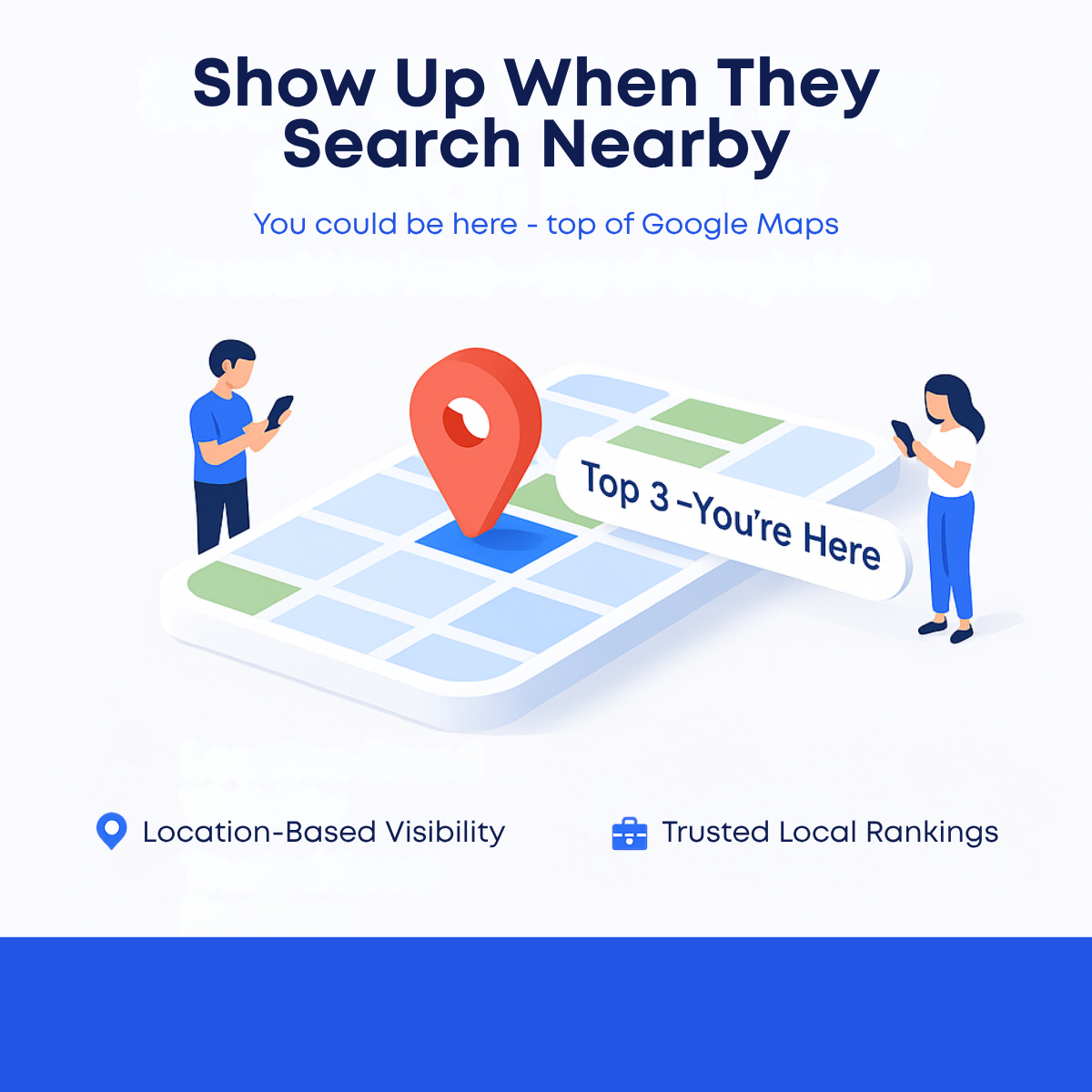
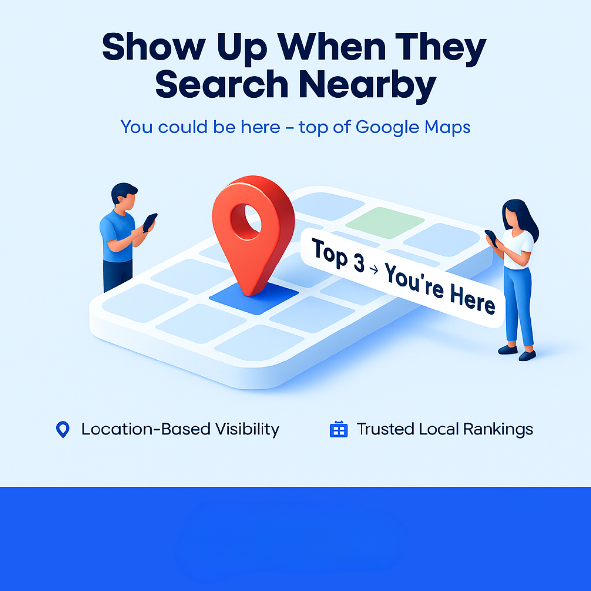
The headline 'Show Up When They Search Nearby' is action-led and mirrors real 'near me' search behaviour. 'Show up' is everyday language for visibility, while 'they' keeps the focus on customers. The subline 'You could be here – top of Google Maps' is aspirational and names the platform explicitly, removing ambiguity. The on-map label 'Top 3 → You're Here' uses an arrow to suggest progress and places the viewer in the winning spot. The two feature lines, 'Location-Based Visibility' and 'Trusted Local Rankings', are a bit generic; a test could swap one for a concrete result such as more calls.
Visual design
A pale-blue background and soft isometric shapes create a calm, approachable mood. The red pin is the only warm, saturated element, drawing the eye straight to the 'you' spot. Two illustrated people frame the map symmetrically and add human scale. The angled white label adds dynamism. Rounded sans-serif type in navy and bright blue keeps hierarchy clear, and the solid blue band at the bottom anchors the layout and holds the CTA.
How to adapt this template for your brand
- Illustrate your customer's ideal outcome as a simple isometric scene.
- Mark their spot with a bold pin or label such as 'You're Here'.
- Add one or two illustrated people to show who benefits.
- Write an action-led headline that mirrors how customers search.
- Add two icon-led benefits and a CTA in the bottom band.
Tips for saas & tech ads on Meta
On Meta, run this in Feed and test a 4:5 crop so the headline keeps its weight on mobile; the copy-light layout leaves room for a short primary text with a local hook such as the city name. On LinkedIn it suits owner and marketing-manager audiences, paired with a free audit offer. For Google Display, keep the visual and shorten the headline so it stays legible in small banner sizes. Always add a clear CTA button and logo in the empty space before launch.
About this creative
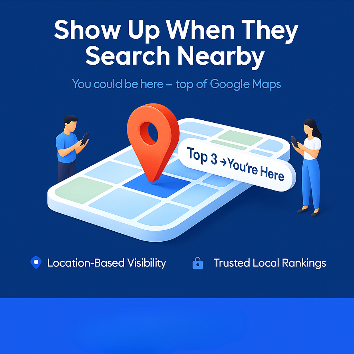
This creative uses a soft pale-blue background and an isometric 3D illustration style. At the top, the dark navy headline 'Show Up When They Search Nearby' is set in bold, rounded sans-serif, with a blue subline: 'You could be here – top of Google Maps'. In the centre, a simplified map grid of pale blue and white tiles, with one green tile, sits like a floating platform. A large red location pin marks a highlighted dark-blue tile. A white tag angled across the map reads 'Top 3 → You're Here'. Two flat-illustrated people stand on either side, a man and a woman, both looking at their phones, representing local customers searching. Below, two icon-led features read 'Location-Based Visibility' and 'Trusted Local Rankings'. A solid blue band at the bottom appears reserved for a CTA button. The overall feel is friendly, approachable and less aggressive than fear-based SEO ads.
Meta ad · 1200 × 1200 · SaaS & Tech
Local SEO Ad: Show Up When They Search Nearby
This square local SEO ad uses a light isometric map, a red pin and two people on their phones to show a business appearing in the top 3 of Google Maps. It is a friendly feature-callout format for agencies and SEO tools advertising on Meta, LinkedIn and Display.
Added
All brand names and logos are property of their owners. Adplaylist is not affiliated with or endorsed by these brands.
Details
Ad copy
Primary text
People nearby are searching for businesses like yours right now. Get into the top 3 on Google Maps and be the business they find, call and visit first.
Description
Location-based visibility for local businesses.
On-image text
Show Up When They Search Nearby | You could be here – top of Google Maps | Top 3 → You're Here | Location-Based Visibility | Trusted Local Rankings
Headline ideas for this template
- 1Be Found When Locals Search 'Near Me'
- 2You Could Be in the Google Maps Top 3
- 3Get Found by Customers Around the Corner
- 4Top 3 on Google Maps Starts Here
- 5When They Search Nearby, Be There
Meta image ad specs
| Placement | Ratio | Size (px) |
|---|---|---|
| Feed | 1:1 or 4:5 | 1080×1080 / 1080×1350 |
| Marketplace | 1:1 | 1200×1200 |
| Messenger inbox | 1:1 | 1200×1200 |
| Stories & Reels | 9:16 | 1080×1920 |
This template is 1:1. Request 4:5 or 9:16 to cover all placements.
Browse similar by tag