Key takeaways
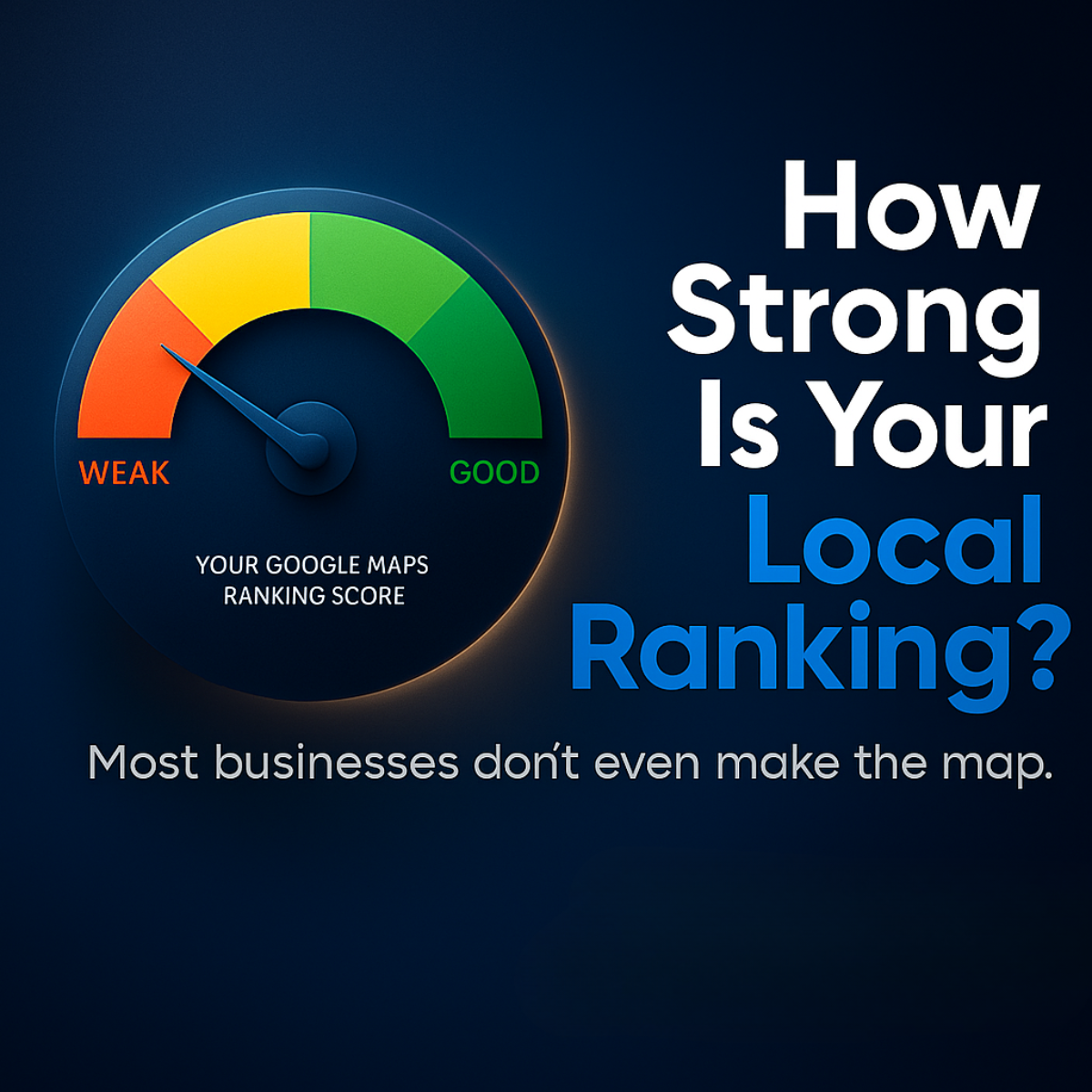
- Format: Gauge meter comparing weak vs good with a question headline
- Best for: Free audit or ranking-check offers for local businesses
- Hook: A direct question plus a needle stuck on 'weak'
- Reuse it: Swap the gauge label for any score your service improves
Available sizes
What is a comparison ad?
A comparison ad sets the product against an alternative, such as a competitor, the old way of doing things or a cheaper option, usually in a two-column layout or table. It helps buyers who are already weighing options see quickly why this one is the better choice.
See all comparison ads →Why this comparison ad works
- 01
Instant self-assessment
A question headline forces viewers to ask themselves the answer, creating personal relevance.
- 02
Universal metaphor
Everyone understands a gauge; the needle on 'weak' communicates the problem without words.
- 03
Fear of missing out
'Most businesses don't even make the map' uses social proof in reverse, hinting that you may be invisible too.
- 04
Bold type hierarchy
Huge stacked words with blue emphasis on 'Local Ranking' make the message readable even at thumbnail size.
Full creative breakdown
Who this ad targets
This ad targets US local business owners and managers who rely on nearby customers finding them on Google: tradespeople, clinics, restaurants, gyms and retail shops. They are busy, not marketing experts, and may suspect they are losing calls to competitors. The question-based hook is aimed at problem-aware but not solution-aware prospects. Targeting can include small business owner interests, Google My Business, local service categories and a radius around target cities.
Copywriting analysis
The headline 'How Strong Is Your Local Ranking?' is a classic diagnostic question that turns a technical topic into a simple yes/no feeling. Highlighting 'Local Ranking' in blue keeps the keyword front and centre. The subline 'Most businesses don't even make the map' adds a mild fear trigger and a clever double meaning – making the map literally on Google Maps. The gauge label 'Your Google Maps Ranking Score' personalises the visual. What's missing is a next step: no CTA or offer. Adding 'Get your free score' would capture the curiosity the ad creates.
Visual design
Split layout: gauge on the left, oversized headline on the right. The dark navy background with a subtle vignette gives a dashboard, night-mode feel. The traffic-light arc (orange, yellow, green) is the only multicolour element, so the eye goes to it first. A warm orange glow around the gauge creates urgency. Type is a heavy geometric sans serif in white and electric blue, with a lighter grey subline for hierarchy. Plenty of empty space at the bottom could host a CTA.
How to adapt this template for your brand
- Pick the metric your audience worries about (ranking, speed, reviews, credit score).
- Draw a weak-to-good gauge with the needle in the weak zone.
- Write a 'How strong is your X?' question as a large stacked headline.
- Add a one-line sting that hints most people fail this test.
- Place a CTA like 'Check your score free' in the empty bottom area.
Tips for saas & tech ads on Meta
Strong as a top-of-funnel Meta Feed ad; add a 'Learn more' or 'Get quote' button linking to a free check landing page. Target owners within your service radius and exclude existing clients. On LinkedIn, the question hook fits agency or franchise audiences. For Stories, crop to 9:16 by stacking gauge above the headline. Follow up with the scan result or how-it-works creative as retargeting.
About this creative
This square local SEO ad uses a simple but powerful visual metaphor: a speedometer. On the left side of a dark navy background sits a circular gauge with a coloured arc running from orange-red 'WEAK' through yellow to green 'GOOD'. The needle points firmly into the weak zone, and the label beneath reads 'Your Google Maps Ranking Score'. On the right, a big stacked headline in white and bright blue asks 'How Strong Is Your Local Ranking?', with 'Local Ranking?' highlighted in blue for emphasis. Across the bottom, a lighter subline delivers the sting: 'Most businesses don't even make the map.' There is no logo or button, which makes the ad feel like a provocative question rather than a pitch. A soft orange glow around the gauge adds warmth and urgency against the cool backdrop. The design invites viewers to wonder where their own needle would land.
Meta ad · 1200 × 1200 · SaaS & Tech
Local SEO Ad Template: Ranking Score Gauge
This local SEO ad uses a speedometer gauge pointing at 'weak' to ask business owners how strong their Google Maps ranking really is. It's a question-led comparison format that triggers self-assessment. Use it for SEO audits, ranking tools or any service that scores performance.
Added
All brand names and logos are property of their owners. Adplaylist is not affiliated with or endorsed by these brands.
Details
Ad copy
Primary text
Most businesses don't even make the map. Check your Google Maps ranking score for free and find out if customers can actually find you.
Description
Free Google Maps ranking check
On-image text
WEAK | GOOD | YOUR GOOGLE MAPS RANKING SCORE | How Strong Is Your Local Ranking? | Most businesses don't even make the map.
Headline ideas for this template
- 1Is Your Business Invisible on Google Maps?
- 2Check Your Local Ranking Score Free
- 3Weak or Strong? Test Your Map Ranking
- 4Your Competitors Are Outranking You
- 5Find Out Where You Stand Locally
Meta image ad specs
| Placement | Ratio | Size (px) |
|---|---|---|
| Feed | 1:1 or 4:5 | 1080×1080 / 1080×1350 |
| Marketplace | 1:1 | 1200×1200 |
| Messenger inbox | 1:1 | 1200×1200 |
| Stories & Reels | 9:16 | 1080×1920 |
This template is 1:1. Request 4:5 or 9:16 to cover all placements.
Browse similar by tag