Key takeaways
- Format: Before and after map panels with calls-per-week banners.
- Best for: Agencies selling local SEO on lead volume, not rankings.
- Hook: A jump from 2 to 30+ calls a week.
- Reuse it: Replace calls with bookings, quotes or visits for your niche.
Available sizes
What is a before and after ad?
A before and after ad shows the same subject in two states side by side, so the result of using the product is visible at a glance. It's common in skincare, cleaning, fitness and home improvement, but claims shown must be realistic and typical to stay within ad platform policies.
See all before / after ads →Why this before / after ad works
- 01
Outcome over metrics
Owners rarely care about rank numbers but always care about calls. Leading with calls per week speaks their language.
- 02
Huge, specific contrast
2 versus 30+ is a roughly fifteenfold jump. A specific number makes the gain feel measured rather than vague.
- 03
Phone icons as proof
Ringing phones on the after map visualize the result. The viewer imagines their own phone lighting up.
- 04
Color-coded banners
Red and green banners carry the key numbers at the bottom of each map. Even a quick glance captures the story.
Full creative breakdown
Who this ad targets
This ad targets local service business owners who measure success by inbound calls, such as plumbers, locksmiths, HVAC, towing, roofing and dental clinics. They are often frustrated by slow weeks and unpredictable lead flow. The ad suits cold and warm audiences on Meta within a city radius, especially owners who have engaged with earlier awareness ads. It also works for agencies pitching franchise owners who need consistent call volume per location.
Copywriting analysis
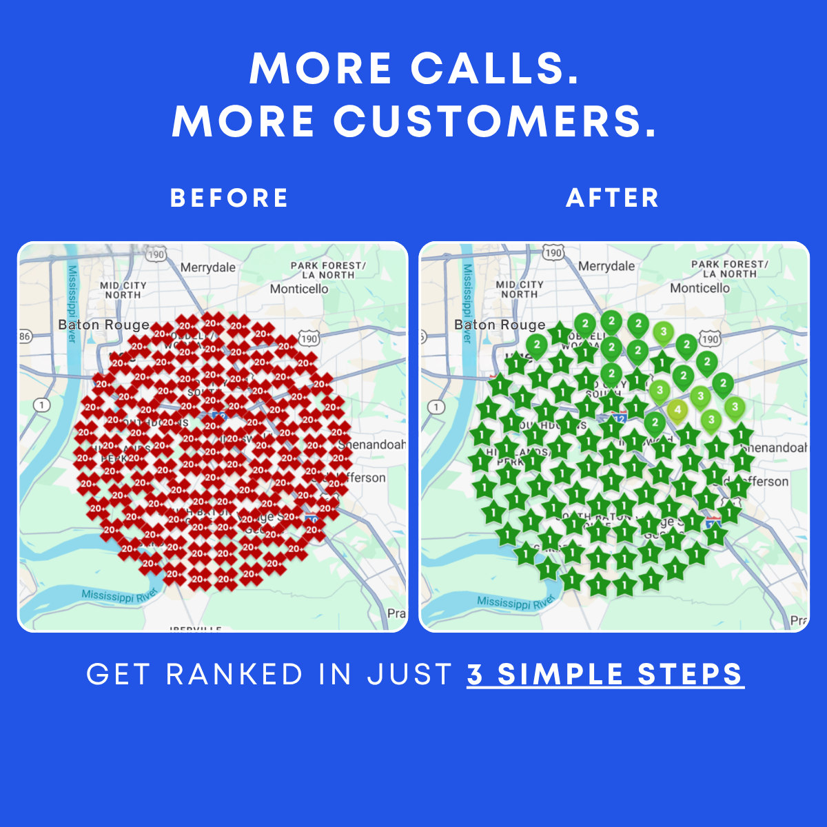
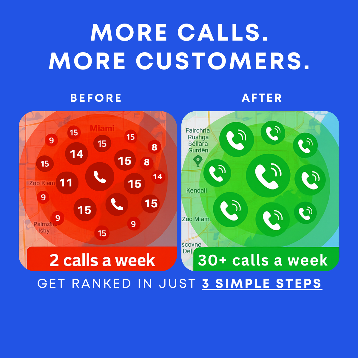
The headline More Calls. More Customers. is repeated from the grid version, which keeps the campaign consistent. The real persuasion sits in the two banners: 2 calls a week versus 30+ calls a week. These lines turn an SEO service into a revenue story, and the plus sign suggests the upside could be even higher. Writing calls a week rather than per month makes both numbers feel immediate and relatable to a small business. Before and After labels frame the change without explanation. The footer Get ranked in just 3 simple steps keeps effort low and connects rankings to calls.
Visual design
The ad keeps the strong blue background and white type of the series, making it recognizable in a campaign. Each map panel uses a full color wash, red or green, so the comparison works even as a thumbnail. Circles of varying sizes create depth and movement, and the large central phone icon anchors each panel. The banners use heavy rounded type for the key numbers. Some map text is garbled and should be cleaned up or replaced with a real screenshot.
How to adapt this template for your brand
- Pull real call tracking numbers from a client before and after your work.
- Use a real map screenshot of their area and apply a red and green color wash.
- Write the before and after numbers in bold banners at the bottom of each panel.
- Swap calls for the metric your niche cares about, such as bookings or quote requests.
- Add a small caption with industry and timeframe to support the claim.
Tips for saas & tech ads on Meta
On Meta, run this as a single image with a lead form or call extension so the CTA mirrors the promise of more calls. A Call Now button can work for agencies that sell over the phone. Keep primary text focused on the numbers. Test it against the ranking grid version: grids often win with experienced buyers while call numbers win with owners new to SEO. Avoid implying guaranteed results.
About this creative
On a bright blue background, a bold white all-caps headline reads More Calls. More Customers. Below, two rounded map panels sit side by side under the labels Before and After. The before panel is washed in red over a map of the Miami area, with dark red circles showing poor rank numbers such as 8, 9, 11, 14 and 15, plus two muted phone icons. A red banner across the bottom reads 2 calls a week. The after panel is washed in green and filled with white phone icons with signal waves on green circles of varying sizes, with a green banner reading 30+ calls a week. The map labels on the right panel contain garbled place names, a sign the image was AI-generated. At the bottom, spaced caps read Get ranked in just 3 simple steps, with the last part underlined. The ad is a variant of the ranking grid creative, but focused on calls rather than positions.
Meta ad · 1200 × 1200 · SaaS & Tech
Before and After Local SEO Ad Template: 2 vs 30+ Calls a Week
This square before and after ad contrasts a red map of poor rankings and 2 calls a week with a green map full of ringing phone icons and 30+ calls a week. It translates local SEO into the one metric owners care about, making it ideal for lead generation ads aimed at service businesses.
Added
All brand names and logos are property of their owners. Adplaylist is not affiliated with or endorsed by these brands.
Details
Ad copy
Primary text
2 calls a week before. 30+ calls a week after. When your business ranks at the top of Google Maps, your phone starts ringing. Get ranked in 3 simple steps and see the difference.
Description
Local SEO that makes your phone ring
On-image text
MORE CALLS. MORE CUSTOMERS. | BEFORE | AFTER | 2 calls a week | 30+ calls a week | GET RANKED IN JUST 3 SIMPLE STEPS
Headline ideas for this template
- 1Is Your Phone Ringing Enough?
- 215x More Calls From Google Maps
- 3Turn Searches Into Phone Calls
- 4Stop Waiting for the Phone to Ring
- 530+ Calls a Week Starts With Ranking
Meta image ad specs
| Placement | Ratio | Size (px) |
|---|---|---|
| Feed | 1:1 or 4:5 | 1080×1080 / 1080×1350 |
| Marketplace | 1:1 | 1200×1200 |
| Messenger inbox | 1:1 | 1200×1200 |
| Stories & Reels | 9:16 | 1080×1920 |
This template is 1:1. Request 4:5 or 9:16 to cover all placements.