Key takeaways
- Format: Handwritten note card on paper stock, UGC-style still photo.
- Best for: Loan comparison sites and brokers wanting a warm, non-corporate top-of-funnel ad.
- Hook: Frames getting a loan offer as a celebratory 'you've been matched' moment.
- Reuse it: Swap the reveal word and proof line for any matching or comparison service.
Available sizes
What is a UGC ad?
A UGC (user-generated content) ad looks like something a real customer posted: phone-quality photos, casual wording and a personal point of view. Because it blends into the feed and reads as genuine experience, it often earns more trust than a polished brand ad.
See all ugc ads →Why this ugc ad works
- 01
Positive outcome first
It opens with the result the viewer wants instead of the effort required. Leading with the payoff makes the application feel already halfway done.
- 02
Spelled-out emphasis
The hyphenated M-A-T-C-H-E-D forces a slower read and makes the key word impossible to miss in a fast feed.
- 03
Human, not corporate
Handwriting on real paper stands out against glossy bank ads and signals friendliness in a category people associate with stress.
- 04
Proof in one line
'19+ lenders, one form' compresses the whole value proposition into five words that answer 'why you over my bank?'.
Full creative breakdown
Who this ad targets
Adults actively looking for a personal loan, car loan or refinance who dread applying at several banks one by one. It speaks to people who have heard 'no' before, or who suspect they are not getting the best offer from their own bank, and who value speed and simplicity. The soft, celebratory tone also suits first-time borrowers and younger audiences who are put off by traditional, formal finance messaging and respond better to friendly, social-style content.
Copywriting analysis
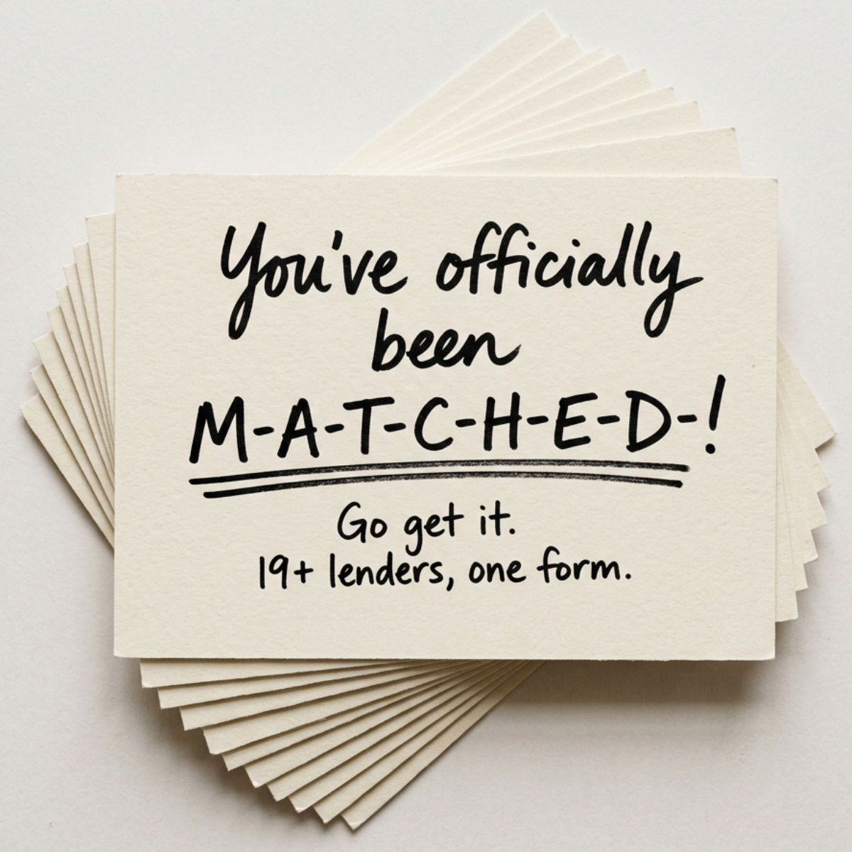
The copy is built as a reveal. 'You've officially been' sets up anticipation and the capitalised, hyphenated 'M-A-T-C-H-E-D-!' pays it off, borrowing the language of dating apps and acceptance letters. 'Officially' adds a sense of confirmation and finality. 'Go get it.' is a short, energetic nudge that turns the moment into action without a hard sell. The last line, '19+ lenders, one form.', is the only functional copy and does the persuasive work: a concrete number signals choice, while 'one form' removes the main objection, which is effort. The writing never mentions interest, debt or risk, keeping the emotional register entirely positive.
Visual design
A top-down product-style photo of fanned cream cards on a pale grey background creates depth and a tactile, premium stationery feel. All type is black handwriting in two styles: script for the setup and block capitals for the reveal, separated by a hand-drawn double underline that anchors the eye. Generous margins and a strict two-colour palette keep the message legible on mobile. The absence of logos or UI makes it read like organic content rather than an ad.
How to adapt this template for your brand
- Pick your outcome word (approved, matched, sorted, funded) and spell it out in hyphenated capitals.
- Write a two-line setup in casual script that frames the outcome as good news.
- Add one proof line with a concrete number, e.g. lender count or minutes to apply.
- Shoot or mock up the text on textured card stock and fan a stack underneath for depth.
- Keep the palette to paper and ink, and place your logo only in the ad copy or a small corner mark.
Tips for finance & fintech ads on Meta
On Meta, credit and loan ads must run under the Financial Products and Services special ad category, which removes age, gender and postcode targeting, so the creative has to qualify the audience itself. This creative performs best in Feed and Explore where the tactile, organic look blends in. Test a 4:5 crop for more screen space, and pair it with primary text that clarifies the product (loan type, soft credit check) since the image is intentionally vague. A carousel continuing the card stack can walk through the three-step process.
About this creative
The creative shows a fanned stack of thick, textured cream note cards photographed from above on a light grey surface. The top card carries a handwritten message in black marker: "You've officially been" in flowing script, followed by "M-A-T-C-H-E-D-!" in spaced, hyphenated capitals with a double underline beneath it. Below, in smaller handwriting, two short lines close the message: "Go get it." and "19+ lenders, one form." There is no logo, product shot or interface, and the palette is limited to off-white paper and black ink. The look borrows from wedding stationery and acceptance letters, framing a loan match as good news worth announcing rather than a transaction. The spelled-out word slows the reader down and gives the headline a playful rhythm, while the final line delivers the actual offer: one application reaching more than nineteen lenders. The result feels warm, human and very different from typical finance advertising.
Meta ad · 1200 × 1200 · Finance & Fintech
Loan Comparison Ad Template: "You've Officially Been Matched"
This loan comparison ad uses a stack of cream note cards with a handwritten message announcing the viewer has been matched with a lender. The UGC-style format makes a dry finance product feel personal and celebratory, and works well as a top-of-funnel Meta creative for brokers and comparison platforms.
Added
All brand names and logos are property of their owners. Adplaylist is not affiliated with or endorsed by these brands.
Details
Ad copy
Primary text
Stop filling in the same form for every bank. One short form, 19+ lenders, and a match that actually fits your situation. It takes a few minutes and checking won't affect your credit score.
Description
19+ lenders, one form
On-image text
You've officially been M-A-T-C-H-E-D-! Go get it. 19+ lenders, one form.
Headline ideas for this template
- 1You've been matched. Now go get it.
- 2One form. 19+ lenders. Your match.
- 3Officially approved for options.
- 4Your lender match is waiting.
- 5Stop applying. Start matching.
Meta image ad specs
| Placement | Ratio | Size (px) |
|---|---|---|
| Feed | 1:1 or 4:5 | 1080×1080 / 1080×1350 |
| Marketplace | 1:1 | 1200×1200 |
| Messenger inbox | 1:1 | 1200×1200 |
| Stories & Reels | 9:16 | 1080×1920 |
This template is 1:1. Request 4:5 or 9:16 to cover all placements.