Key takeaways
- Format: Stacked one-line fragments on a dark card with an eyebrow label.
- Best for: Explaining the core logic of a marketplace to rational, analytical buyers.
- Hook: 'Do the math' invites viewers to reach the conclusion themselves.
- Reuse it: Build a three-step cause-and-effect chain and end with 'Simple.'
Available sizes
What is a listicle ad?
A listicle ad presents the product's benefits or reasons to buy as a short numbered list, like an article headline ("5 reasons…"). The list format is easy to scan in a feed and lets one creative answer several objections at once.
See all listicle ads →Why this listicle ad works
- 01
Logic the viewer completes
The eyebrow invites the viewer to work it out, so the conclusion feels like their own idea rather than a claim.
- 02
Rhythm of repetition
'More... More...' builds momentum that makes 'Lower rate' land as the natural result.
- 03
Ends on ease
'Simple.' answers the unspoken objection that comparing lenders is a hassle.
- 04
Tech-brand polish
The floating card and restrained palette look like a modern app, signalling a trustworthy, digital-first service.
Full creative breakdown
Who this ad targets
Analytical, price-conscious borrowers who want to understand how a service saves them money before they hand over their details. Typically working professionals refinancing a car or personal loan, or homeowners researching mortgage options, who are sceptical of emotional advertising. The rational tone and lack of hype also make it suitable for LinkedIn and for retargeting people who visited a comparison page but did not convert.
Copywriting analysis
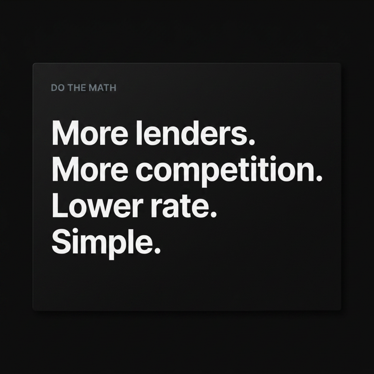
The eyebrow 'DO THE MATH' frames everything that follows as an equation the reader can verify. The body is four fragments with no verbs, which strips the copy down to pure logic: lenders lead to competition, competition leads to a lower rate. Repeating 'More' at the start of two lines creates a rhythm that makes the third line feel inevitable. The final one-word line, 'Simple.', shifts from economics to experience, reassuring the reader that acting on the logic is easy. The copy promises a lower rate in general terms without a number, keeping it broadly compliant.
Visual design
A charcoal rounded rectangle floats over a pure black background with a subtle drop shadow, creating a layered, interface-like look. A small grey uppercase label sits top left as an eyebrow, while large bold white type stacks in four left-aligned lines. Ample padding and consistent line spacing give the card a calm, premium rhythm. The near-monochrome palette keeps all attention on the logic sequence.
How to adapt this template for your brand
- Write a short eyebrow label that frames the logic, e.g. 'Do the math' or 'Here's how'.
- List two inputs your product increases, starting each with the same word.
- Add the outcome as the third line, phrased as a clear benefit.
- Close with a one-word reassurance like 'Simple.' or 'Done.'
- Set it on a dark floating card with a grey eyebrow and bold white text.
Tips for finance & fintech ads on Meta
On Meta, credit and loan ads must run under the Financial Products and Services special ad category, which removes age, gender and postcode targeting, so the creative has to qualify the audience itself. The rational message fits mid-funnel retargeting and LinkedIn audiences especially well. On Instagram Stories, reveal each line one at a time for a satisfying build. Pair it with primary text that adds one proof point, such as the number of lenders on your panel, since the image deliberately leaves specifics out.
About this creative
A slightly lighter charcoal card floats on a deep black background with a soft shadow, giving the ad a clean, app-like depth. In the top left, a small grey uppercase eyebrow label reads "DO THE MATH". Below, four lines of bold white sans-serif text are stacked left-aligned: "More lenders. More competition. Lower rate. Simple." Each line is a single fragment ending in a full stop, so the ad reads like a chain of cause and effect rather than a sentence. The first three lines build a logical sequence based on basic economics, and the final word, 'Simple.', closes the argument and reassures the reader that the process is easy. There is no logo, image or price claim. The overall feel is calm, rational and modern, similar to tech product marketing, which suits audiences who prefer logic over emotion when making financial decisions and want to understand why comparison saves money.
Meta ad · 1200 × 1200 · Finance & Fintech
Loan Comparison Ad Template: "Do The Math"
This minimal finance ad stacks four short lines on a dark card under a small 'DO THE MATH' label, walking from more lenders to a lower rate. The listicle-style logic chain makes comparison feel obvious, and suits loan marketplaces running clean, rational creatives on Meta and LinkedIn.
Added
All brand names and logos are property of their owners. Adplaylist is not affiliated with or endorsed by these brands.
Details
Ad copy
Primary text
When more lenders compete for your loan, rates come down. That's the whole idea. Fill in one form, let lenders compete and pick the lowest offer.
Description
Let lenders compete for you
On-image text
DO THE MATH. More lenders. More competition. Lower rate. Simple.
Headline ideas for this template
- 1More lenders, lower rates. Simple.
- 2Let lenders compete for you.
- 3Competition lowers your rate.
- 4The simple math of a better loan.
- 5One form. More offers. Less interest.
Meta image ad specs
| Placement | Ratio | Size (px) |
|---|---|---|
| Feed | 1:1 or 4:5 | 1080×1080 / 1080×1350 |
| Marketplace | 1:1 | 1200×1200 |
| Messenger inbox | 1:1 | 1200×1200 |
| Stories & Reels | 9:16 | 1080×1920 |
This template is 1:1. Request 4:5 or 9:16 to cover all placements.