Key takeaways
- Format: Single illustrated metaphor with a two-line statement and logo.
- Best for: Learning, productivity and self-improvement apps targeting busy adults.
- Hook: A universal truth about time that everyone instantly agrees with.
- Reuse it: Pick one abstract benefit and draw it as a simple, physical object.
Available sizes
What is a meme ad?
A meme ad borrows a familiar meme format or internet joke and adapts it to the product or the buyer's problem. It feels native to social feeds and is highly shareable, but depends on the meme still being recognisable to the audience.
See all meme ads →Why this meme ad works
- 01
One idea, one image
The ad communicates a single thought with a single picture. Nothing competes for attention, so it is understood in a glance.
- 02
Truth that invites agreement
"You can't take time back" is hard to argue with. The second line then reframes the app as the smart way to use that time.
- 03
Metaphor makes value tangible
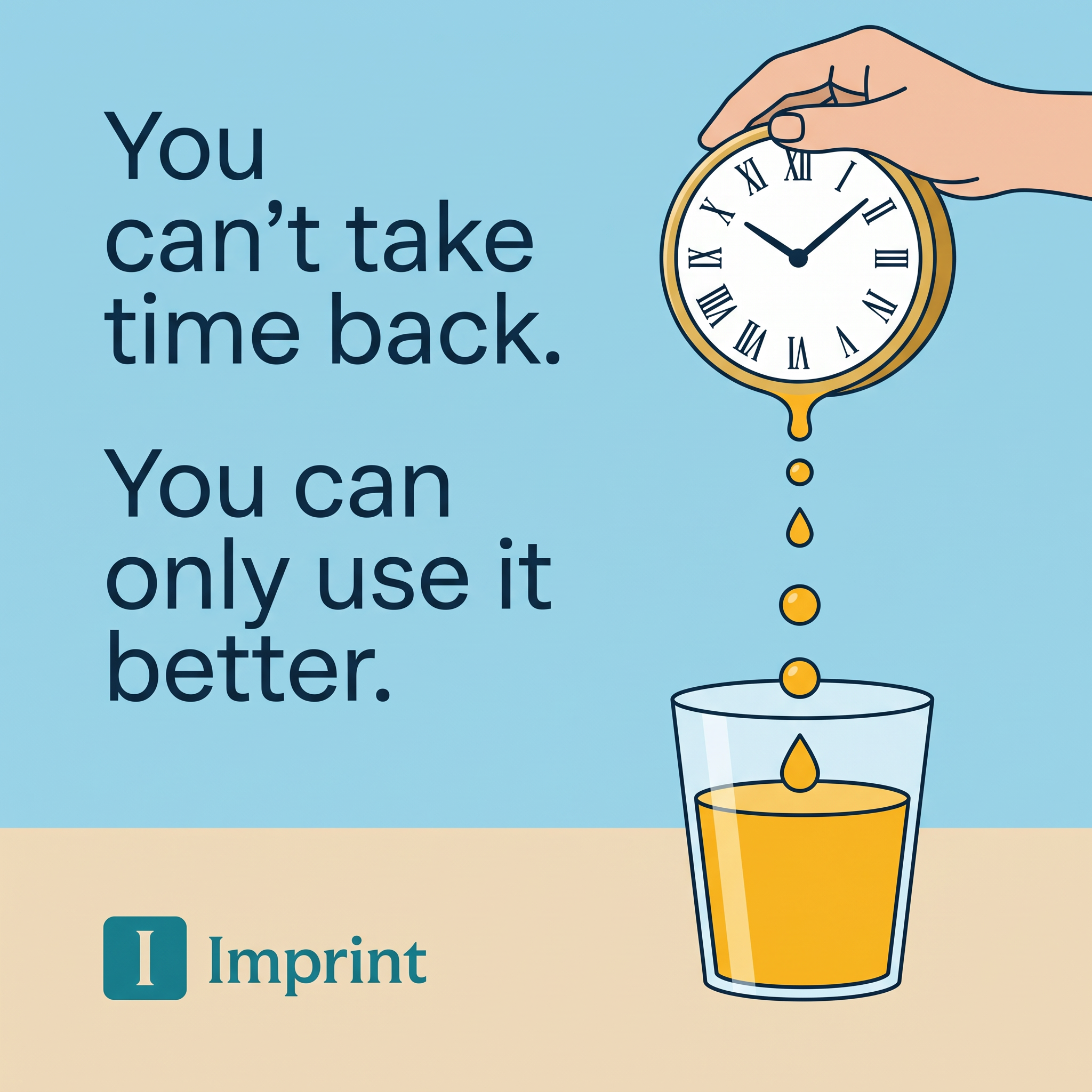
Pouring time into a glass shows time being saved and collected. It visualises the abstract benefit of learning in small doses.
- 04
Feels like content, not an ad
The illustrated, poster-like style looks like an insight post. It earns attention and shares on social feeds.
Full creative breakdown
Who this ad targets
This ad targets curious, self-improvement-minded adults, typically 22 to 45, who want to read more but feel short on time. They listen to podcasts, follow productivity creators and may already use apps like Blinkist or Headway. The message appeals to people who feel guilty about scrolling and want a better habit. It works well for broad interest audiences around books, personal growth and productivity, and for app-install campaigns where a calm, thoughtful tone differentiates from louder competitors.
Copywriting analysis
The copy is built as a setup and payoff. The first sentence states a hard limitation, which creates a slight sense of loss. The second sentence offers control: you can only use it better. The word "only" is subtle but important, turning a fact into a choice. There is no mention of books, lessons or features on the image, so the copy works as a philosophy statement that the brand owns. Short words and line breaks make it readable at a glance. The primary text must then explain what using time better looks like with the app.
Visual design
The flat illustration uses thick outlines and a limited palette of sky blue, sand, navy, gold and teal. The text block takes the left half and the illustration the right, a balanced split that reads left to right. The vertical drip line guides the eye from the clock down into the glass. Generous white space around the text keeps it calm. The teal logo is the only teal element, making the brand easy to spot. The style fits well in feeds dominated by photos.
How to adapt this template for your brand
- Identify the core resource your product saves or improves, like time or money.
- Write a two-line statement: an undeniable truth, then how to act on it.
- Turn the resource into a physical object being transformed or collected.
- Use a flat illustration with a limited palette and leave space for the text.
- Keep the logo small at the bottom and test versions with an app screenshot added.
Tips for education & e-learning ads on Meta
On Meta, use this in feed for app-install or traffic campaigns and pair it with primary text that explains the format, such as 10-minute lessons. On TikTok, animate the drip so drops fall into the glass in a short loop. Instagram users often save and share quote-style posts, so also test it as an organic post. Keep the copy unchanged across placements for consistent recall.
About this creative
This square Imprint creative uses a flat, editorial illustration style. The background is split into a light sky-blue upper section and a pale sand-colored table surface below. On the left, large dark-navy sans-serif text reads: "You can't take time back." followed by "You can only use it better." At the bottom left sits the Imprint logo, a teal rounded square with a serif I, next to the wordmark in teal. On the right, a hand reaches in from the top corner holding a gold-rimmed clock with Roman numerals. The clock melts at the bottom, dripping golden liquid drop by drop into a clear glass that is half full. The metaphor is direct: time is a liquid you can either waste or pour into something useful. There is no product UI, CTA or price on the image. The ad relies entirely on the idea and the brand mark, making it feel like shareable content rather than a hard sell.
Meta ad · 1200 × 1200 · Education & E-learning
Learning App Ad Template with a Visual Metaphor (Imprint Example)
This Imprint ad sells a learning app with one strong visual metaphor: a clock poured like juice into a glass. The two-line statement on the left frames time as something to use better. It is an easy template for education, productivity and self-improvement apps that want to stand out with illustration.
Added
All brand names and logos are property of their owners. Adplaylist is not affiliated with or endorsed by these brands.
Details
Ad copy
Primary text
Spend your minutes on ideas that stick. Imprint turns the world's best books and big ideas into short, visual lessons you can finish in minutes a day.
Description
Learn the best ideas in minutes
On-image text
You can't take time back. You can only use it better. | Imprint
Headline ideas for this template
- 1Ten minutes a day. A lifetime of ideas.
- 2Stop scrolling. Start learning.
- 3Make your minutes count.
- 4Read more without finding more time.
- 5Every minute is worth learning something.
Meta image ad specs
| Placement | Ratio | Size (px) |
|---|---|---|
| Feed | 1:1 or 4:5 | 1080×1080 / 1080×1350 |
| Marketplace | 1:1 | 1200×1200 |
| Messenger inbox | 1:1 | 1200×1200 |
| Stories & Reels | 9:16 | 1080×1920 |
This template is 1:1. Request 4:5 or 9:16 to cover all placements.
Browse similar by tag