Key takeaways
- Format: Long-form message card over a soft lifestyle background.
- Best for: Learning, wellness and productivity apps aimed at busy, overwhelmed adults.
- Hook: Naming a pain the reader feels right now: feeling drained and unable to focus.
- Reuse it: Open with the problem, remove the guilt, then introduce your product as the easier way.
Available sizes
What is a feature callout ad?
A feature callout ad is a static image that shows a single product with short text labels pointing to its key features or benefits, usually joined to the product by thin lines. It explains several selling points at a glance without a long caption, which is why it's common for supplements, skincare, electronics and kitchenware.
See all feature callouts ads →Why this feature callouts ad works
- 01
It names the feeling first
The headline describes a state the reader recognises immediately. That instant self-identification is what makes people stop and read a long text ad.
- 02
It removes guilt before selling
Lines like it's not your fault and you aren't falling behind lower defences. The product then arrives as relief rather than another obligation.
- 03
The scene matches the promise
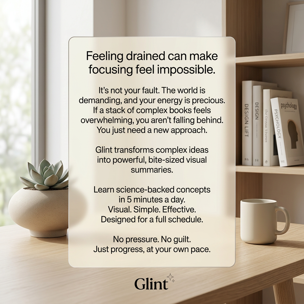
Soft light, neutral tones, books and a mug create the calm, focused space the app promises. The visual is the after-state.
- 04
Short closing lines are scannable
After the longer opening, the copy switches to punchy fragments like Visual. Simple. Effective. Readers who skim still get the benefits.
Full creative breakdown
Who this ad targets
This ad targets busy working adults, roughly 25 to 45, who want to keep learning but feel too tired to read full non-fiction books. They are knowledge workers, managers and self-improvement fans who own more books than they finish and feel a little guilty about it. They are drawn to psychology, productivity and business ideas, value calm and minimal design, and respond well to gentle, non-judgemental messaging. They are typical buyers of book summary and microlearning subscriptions.
Copywriting analysis
The copy follows a classic problem, agitate, solve structure, but with a soft touch. It opens by naming the reader's pain, then quickly shifts to reassurance instead of fear, which suits an audience that already feels overwhelmed. The product is introduced in one clear sentence, followed by a concrete promise of five minutes a day. The closing fragments and the no pressure, no guilt line reinforce the emotional positioning. The main weakness is length: there is a lot of text for a feed ad, and the app name only appears halfway down. A shorter version could lead with the headline and benefit line and move the rest into the primary text.
Visual design
The design uses a frosted-glass card with rounded corners as the main focal point, which keeps a long block of text readable over a photo. The background is a soft, warm home office with a window, succulent, mug and books, all in neutral beige and white. The typography is a clean, centred sans-serif with a larger headline. The Glint logo sits in a serif wordmark at the bottom with a small sparkle icon. The low contrast palette feels calm, but may get lost in a busy feed.
How to adapt this template for your brand
- Write a one-line headline that names the exact feeling or frustration your audience has right now.
- Add two or three lines of reassurance that remove blame before mentioning your product.
- Introduce your product in one sentence, followed by one concrete, measurable promise.
- Place the text on a semi-transparent card over a calm photo that shows the desired after-state.
- End with a short, guilt-free sign-off and keep your logo small below the card.
Tips for apps & subscriptions ads on Meta
On Meta, this works best in feed placements where people slow down to read; for Stories and Reels, cut the card text to the headline and the five-minutes-a-day line. Use the primary text to add a free trial offer and an app store CTA. On TikTok, turn the message into a calm voiceover or on-screen text sequence, one line at a time, over the same desk scene. Test a shorter text variant against this long one, since text-heavy images can lower reach.
About this creative
This square creative for Glint, a microlearning app, is built around a large frosted-glass card that sits in front of a calm, neutral home office. Behind it you see a window with soft daylight, a succulent in a ceramic pot, a white mug and a shelf of books with titles about design and psychology. The card carries a long, centred message in a clean sans-serif. It opens with a headline about feeling drained and finding it impossible to focus, then reassures the reader that it is not their fault. Only after that does it introduce Glint, which turns complex ideas into bite-sized visual summaries. The copy closes with short benefit lines about learning in five minutes a day and a reassuring no pressure, no guilt sign-off. The Glint wordmark with a small sparkle sits below the card. The whole ad feels quiet, warm and premium, with no button, price or discount on the image.
Meta ad · 1200 × 1200 · Apps & Subscriptions
Learning App Ad: Glint's Feeling Drained Message Card
This square ad for Glint, a microlearning app, places a long empathetic message on a frosted card in a calm home office scene. It speaks to tired professionals who feel guilty about unread books. Use it as a template for app, subscription and e-learning ads that lead with emotion before features.
Added
All brand names and logos are property of their owners. Adplaylist is not affiliated with or endorsed by these brands.
Details
Ad copy
Primary text
Too tired to read another book? You're not behind. Glint turns big ideas from psychology, science and business into 5-minute visual summaries you can take in on a busy day. Try it free.
Description
Visual summaries for busy minds
On-image text
Feeling drained can make focusing feel impossible. / It's not your fault. The world is demanding, and your energy is precious. If a stack of complex books feels overwhelming, you aren't falling behind. You just need a new approach. / Glint transforms complex ideas into powerful, bite-sized visual summaries. / Learn science-backed concepts in 5 minutes a day. Visual. Simple. Effective. Designed for a full schedule. / No pressure. No guilt. Just progress, at your own pace. / Glint (logo)
Headline ideas for this template
- 1Too Tired to Read? Try 5 Minutes Instead
- 2You're Not Behind. You Just Need a New Approach.
- 3Big Ideas, Bite-Sized and Visual
- 4Learn Something Smart Before Your Coffee Gets Cold
- 5No Pressure. No Guilt. Just Progress.
Meta image ad specs
| Placement | Ratio | Size (px) |
|---|---|---|
| Feed | 1:1 or 4:5 | 1080×1080 / 1080×1350 |
| Marketplace | 1:1 | 1200×1200 |
| Messenger inbox | 1:1 | 1200×1200 |
| Stories & Reels | 9:16 | 1080×1920 |
This template is 1:1. Request 4:5 or 9:16 to cover all placements.