Key takeaways
- Format: Overhead interior shot with thin lowercase label callouts.
- Best for: Totes, work bags and organisers sold on layout.
- Hook: Labelled sleeves for laptop, tablet and bottle show a bag built around real daily items.
- Reuse it: Shoot your tote open from above and label each pocket once, in a consistent style.
Available sizes
What is a feature callout ad?
A feature callout ad is a static image that shows a single product with short text labels pointing to its key features or benefits, usually joined to the product by thin lines. It explains several selling points at a glance without a long caption, which is why it's common for supplements, skincare, electronics and kitchenware.
See all feature callouts ads →Why this feature callouts ad works
- 01
Daily items shown
Laptop, tablet, bottle and notebook reflect a real workday carry.
- 02
Quiet labels
Thin lowercase type feels calm and premium.
- 03
Bottle sleeve
A dedicated bottle spot answers a common tote frustration.
- 04
Neutral styling
Rose gold, silver and cream props stand out against the black lining.
Full creative breakdown
Who this ad targets
Professionals and creatives who prefer a tote to a backpack but still need structure for a laptop, tablet and water bottle. They want a bag that looks polished for meetings and works for commuting. Design-conscious buyers will respond to the minimal styling. Remote and hybrid workers moving between home, office and cafés are a natural fit. Teachers and consultants carrying documents also fit.
Copywriting analysis
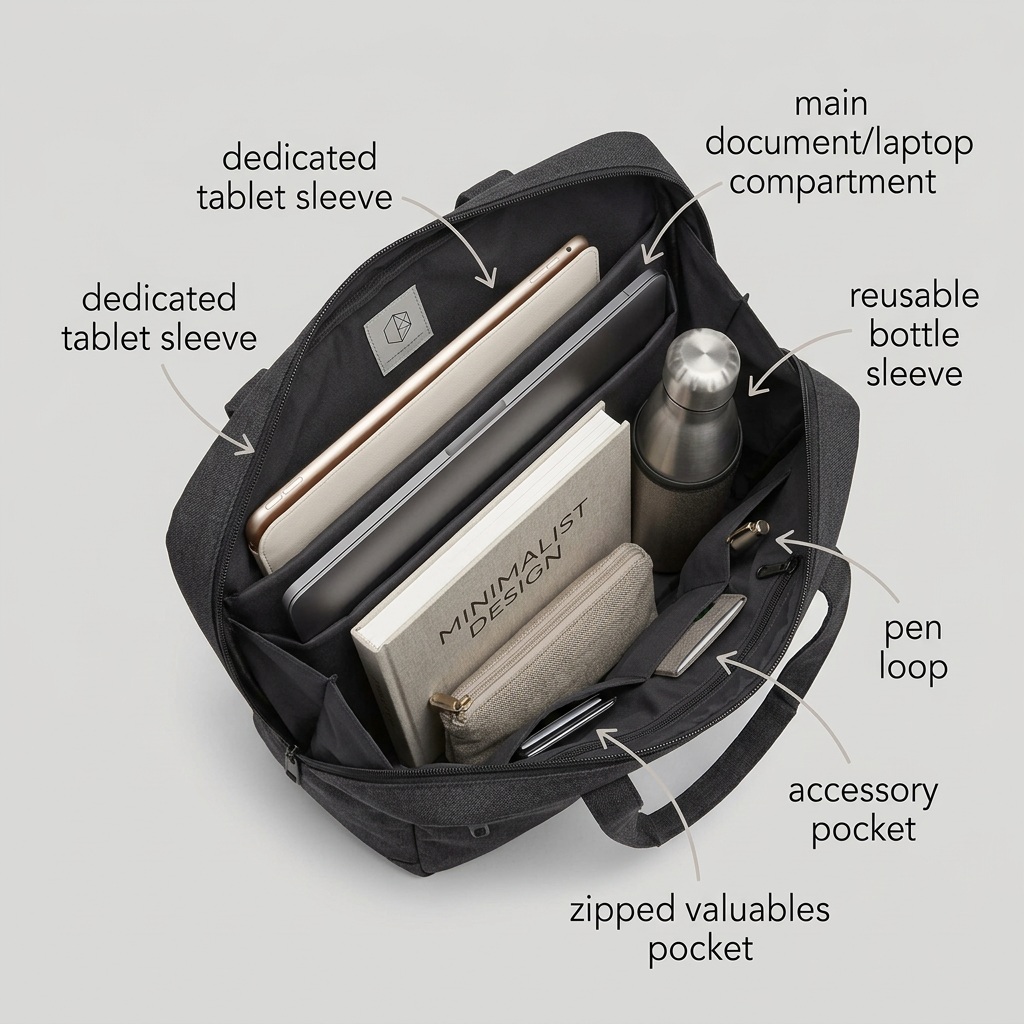
The labels are clear and descriptive, and lowercase styling suits a minimal brand. However, 'dedicated tablet sleeve' appears twice, once pointing inside and once at the bag's exterior, which looks like an error. 'Main document/laptop compartment' is a bit clunky with the slash. There's no headline, brand name or call to action, so the primary text must explain the product and its key differentiator. A short headline such as 'Every essential, in its place' would give the labels context and anchor the layout. A visible brand name would also help viewers remember where to find it.
Visual design
The pale grey background and charcoal tote create a calm, professional look. The black lining makes props like the rose gold tablet and steel bottle pop. Thin grey arrows are subtle and elegant. The arrangement is neat and believable. The duplicated label on the left clutters the layout. The small logo patch is visible but not legible, so the brand isn't recognisable.
How to adapt this template for your brand
- Shoot your tote from above, open and neatly packed with everyday items.
- Label each pocket once, using a consistent style.
- Choose props that contrast with the lining colour.
- Make the brand name legible on the bag or add a logo.
- Write a headline in the primary text that sums up the organisation benefit.
Tips for travel ads on Meta
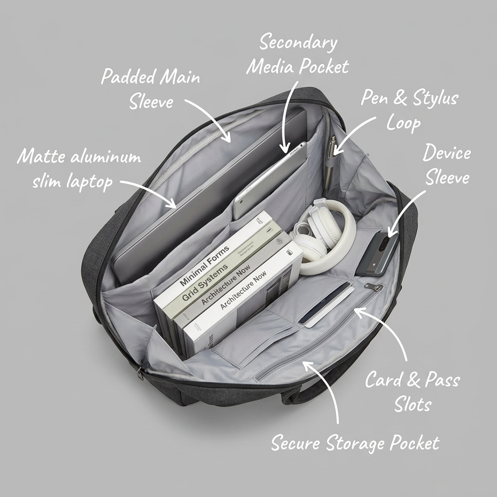
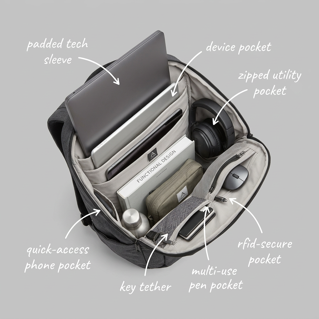
This works on Meta and Pinterest for professionals and creatives interested in work bags. A carousel with the tote closed, on the shoulder and open would give a fuller picture. Fix the duplicated label before running. Compare it against the laptop bag (33) and backpack (35) interior ads in the same style to see which format resonates most with your audience.
About this creative
An overhead feature ad on a pale grey background showing an open charcoal tote with a black lining and a small grey logo patch. Grey lowercase labels with thin curved arrows surround the bag. Inside, a rose gold tablet sits in a sleeve at the back, labelled 'dedicated tablet sleeve'. The same label appears a second time on the left, pointing at the outside of the bag. Next to the tablet, a silver laptop sits in a compartment labelled 'main document/laptop compartment'. In front, a cream notebook titled 'Minimalist Design' and a beige zip pouch stand upright. On the right, a brushed steel bottle in a sleeve is labelled 'reusable bottle sleeve'. Smaller pockets on the right are labelled 'pen loop' and 'accessory pocket', and a pocket at the front holding cards is labelled 'zipped valuables pocket'. The tote's top handles are visible at the edge. No brand name is legible.
Meta ad · 1200 × 1200 · Travel
Labelled Interior Ad for an Organised Laptop Tote
This ad looks into an open charcoal tote holding a tablet, laptop, notebook, steel bottle and pouch, with thin grey lowercase labels and arrows naming each pocket. Use it for bags sold on organisation, but fix the duplicated 'dedicated tablet sleeve' label first.
Added
All brand names and logos are property of their owners. Adplaylist is not affiliated with or endorsed by these brands.
Details
Ad copy
Primary text
Organisation without the bulk. This tote has dedicated sleeves for your laptop and tablet, a bottle sleeve, a pen loop and zipped pockets for valuables, all in a clean, minimal design.
Description
Organised laptop tote
On-image text
dedicated tablet sleeve | dedicated tablet sleeve | main document/laptop compartment | reusable bottle sleeve | pen loop | accessory pocket | zipped valuables pocket
Headline ideas for this template
- 1Every essential, in its place
- 2The organised tote
- 3Laptop, tablet and bottle sorted
- 4Workday-ready, inside and out
- 5Structure meets style
Meta image ad specs
| Placement | Ratio | Size (px) |
|---|---|---|
| Feed | 1:1 or 4:5 | 1080×1080 / 1080×1350 |
| Marketplace | 1:1 | 1200×1200 |
| Messenger inbox | 1:1 | 1200×1200 |
| Stories & Reels | 9:16 | 1080×1920 |
This template is 1:1. Request 4:5 or 9:16 to cover all placements.
Browse similar by tag