Key takeaways
- Format: Illustrated collab launch with hand-drawn feature callouts.
- Best for: Kids' products or brand collaborations aimed at parents.
- Hook: Cute illustrated explorers and pastel colours that charm kids and parents alike.
- Reuse it: Split the background in two brand colours, centre a collab logo and point arrows at features.
Available sizes
What is a feature callout ad?
A feature callout ad is a static image that shows a single product with short text labels pointing to its key features or benefits, usually joined to the product by thin lines. It explains several selling points at a glance without a long caption, which is why it's common for supplements, skincare, electronics and kitchenware.
See all feature callouts ads →Why this feature callouts ad works
- 01
Speaks to two audiences
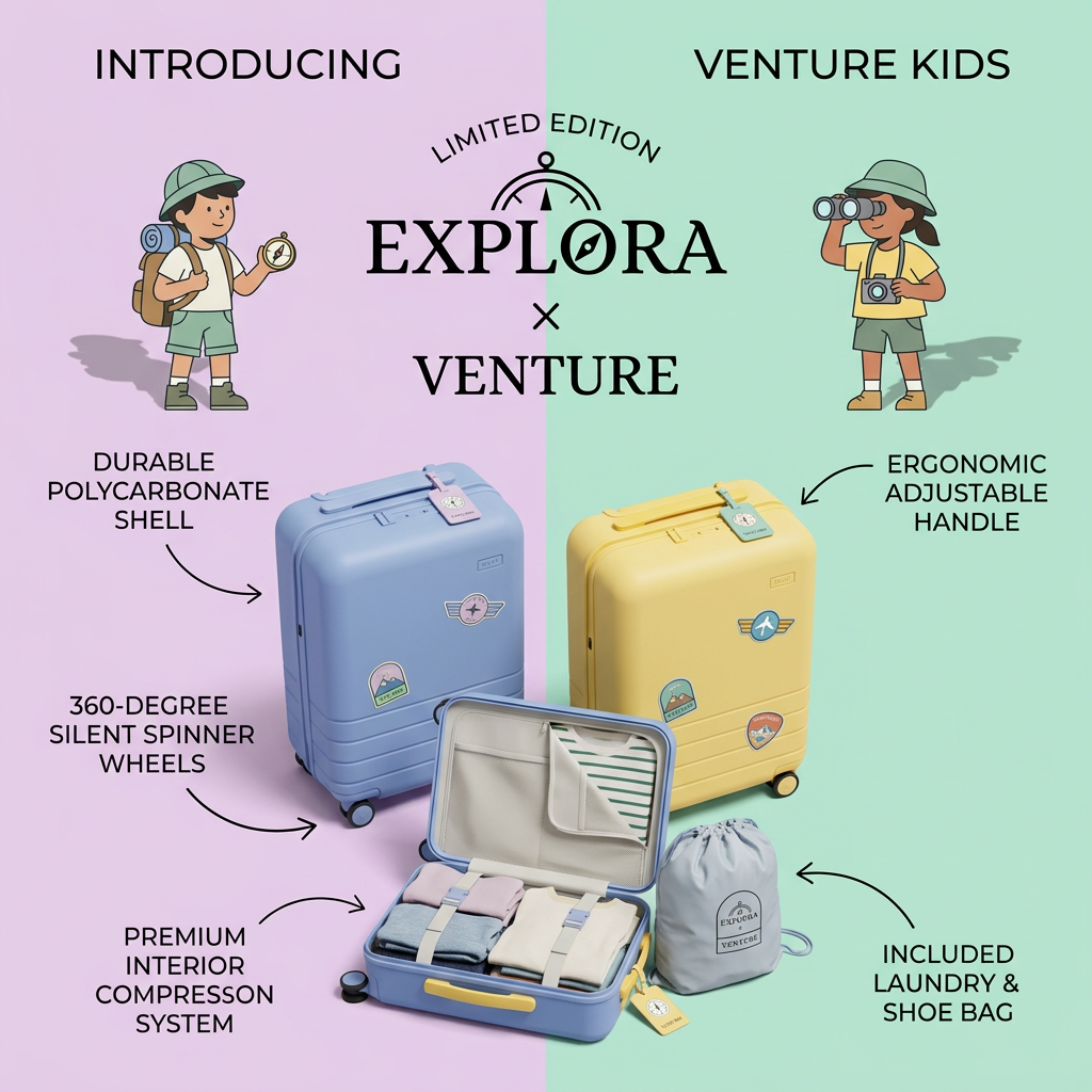
Illustrations and stickers appeal to children, while technical callouts reassure the parents who pay.
- 02
Collab and scarcity
"Limited edition" and the × logo make it feel special and collectible, encouraging quick purchase.
- 03
Open case shows value
Showing the interior and laundry bag proves the features instead of only listing them.
- 04
Hand-drawn arrows feel friendly
Sketchy arrows keep a playful, storybook tone while still delivering spec information.
Full creative breakdown
Who this ad targets
Parents aged roughly 30–45 with children aged about 4–10 who travel as a family and want their kids to carry their own luggage. They value durability and practical features but also want something their child will love. Grandparents and relatives looking for a special gift are a secondary audience. The limited-edition collab angle also appeals to fans of either brand and collectors of design-led kids' products.
Copywriting analysis
The copy has two layers. The headline layer ("Introducing," "Venture Kids," "Limited edition," "Explora × Venture") is launch and brand language, creating excitement and exclusivity. The callout layer is purely rational: material, handle, wheels, interior system and included accessory. Adjectives such as "durable," "ergonomic," "silent" and "premium" target parental concerns about breakage, comfort, noise and value. Uppercase labels keep it consistent. The split of "Introducing" and "Venture Kids" across the top is slightly hard to read as one phrase. The typo "compresson" should be fixed before running, as it undermines the premium claim.
Visual design
A symmetrical layout built around the vertical colour split, with the collab logo and illustrations mirrored on both sides. Pastel lilac, mint, periwinkle and butter yellow create a soft, playful palette suitable for kids without being garish. Product photos are realistic, while the children are flat illustrations, a mix that keeps the focus on the real product. Black hand-drawn arrows and condensed uppercase labels add structure. A serif logo adds a heritage, adventure-brand touch.
How to adapt this template for your brand
- Split the background vertically into two soft colours, one per brand or variant.
- Centre your logo (or collab lockup) with a "Limited edition" arc above it.
- Add simple illustrated characters on each side to set the tone.
- Show the product closed and open, plus any included accessory.
- Draw arrows to four or five features with short uppercase labels and proofread every word.
Tips for parenting & baby ads on Meta
On Meta, target parents of young children and family-travel interests; this is a strong fit for pre-holiday and gifting seasons. Test a carousel showing each colour and the open interior. Kids' products must follow platform rules, so target adults only. On TikTok, film a child packing their own suitcase, with the callouts appearing as animated stickers. Fix the label typo before launch.
About this creative
This square ad announces a limited-edition kids' suitcase from a collaboration between Explora and Venture. The background is split vertically into pastel lilac on the left and mint green on the right. At the top, "Introducing" and "Venture Kids" sit in each corner, while the centre shows a compass-style logo with "Limited edition" arched above and "Explora × Venture" in a classic serif. Two illustrated children in safari hats flank the logo: one with a backpack and compass, the other with binoculars and a camera. Below, a periwinkle-blue and a butter-yellow carry-on suitcase stand upright, decorated with badge stickers and luggage tags. In front, an open blue case shows neatly packed clothes held by compression straps, next to a grey drawstring laundry bag. Hand-drawn black arrows point to five features: durable polycarbonate shell, ergonomic adjustable handle, 360-degree silent spinner wheels, premium interior compression system and included laundry and shoe bag. One label has a small typo ("compresson").
Meta ad · 1200 × 1200 · Parenting & Baby
Kids Suitcase Ad: Explora × Venture Limited Edition
This square collaboration ad launches the limited-edition Explora × Venture Kids suitcase. A pastel lilac and mint split background, illustrated child explorers and hand-drawn arrows highlight five features. Use this template for kids' products or collabs that need to charm children and reassure parents at once.
Added
All brand names and logos are property of their owners. Adplaylist is not affiliated with or endorsed by these brands.
Details
Ad copy
Primary text
Little explorers deserve their own gear. The limited-edition Explora × Venture Kids suitcase has a durable shell, silent spinner wheels, an adjustable handle and a laundry bag included. Available in lilac-blue and sunshine yellow.
Description
Kids' carry-on built for real adventures.
On-image text
Introducing | Venture Kids | Limited edition | Explora × Venture | Durable polycarbonate shell | Ergonomic adjustable handle | 360-degree silent spinner wheels | Premium interior compression system | Included laundry & shoe bag
Headline ideas for this template
- 1Their first suitcase, their first adventure
- 2Little explorers, big trips
- 3The kids' carry-on parents trust
- 4Limited edition gear for tiny travellers
- 5Pack light, roll quiet, explore more
Meta image ad specs
| Placement | Ratio | Size (px) |
|---|---|---|
| Feed | 1:1 or 4:5 | 1080×1080 / 1080×1350 |
| Marketplace | 1:1 | 1200×1200 |
| Messenger inbox | 1:1 | 1200×1200 |
| Stories & Reels | 9:16 | 1080×1920 |
This template is 1:1. Request 4:5 or 9:16 to cover all placements.