Key takeaways
- Format: Side-by-side illustrated tech comparison: our technology vs the old way.
- Best for: Products with a proprietary technology that outperforms the category standard.
- Hook: 'The most powerful at-home IPL device' backed by a visual proof diagram.
- Reuse it: Illustrate your mechanism next to the traditional one with matching diagrams.
Available sizes
What is a comparison ad?
A comparison ad sets the product against an alternative, such as a competitor, the old way of doing things or a cheaper option, usually in a two-column layout or table. It helps buyers who are already weighing options see quickly why this one is the better choice.
See all comparison ads →Why this comparison ad works
- 01
Visual mechanism
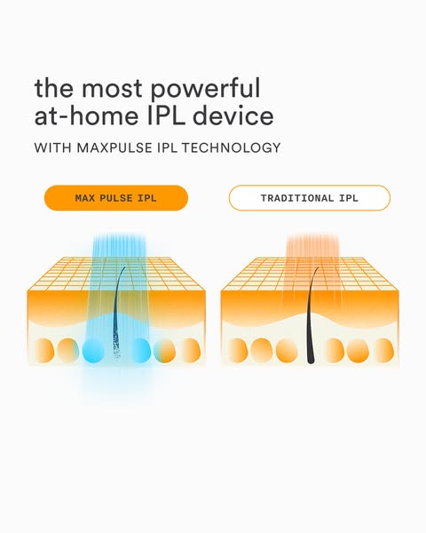
Showing how the beam reaches the follicle makes 'more powerful' believable.
- 02
Us vs them framing
Filled vs outlined labels signal a clear winner without naming competitors.
- 03
Proprietary tech name
'MaxPulse' gives the claim an ownable, memorable label.
- 04
Medical-diagram credibility
The cross-section style borrows authority from clinical illustrations.
Full creative breakdown
Who this ad targets
This ad targets women and men aged around 25 to 50 who are comparing IPL devices or have tried a weaker one with disappointing results. They want to understand why one device costs more and whether it really works better. Analytical buyers who read spec comparisons and reviews respond to the visual mechanism explanation and the superlative 'most powerful' positioning.
Copywriting analysis
'The most powerful at-home IPL device' is a bold superlative that grabs attention but must be substantiated to meet advertising standards. The sub-line introduces the proprietary 'MaxPulse IPL technology', giving the claim a reason to believe. The comparison labels are the only other copy, keeping the ad simple. Note the inconsistency between 'MAXPULSE' in the sub-line and 'MAX PULSE' in the label; unifying the spelling would strengthen the brand name.
Visual design
Two identical isometric diagrams side by side make the comparison fair and easy to read. The orange-and-cream palette is warm and on-brand, while the electric blue beam on the winning side is the visual hero. Filled versus outlined labels create hierarchy. Plenty of white space at the top and bottom keeps it clean. The illustration style is simple enough to read on a phone screen.
How to adapt this template for your brand
- Name your proprietary technology or mechanism.
- Illustrate it next to the traditional approach using identical diagrams.
- Use a bright accent colour on your side and muted tones on the other.
- Use filled vs outlined labels to signal the winner.
- Back the superlative headline with data on your landing page.
Tips for hair removal ads on Meta
Superlative claims such as 'most powerful' must be substantiated on Meta and Google, so link to evidence. Use 4:5 portrait in Feed; for Reels, animate the beams penetrating the skin. This is a consideration-stage creative, so pair with testimonials and offers in the same campaign. On Google Demand Gen, the illustration style performs well among informational content.
About this creative
This portrait creative uses a clean white background and a bold, illustrated explainer. The headline at the top-left reads 'the most powerful at-home IPL device' in dark lowercase sans-serif, with an uppercase sub-line, 'WITH MAXPULSE IPL TECHNOLOGY'. Below are two pill-shaped labels: a filled orange 'MAX PULSE IPL' on the left and an outlined 'TRADITIONAL IPL' on the right. Each label sits above an isometric skin cross-section in orange and cream, with a grid surface, a single dark hair and round cells beneath. On the left, a bright blue light beam passes through the skin and destroys the hair follicle, highlighted by glowing blue cells. On the right, a pinkish-orange beam barely penetrates and the hair remains intact. The filled versus outlined labels instantly signal 'winner' and 'loser'. The schematic style borrows from medical diagrams to build credibility, while the bright orange-and-blue palette keeps it eye-catching in feeds.
Meta ad · 338 × 600 · Hair Removal
Nood MaxPulse vs Traditional IPL Comparison Ad
This Nood ad uses a side-by-side illustration to compare MaxPulse IPL with traditional IPL. A blue beam penetrates deep to the hair follicle on the left, while a weaker orange beam stops near the surface on the right. A 'most powerful at-home IPL device' headline frames the claim. It is a clear template for explaining technical superiority visually.
Added
All brand names and logos are property of their owners. Adplaylist is not affiliated with or endorsed by these brands.
Details
Ad copy
Primary text
Not all IPL is created equal. Nood's MaxPulse IPL technology reaches deeper into the follicle than traditional IPL for faster, longer-lasting hair reduction. Meet the most powerful at-home IPL device.
Description
MaxPulse vs traditional IPL
On-image text
the most powerful at-home IPL device | WITH MAXPULSE IPL TECHNOLOGY | MAX PULSE IPL | TRADITIONAL IPL
Headline ideas for this template
- 1Why MaxPulse beats traditional IPL
- 2Deeper reach, faster results
- 3Not all IPL is created equal
- 4The IPL that reaches the root
- 5Upgrade to MaxPulse power
Meta image ad specs
| Placement | Ratio | Size (px) |
|---|---|---|
| Feed | 1:1 or 4:5 | 1080×1080 / 1080×1350 |
| Marketplace | 1:1 | 1200×1200 |
| Messenger inbox | 1:1 | 1200×1200 |
| Stories & Reels | 9:16 | 1080×1920 |
This template is 1:1. Request 4:5 or 9:16 to cover all placements.
Browse similar by tag