Key takeaways
- Format: Side-by-side colourway comparison
- Best for: Selling the same product in several finishes or materials
- Hook: Three neat variants invite the viewer to pick a favourite
- Reuse it: Line up your variants at one angle for instant comparison
Available sizes
What is a comparison ad?
A comparison ad sets the product against an alternative, such as a competitor, the old way of doing things or a cheaper option, usually in a two-column layout or table. It helps buyers who are already weighing options see quickly why this one is the better choice.
See all comparison ads →Why this comparison ad works
- 01
Easy visual choice
Identical angles and spacing let buyers compare finishes in a glance and mentally pick one.
- 02
Balanced composition
Three evenly spaced products literally echo the headline Perfectly balanced.
- 03
Third-party trust
A review credit adds credibility for a premium, considered purchase.
- 04
Calm minimal styling
Light grey background and black type feel premium and unfussy, matching without the clutter.
Full creative breakdown
Who this ad targets
This ad targets discerning listeners aged roughly 25 to 55 who want premium wireless headphones with a refined, understated look. They read reviews, care about materials like leather and fabric, and want a finish that matches their wardrobe or interior. It suits audiences interested in hi-fi audio, design, Scandinavian interiors and premium travel. It also works for retargeting people who viewed the product page but have not chosen a colour.
Copywriting analysis
The headline Pure sound. Perfectly balanced. uses two short statements with full stops for a calm, confident tone. Balanced works on two levels: audio tuning and the visual symmetry of the three headphones. The body line Rich, smooth, and detailed sound without the clutter. stacks three sensory adjectives and ends by positioning the product against noisy, over-designed competitors. The review credit adds proof but must reference a real, verifiable review. Listen now is softer than Shop now and fits an experience-led brand.
Visual design
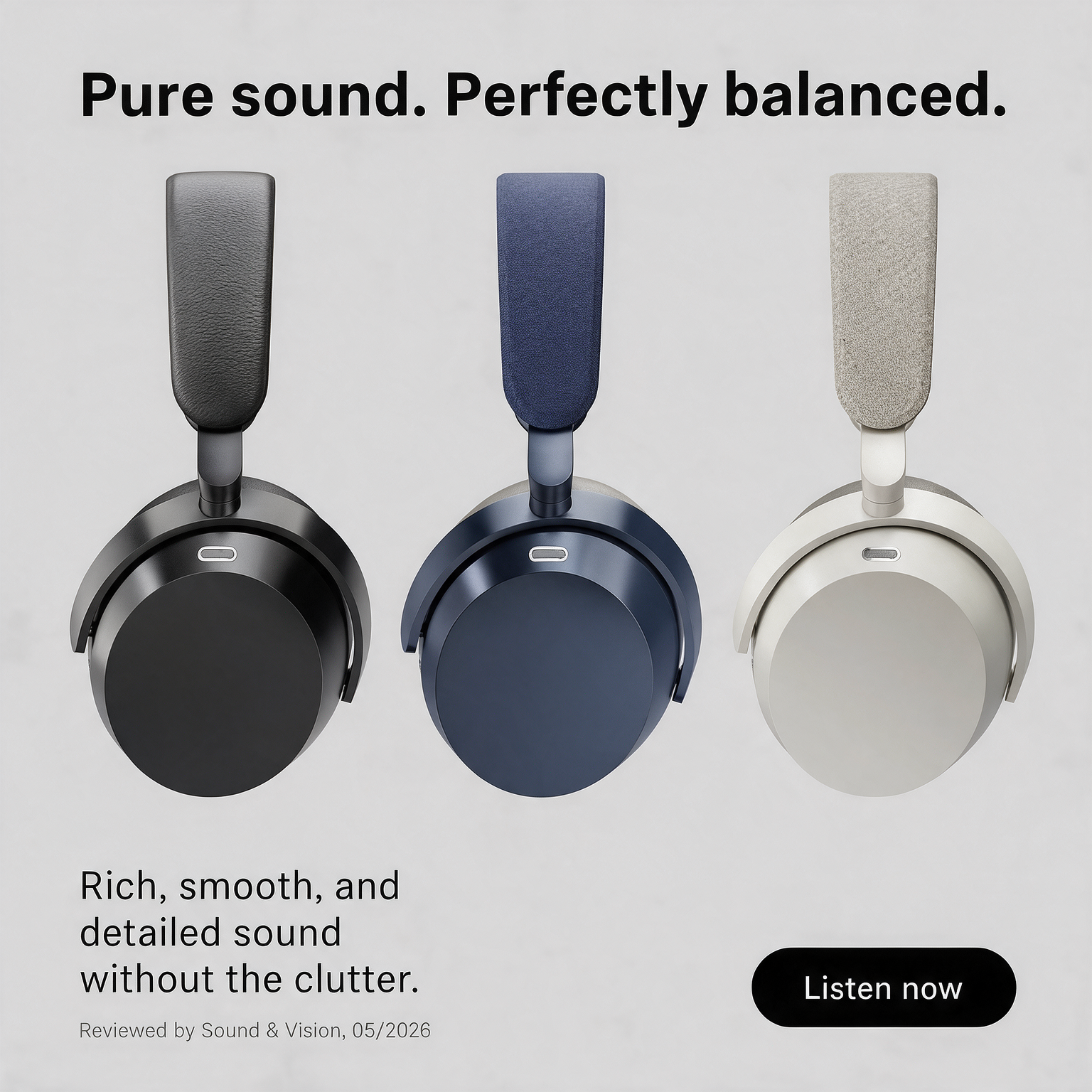
Three headphones are arranged in a row, each with its headband pointing up, at identical scale and angle. The light grey textured background lets the black, navy and stone tones stand out. A bold black sans serif headline spans the top. Body copy sits bottom left in a larger regular weight, with a small grey review credit below. A black pill button sits bottom right. Ample whitespace and a strict grid give a minimal, premium feel.
How to adapt this template for your brand
- Photograph each colour variant from the same angle and distance.
- Arrange them evenly in a row on a neutral background.
- Write a headline that connects the product benefit to balance or choice.
- Add a genuine review or award credit in small text.
- Test labelling each variant with its colour name.
Tips for headphones ads on Meta
This comparison creative suits Meta feeds and works especially well as the cover of a carousel, with each colour on its own following card. For Stories, stack the three headphones vertically. On Google Shopping and Performance Max, upload each colourway separately. Only use the review credit where you have permission, as platforms may require substantiation of claims. Retarget product page visitors with this creative.
About this creative
This creative shows three identical over-ear headphones photographed from the side in a neat row on a light grey background: one in black with a leather headband, one in navy with a textile headband, and one in stone grey with a felt-like fabric headband. The uniform angle and spacing make it easy to compare colours and materials. At the top, a bold black headline spans the width: Pure sound. Perfectly balanced. In the lower left, a larger regular-weight sentence reads Rich, smooth, and detailed sound without the clutter., and beneath it a small credit says Reviewed by Sound & Vision, 05/2026. A black pill-shaped Listen now button sits bottom right. The design is restrained and Scandinavian in feel, letting materials and finishes speak. The review credit adds third-party trust, but it should only be used if the review is real and permission has been obtained.
Meta ad · 1200 × 1200 · Headphones
Headphones Colours Ad Template: Pure Sound, Balanced
This square headphones ad lines up three over-ear headphones in black, navy and stone grey side by side, under the headline Pure sound. Perfectly balanced. It is a comparison format that helps buyers choose a finish, with a small review credit for trust. Use it as a template for Meta ads showing product variants.
Added
All brand names and logos are property of their owners. Adplaylist is not affiliated with or endorsed by these brands.
Details
Ad copy
Primary text
Rich, smooth and detailed sound without the clutter. Choose your finish: Black leather, Navy fabric or Stone grey – each tuned for perfectly balanced listening.
Description
Rich, smooth, and detailed sound without the clutter.
On-image text
Pure sound. Perfectly balanced. | Rich, smooth, and detailed sound without the clutter. | Reviewed by Sound & Vision, 05/2026 | Listen now
Headline ideas for this template
- 1Three Finishes. One Perfect Sound.
- 2Choose Your Balance
- 3Leather, Navy or Stone?
- 4Detailed Sound, Your Colour
- 5Clutter-Free Sound in Three Styles
Meta image ad specs
| Placement | Ratio | Size (px) |
|---|---|---|
| Feed | 1:1 or 4:5 | 1080×1080 / 1080×1350 |
| Marketplace | 1:1 | 1200×1200 |
| Messenger inbox | 1:1 | 1200×1200 |
| Stories & Reels | 9:16 | 1080×1920 |
This template is 1:1. Request 4:5 or 9:16 to cover all placements.