Key takeaways
- Format: Portrait two-product shot with foreground and background depth.
- Best for: Launching multiple colourways and driving D2C store traffic.
- Hook: Evocative colour names paired with a store-exclusive line.
- Reuse it: Stage two variants at different depths and name them in the headline.
Available sizes
What is a product shot ad?
A product shot ad puts the product itself at the centre of the frame, usually on a clean or styled background with little text. It works best when the packaging or product is distinctive enough to stop the scroll and the viewer already understands what it does.
See all product shot ads →Why this product shot ad works
- 01
Depth shows both options
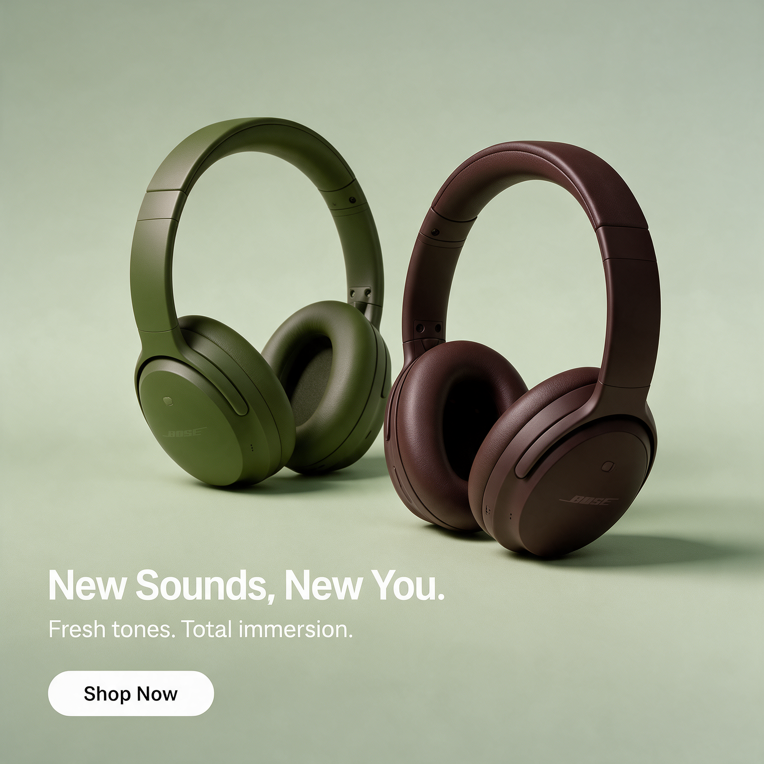
Placing one pair close and one far keeps both colours visible without a cluttered side-by-side line-up.
- 02
Names that sell
'Olive Green' and 'Cherry Chocolate' sound like fashion or food, adding desire beyond a plain colour swatch.
- 03
Exclusivity drives D2C
'Exclusively at Bose.com' gives a reason to buy direct instead of through a retailer.
- 04
Editorial framing
The vertical logo rule adds structure and brand recognition without taking space from the products.
Full creative breakdown
Who this ad targets
This ad targets premium headphone buyers in the US, typically 25 to 45, who care about design and want something less common than black or silver. It suits fashion-aware professionals, frequent travellers and existing Bose fans considering an upgrade. Because the CTA pushes to Bose.com, it is also built for retargeting site visitors and audiences who previously engaged with QuietComfort content. Interests like menswear, interior design, coffee culture and premium travel align with the earthy, sophisticated colour story.
Copywriting analysis
The headline is simply the two colour names, which is a confident move: it assumes the names themselves are appealing enough to stop the scroll. 'Cherry Chocolate' in particular uses food language to suggest richness and indulgence. The second line, 'Exclusively at Bose.com', carries the commercial intent and gives a clear destination. There is no product name on the image, as the shape of the QuietComfort Ultra is distinctive enough for the target audience; the primary text handles naming and features. Short, declarative and brand-led copy keeps the creative premium.
Visual design
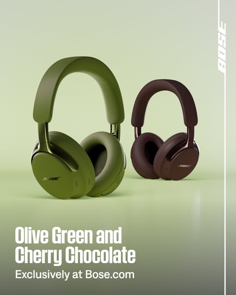
The sage background is colour-matched to the olive pair so the foreground product almost emerges from the scene, while the brown pair provides a contrasting focal point. Soft studio lighting and a subtle floor reflection keep the look clean. The vertical white rule with the rotated Bose logo frames the right edge and echoes a magazine spine. White condensed type in the bottom left balances the visual weight of the large foreground headphones. The muted, earthy palette signals sophistication rather than flashy tech.
How to adapt this template for your brand
- Pick two variants and stage one large in the foreground and one smaller in the background.
- Colour-match the background to one variant so the other stands out by contrast.
- Use the variant names as your headline; rename them if needed to sound more evocative.
- Add a single line with your exclusive channel or offer (only on our site, online only).
- Frame the creative with a thin brand rule or logo strip to add an editorial touch.
Tips for headphones ads on Meta
On Meta, use this 4:5 creative for traffic and conversion campaigns pointed at your own store, and pair it with a product catalogue for dynamic retargeting. Because the image carries little text, add the key feature (noise cancellation, battery life) in the primary text. For Stories, extend the background vertically and move the headline up above the bottom safe zone. Test the two colours as separate single-product creatives too, to learn which colour your audience prefers.
About this creative
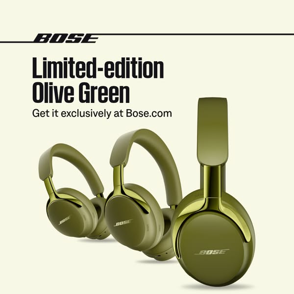
This Bose creative presents two new QuietComfort Ultra colourways in a calm, minimalist studio scene. The Olive Green pair sits large in the foreground on the left, while the Cherry Chocolate pair stands smaller and further back on the right, creating natural depth and letting both colours be seen at once. The background is a soft sage green gradient that blends with the olive pair and makes the deep brown model pop by contrast. A thin vertical white rule runs down the right edge with the Bose wordmark set vertically inside it, a framing device that feels editorial. In the bottom left, a bold condensed white headline names both colours, 'Olive Green and Cherry Chocolate', followed by 'Exclusively at Bose.com'. The message is simple: two new looks, and you can only get them from the brand directly. No feature claims appear on the image, keeping it focused on colour and exclusivity.
Meta ad · 338 × 600 · Headphones
Bose Olive Green and Cherry Chocolate Headphones Ad
This Bose ad introduces two new QuietComfort Ultra colourways side by side and pushes buyers to the brand's own store. It is a 4:5 product shot format with depth-of-field staging, ideal for D2C electronics brands driving traffic to their own website with exclusive variants.
Added
All brand names and logos are property of their owners. Adplaylist is not affiliated with or endorsed by these brands.
Details
Ad copy
Primary text
Two new shades, only on Bose.com. QuietComfort Ultra Headphones now come in Olive Green and Cherry Chocolate, with immersive audio and world-class noise cancellation.
Description
QuietComfort Ultra Headphones
On-image text
Olive Green and Cherry Chocolate | Exclusively at Bose.com | BOSE
Headline ideas for this template
- 1Olive Green and Cherry Chocolate
- 2Two new shades of quiet
- 3Only at Bose.com
- 4Your new favourite colour has noise cancelling
- 5Earthy tones, immersive sound
Meta image ad specs
| Placement | Ratio | Size (px) |
|---|---|---|
| Feed | 1:1 or 4:5 | 1080×1080 / 1080×1350 |
| Marketplace | 1:1 | 1200×1200 |
| Messenger inbox | 1:1 | 1200×1200 |
| Stories & Reels | 9:16 | 1080×1920 |
This template is 1:1. Request 4:5 or 9:16 to cover all placements.
Browse similar by tag