Key takeaways
- Format: Objection quote plus three icon callouts pointing at the product.
- Best for: Products positioned as an easier alternative to an established routine.
- Hook: A complaint about hair dye that most of the audience has felt.
- Reuse it: List the top three frustrations with the alternative and flip them into icons.
Available sizes
What is a feature callout ad?
A feature callout ad is a static image that shows a single product with short text labels pointing to its key features or benefits, usually joined to the product by thin lines. It explains several selling points at a glance without a long caption, which is why it's common for supplements, skincare, electronics and kitchenware.
See all feature callouts ads →Why this feature callouts ad works
- 01
Objection-first hook
Opening with the competitor's weakness frames the product as the obvious upgrade.
- 02
Split hair background
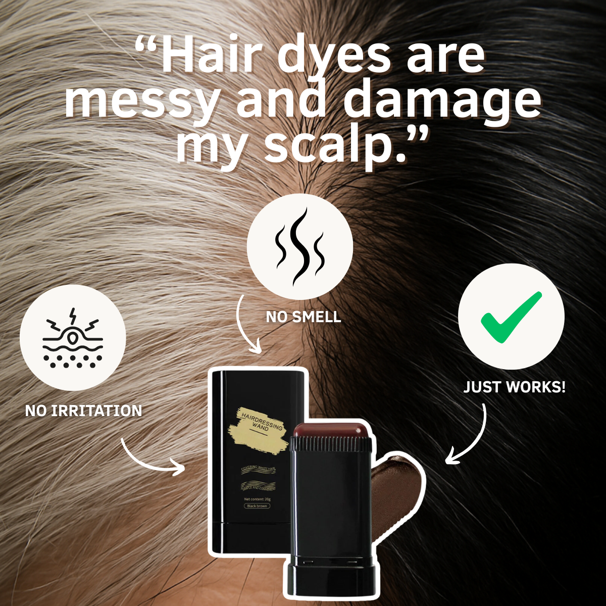
Gray versus dark hair shows the transformation without needing a separate before/after panel.
- 03
Scannable icons
Three simple icons with two-word labels are readable in a split second on mobile.
- 04
Arrows converge on product
All arrows point to the stick, making it the visual endpoint of every benefit.
Full creative breakdown
Who this ad targets
Women who currently use box dye or salon color and dislike the process: the smell of ammonia, scalp sensitivity, stained towels and time spent waiting. They are likely 40+, practical and open to switching if a product feels gentler. The ad also reaches people with sensitive skin who avoid permanent dyes altogether. Lookalike audiences built from past buyers, plus interests around hair color, salons and beauty, are a natural fit.
Copywriting analysis
The quote targets two pain points at once, mess and scalp damage, both strong reasons people delay or avoid dyeing. The three callouts then answer them directly: 'No smell' and 'No irritation' address comfort, while 'Just works!' handles the efficacy doubt that comes with any alternative. The informal 'Just works!' adds personality. Be careful: 'damage my scalp' and 'no irritation' are health-adjacent claims that need product backing, and advertisers should avoid implying medical benefits in the primary text. Overall, the copy stays short enough to read in a couple of seconds on mobile, letting the visuals carry most of the persuasion.
Visual design
The background does double duty as decoration and proof, with the hair split creating a strong diagonal. White text with a drop shadow stays legible over the busy texture. Off-white circles give the icons consistent weight and separate them from the background. The single green check mark adds a positive color accent. The product sits low and central, framed by the three callouts like a target.
How to adapt this template for your brand
- Identify the alternative your audience uses now and its biggest complaint.
- Write that complaint as a customer quote for the headline.
- Choose three benefits that directly answer it and design simple icons.
- Use a background that visualises the before and after in one image.
- Point all callouts at a centred product cut-out.
Tips for beauty & skincare ads on Meta
Feature callouts perform well as Meta Feed statics and as the final frame of a short video. For TikTok and Reels, animate each icon appearing one by one with a swipe demo. Keep the three labels identical across formats so the message is consistent. Avoid words like 'heal' or 'safe for scalp conditions' in primary text, which can trigger health-claim reviews.
About this creative
The full background is an extreme close-up of a hair part: the left half is silvery gray, the right half is glossy dark brown, with the split running diagonally through the middle. At the top, a large white quote with a soft shadow reads 'Hair dyes are messy and damage my scalp.', voicing the main objection to traditional coloring. In the centre bottom, a cut-out of the black 'Hairdressing Wand' root stick is shown open with a brown swatch beside it. Around it sit three off-white circular icons with hand-drawn white arrows pointing at the product: a scalp-with-lightning icon labelled 'NO IRRITATION', a wavy-lines icon labelled 'NO SMELL' and a green check mark labelled 'JUST WORKS!'. The icons are evenly spaced in a triangle, creating a balanced composition that draws the eye toward the product from every direction. There is no button or price; the focus stays entirely on benefits.
Meta ad · 1200 × 1200 · Beauty & Skincare
Hair Dyes Are Messy: Feature Callout Ad for a Root Stick
This ad answers a common objection to hair dye with three icon callouts around the product: no smell, no irritation, just works. A split background of gray and dark hair makes the transformation visible instantly. Use this template when your product beats a familiar alternative on comfort, convenience or safety.
Added
All brand names and logos are property of their owners. Adplaylist is not affiliated with or endorsed by these brands.
Details
Ad copy
Primary text
Box dye means stained towels, strong fumes and an itchy scalp. Our root touch-up stick skips all of it: no smell, no irritation, just quick coverage in a swipe.
Description
No smell. No irritation.
On-image text
“Hair dyes are messy and damage my scalp.” / NO SMELL / NO IRRITATION / JUST WORKS! / Hairdressing Wand
Headline ideas for this template
- 1Ditch the Box Dye Mess
- 2Gray Coverage Without the Fumes
- 3Gentle on Scalp, Tough on Grays
- 4No Smell. No Stains. Just Color.
- 5The Easier Way to Hide Grays
Meta image ad specs
| Placement | Ratio | Size (px) |
|---|---|---|
| Feed | 1:1 or 4:5 | 1080×1080 / 1080×1350 |
| Marketplace | 1:1 | 1200×1200 |
| Messenger inbox | 1:1 | 1200×1200 |
| Stories & Reels | 9:16 | 1080×1920 |
This template is 1:1. Request 4:5 or 9:16 to cover all placements.
Browse similar by tag