Key takeaways
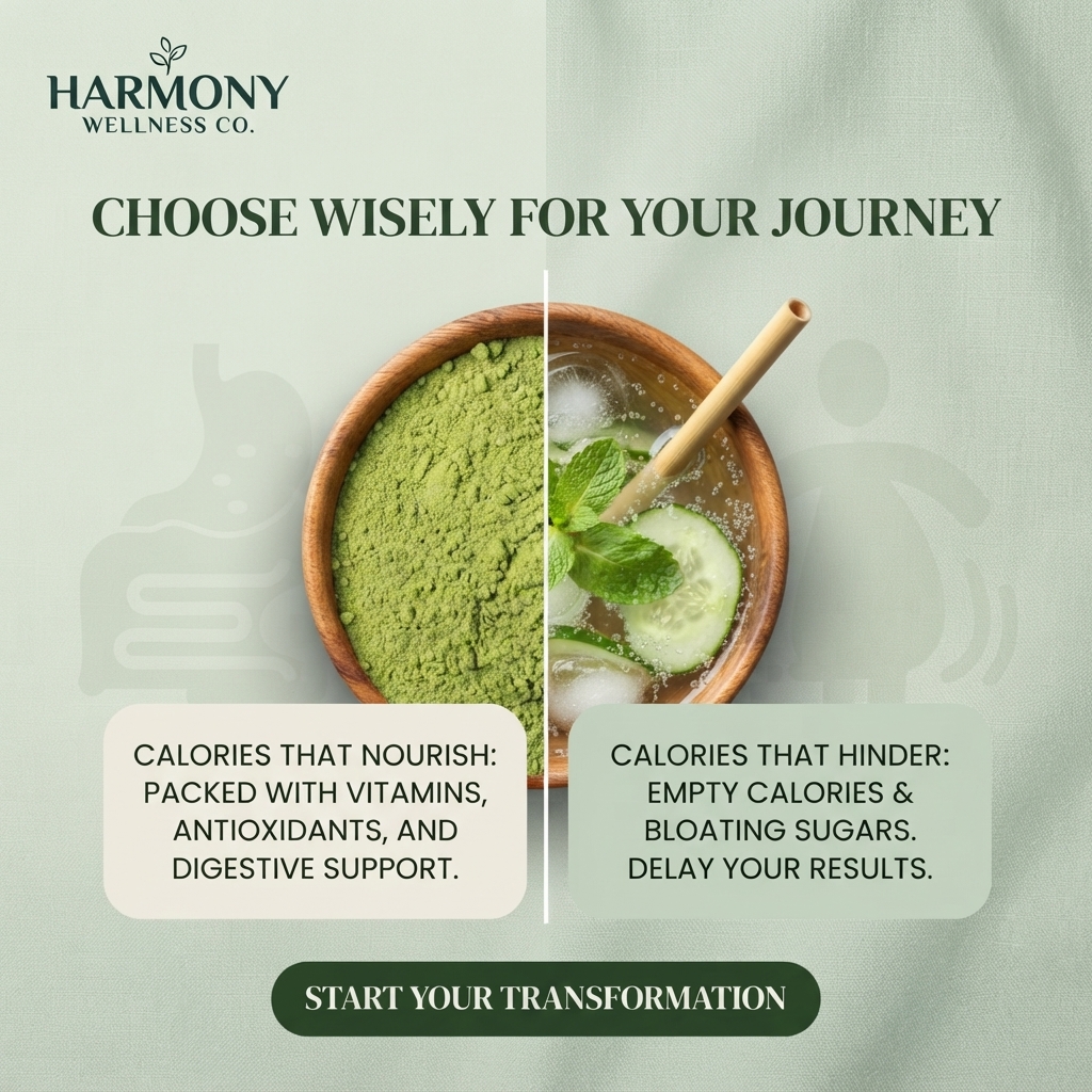
- Format: Split-image comparison of a good and a bad choice in one object.
- Best for: Supplement or nutrition brands positioning against sugary habits.
- Hook: One bowl cut in half to show two different paths.
- Reuse it: Swap the two halves and text boxes; keep the split line and labels.
Available sizes
What is a comparison ad?
A comparison ad sets the product against an alternative, such as a competitor, the old way of doing things or a cheaper option, usually in a two-column layout or table. It helps buyers who are already weighing options see quickly why this one is the better choice.
See all comparison ads →Why this comparison ad works
- 01
One object, two choices
Splitting a single bowl makes the comparison instant and visually clever.
- 02
Clear good vs bad framing
'Nourish' and 'hinder' labels give viewers a simple decision to make.
- 03
Calm, natural palette
Sage, cream and wood tones feel healthy and trustworthy.
- 04
Benefits are concrete
Vitamins, antioxidants and digestive support give specific reasons to choose the product.
Full creative breakdown
Who this ad targets
This ad targets health-conscious adults, mainly women aged around 25 to 50, who are trying to lose weight and want to clean up their diet. They are open to supplements such as greens powders and want natural, plant-based support. They respond to calm, wellness-style branding rather than aggressive diet marketing and like simple swaps that feel achievable. Many have tried strict diets before and now prefer gentle, sustainable changes.
Copywriting analysis
The headline 'Choose Wisely for Your Journey' frames weight loss as a series of everyday decisions. The two text boxes use parallel structure, 'Calories that nourish' versus 'Calories that hinder', which makes the comparison memorable. Benefits on the left are specific, while the right side names pain points: empty calories, bloating and delayed results. One issue is that the right side shows a cucumber and mint drink, which looks healthy, so the visual undercuts the 'bloating sugars' message. 'Start Your Transformation' is a motivating CTA. All-caps body text is harder to read on mobile.
Visual design
The design is symmetrical, with the bowl in the centre and two text boxes mirroring each other below. A thin white line divides both bowl and layout. Sage green, cream and natural wood keep the palette soft and natural. Faint body icons in the background add subtle context. The dark green button anchors the bottom and matches the headline colour.
How to adapt this template for your brand
- Place one object in the centre and split it into two halves.
- Fill one half with your product and the other with a common bad habit.
- Make sure the 'bad' side actually looks less healthy.
- Add two matching text boxes with parallel labels.
- Use a calm, natural colour palette and a motivating CTA.
Tips for weight loss ads on Meta
On Meta, weight loss ads must avoid implying negative self-perception, so keep the tone positive as this ad does. Restrict targeting to adults 18+, as required for weight loss products. Replace the right-hand drink with a clearly sugary soda for a stronger contrast. Use primary text to explain how the greens fit into a daily routine. Retarget engaged viewers with a starter pack offer.
About this creative
The creative sits on a soft sage green linen background with faint icons of a stomach and a person in the shadows. The Harmony Wellness Co. logo, a dark green serif wordmark with a small leaf, appears top left. A bold dark green serif headline across the top reads 'Choose Wisely for Your Journey'. In the centre, a round wooden bowl is divided by a thin vertical white line. The left half is filled with fine, vivid green powder, likely a greens or matcha supplement. The right half holds a sparkling drink with ice cubes, cucumber slices, mint leaves and a bamboo straw. Below, two rounded boxes sit side by side. The cream box on the left says calories that nourish are packed with vitamins, antioxidants and digestive support. The sage box on the right says calories that hinder are empty calories and bloating sugars that delay results. A dark green pill button at the bottom reads 'Start Your Transformation'.
Meta ad · 1200 × 1200 · Weight Loss
Greens Powder Ad: Split Bowl Comparison
This Harmony Wellness Co. ad splits a single wooden bowl down the middle: bright green superfood powder on the left and an iced drink with mint and cucumber on the right. Two text boxes contrast calories that nourish with calories that hinder, making it a clear comparison template for supplements.
Added
All brand names and logos are property of their owners. Adplaylist is not affiliated with or endorsed by these brands.
Details
Ad copy
Primary text
Every choice shapes your journey. Swap empty, bloating sugars for calories that nourish: Harmony Wellness greens are packed with vitamins, antioxidants and digestive support to keep you on track. Start your transformation today.
Description
Nourishing greens packed with vitamins and antioxidants.
On-image text
HARMONY WELLNESS CO. | CHOOSE WISELY FOR YOUR JOURNEY | CALORIES THAT NOURISH: PACKED WITH VITAMINS, ANTIOXIDANTS, AND DIGESTIVE SUPPORT. | CALORIES THAT HINDER: EMPTY CALORIES & BLOATING SUGARS. DELAY YOUR RESULTS. | START YOUR TRANSFORMATION
Headline ideas for this template
- 1Swap sugar for greens
- 2Calories that nourish, not hinder
- 3One small swap, big difference
- 4Fuel your journey the green way
- 5Choose what helps you, not what holds you back
Meta image ad specs
| Placement | Ratio | Size (px) |
|---|---|---|
| Feed | 1:1 or 4:5 | 1080×1080 / 1080×1350 |
| Marketplace | 1:1 | 1200×1200 |
| Messenger inbox | 1:1 | 1200×1200 |
| Stories & Reels | 9:16 | 1080×1920 |
This template is 1:1. Request 4:5 or 9:16 to cover all placements.
Browse similar by tag