Key takeaways
- Format: Text-only UGC tip styled like a personal note
- Best for: Apps and tools with one simple, repeatable how-to feature
- Hook: 'My friend showed me…' social-proof curiosity opener
- Reuse it: Swap the tip and brand, keep the first-person headline and plain background
Available sizes
What is a UGC ad?
A UGC (user-generated content) ad looks like something a real customer posted: phone-quality photos, casual wording and a personal point of view. Because it blends into the feed and reads as genuine experience, it often earns more trust than a polished brand ad.
See all ugc ads →Why this ugc ad works
- 01
Borrowed trust
The tip comes from 'my friend', not the brand, which lowers ad resistance. People act on recommendations from peers far faster than on claims from companies.
- 02
Native look
Plain text on a soft color looks like a note or a screenshot. It blends into the feed and earns a read before the viewer realises it is an ad.
- 03
One clear action
The ad teaches exactly one behaviour: filter for green. A concrete, easy step makes the product benefit feel immediately usable.
- 04
Built-in CTA
The last line names both the website and the app. The viewer knows where to go without a loud button breaking the native style.
Full creative breakdown
Who this ad targets
Price-conscious travellers, roughly 20 to 45, who book their own flights and like feeling smart about money. They scroll social feeds for hacks and tips, distrust obvious ads and are more likely to save or share a post that teaches them something. The ad also reaches people who already use flight search sites but have never noticed price-calendar features. For them, the green-filter tip is a small discovery that makes Kayak feel like the clever choice over generic search.
Copywriting analysis
The copy works because it follows the structure of a real personal recommendation. The headline sets up a story ('my friend showed me') and promises a payoff ('the best flight deals'), which creates curiosity without hype. The body delivers that payoff in one sentence with a specific instruction: use the color-coded chart and filter for green. That specificity makes the claim credible. Brand mentions are woven into the advice rather than shouted in a logo. The final line doubles as the call to action and covers both web and app users. Skipping adjectives, exclamation marks and prices keeps it believable. The small 'Tips' label primes the reader to expect value, not a sales pitch.
Visual design
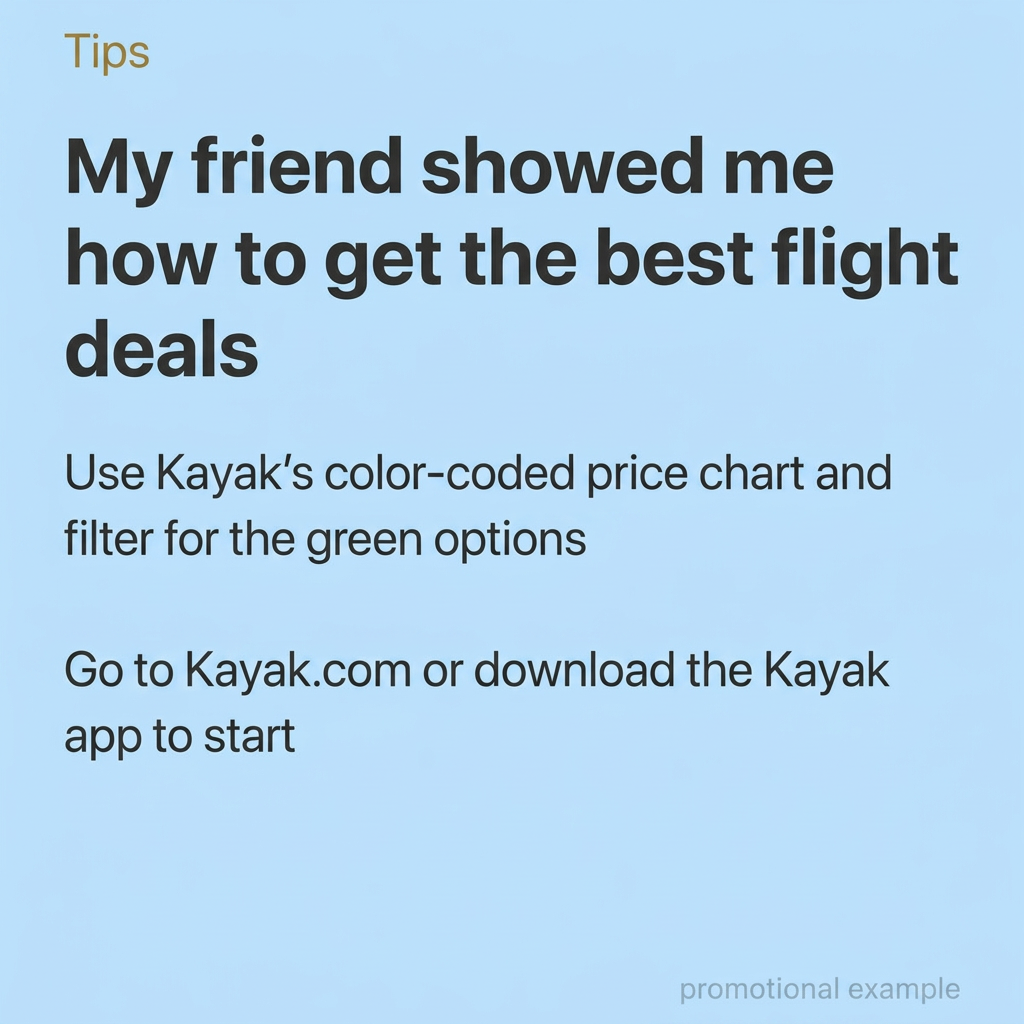
The design is deliberately minimal. A flat light blue fills the full square and suggests sky and travel without any imagery. Typography carries all the hierarchy: a small gold label, a heavy black sans-serif headline across three lines, then lighter body text with generous spacing between the two instructions. Everything is left-aligned like a phone note, which adds to the native feel. Lots of empty space at the bottom keeps it calm and readable on mobile. There is no logo, button or product screenshot competing for attention.
How to adapt this template for your brand
- Pick one specific, easy-to-explain feature or hack your product offers.
- Write a first-person headline that credits a friend: 'My friend showed me how to…'.
- Explain the tip in one or two plain sentences, naming your brand inside the advice.
- End with where to go: your website, app or store, as a soft call to action.
- Set it on a flat brand color with a small label like 'Tips' and test several tips side by side.
Tips for travel ads on Meta
On Meta, run this in Feed and Instagram placements where text posts and screenshots already perform well; keep primary text short so the image does the talking. On TikTok, turn the same script into a talking-head or green-screen video with the text as an overlay. Test multiple tips as separate creatives rather than cramming them into one. For Stories, extend the background to 9:16 and move the text into the safe zone. Avoid adding a logo or price badge, as it breaks the native look.
About this creative
This square Kayak creative uses no product imagery at all. The whole ad is typography on a flat, pale blue background, styled like a phone note or a saved social post. A small gold 'Tips' label sits in the top-left corner and frames everything below as advice rather than advertising. The bold headline, 'My friend showed me how to get the best flight deals', is written in the first person and borrows credibility from a friend instead of the brand. Below it, two short lines in regular weight give the actual instruction: use Kayak's color-coded price chart, filter for the green options, then go to Kayak.com or download the app. A faint 'promotional example' note sits bottom right. The result feels native in a feed full of screenshots and personal posts. It is cheap to produce, easy to localise and easy to A/B test, because the only variable is the words themselves.
Meta ad · 1200 × 1200 · Travel
Kayak Flight Deals Ad: Friend's Tip UGC Format
This Kayak ad dresses a product message up as a tip from a friend. A soft blue background, a bold first-person headline and two plain instructions make it feel like a Notes-app post rather than an ad. Use this UGC tip format for travel apps, booking tools and any product with one clear how-to.
Added
All brand names and logos are property of their owners. Adplaylist is not affiliated with or endorsed by these brands.
Details
Ad copy
Primary text
My friend let me in on the easiest way to find cheap flights: Kayak's color-coded price chart. Filter for the green options, book, done. ✈️
Description
Color-coded prices show you when to book
On-image text
Tips | My friend showed me how to get the best flight deals | Use Kayak's color-coded price chart and filter for the green options | Go to Kayak.com or download the Kayak app to start | promotional example
Headline ideas for this template
- 1My friend showed me the cheapest day to fly
- 2The flight hack I wish I knew sooner
- 3Stop overpaying for flights: look for green
- 4How I booked my last trip for half the price
- 5A travel agent friend told me this booking trick
Meta image ad specs
| Placement | Ratio | Size (px) |
|---|---|---|
| Feed | 1:1 or 4:5 | 1080×1080 / 1080×1350 |
| Marketplace | 1:1 | 1200×1200 |
| Messenger inbox | 1:1 | 1200×1200 |
| Stories & Reels | 9:16 | 1080×1920 |
This template is 1:1. Request 4:5 or 9:16 to cover all placements.
Browse similar by tag